Hi all, this is a running thread for feature announcements for the new Table component! We launched the new Table last month, but have so many exciting features lined up to supercharge the power of this component.
The Table team will be sharing the new features we've shipped in this thread. Feel free to share feedback, ask questions, and more!
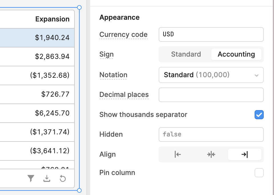
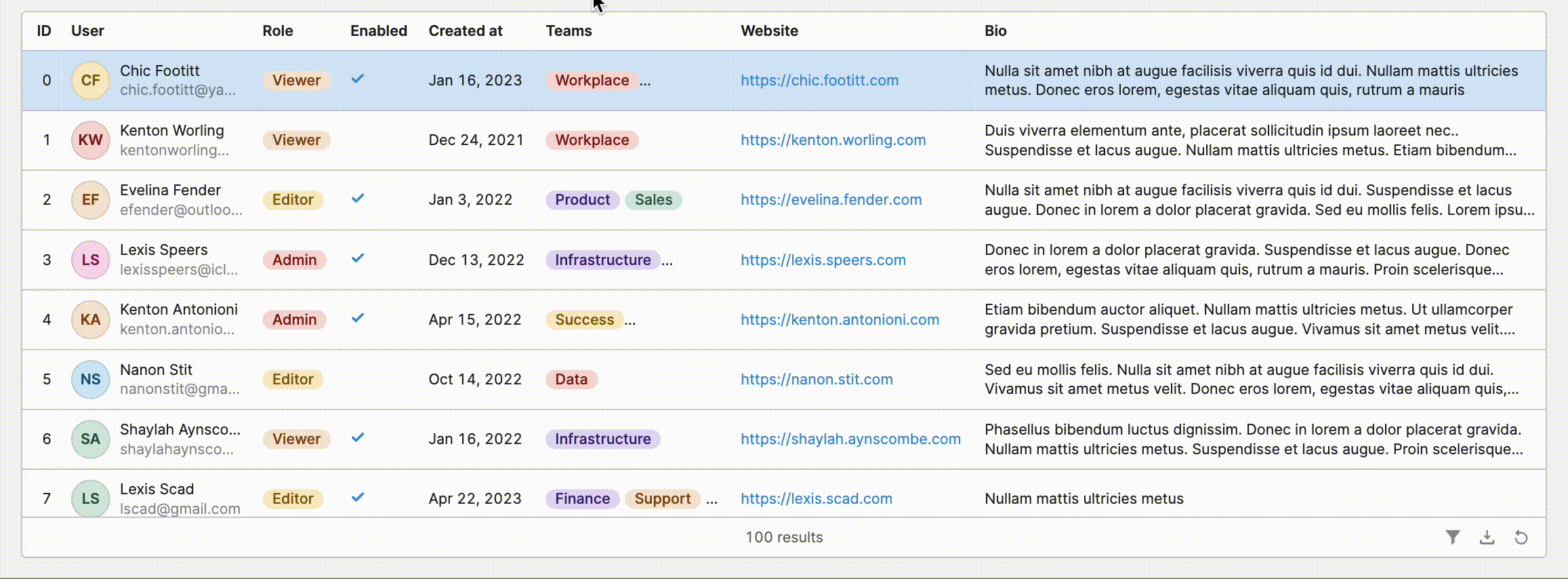
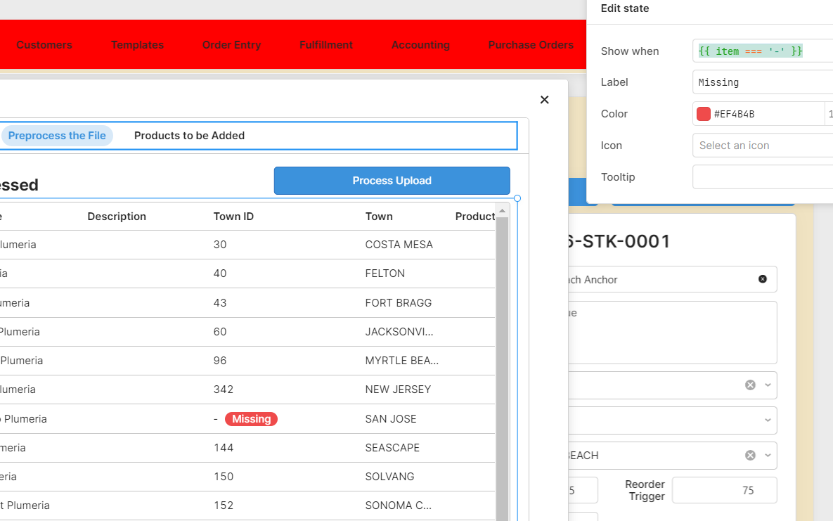
Status indicators are now available for tables in cloud! You can use these to conditionally flag or highlight cells. Add one via the Addon dropdown for a column, and conditionally decide whether to show one via the "Show when" field (use {{ item }} to refer to the content of the cell). The first status indicator matching the conditions for a cell will be the one that is rendered.
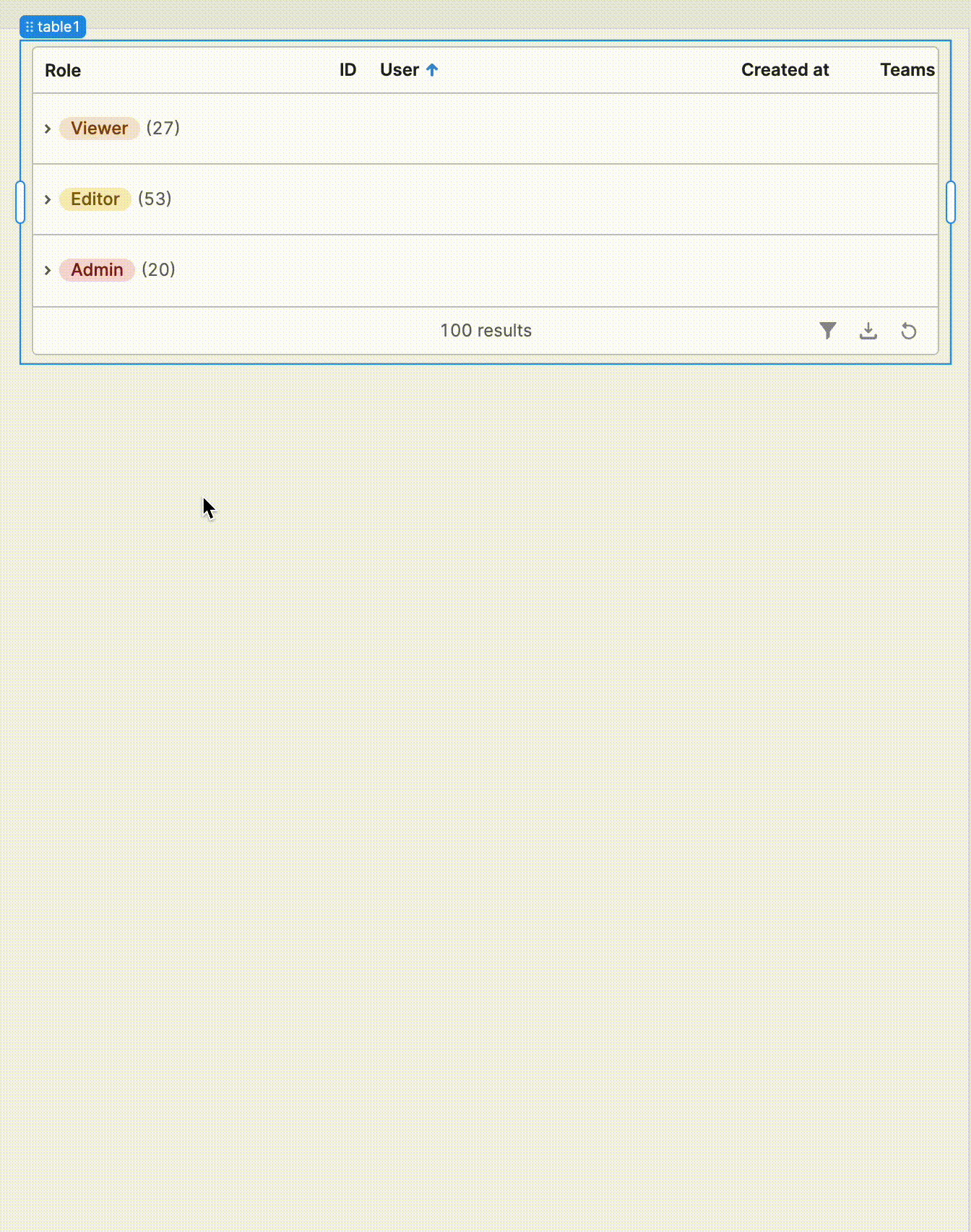
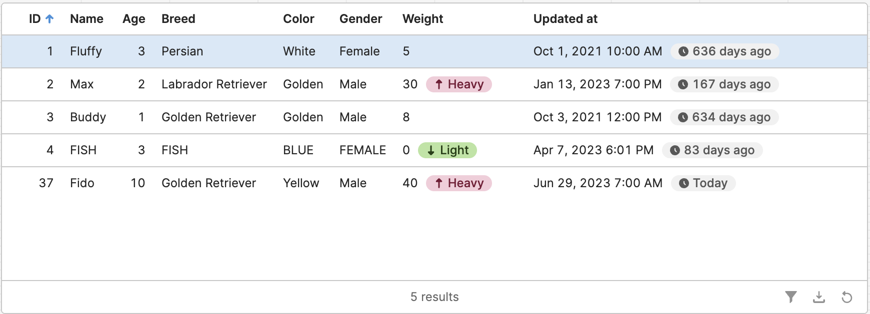
I had a good use case for this - highlighting missing data in fields, But if using a column type of number and 'item' is undefined then nothing displays. Same thing if it is String type, but the string is empty : ''.
So I can't do something like Show when: {{ item === undefined }} to highlight the missing cell.
The workaround is to make the column a string and set its Mapped value to a hyphen (or any non-empty string): {{ item === undefined ? '-' : item}} and then use a Show when of {{ item === '-' }}. Now it works:
We're working on cell copying interactions. I'll follow up when these are deployed. However, that only enables copying content inside the cell (overflow tooltips display this content).
Do you have custom tooltips that you wish to copy?
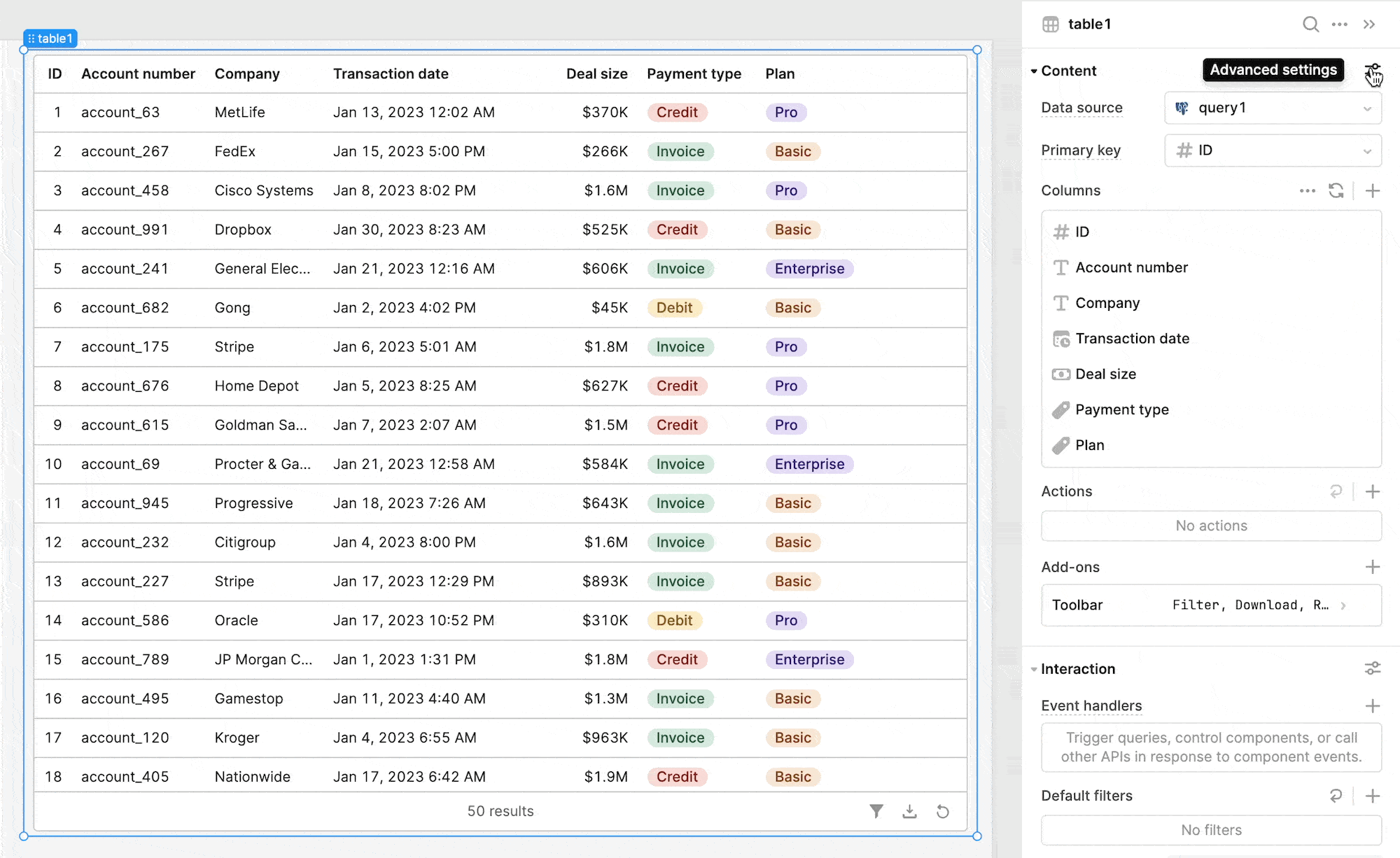
Hi @jclutterbuck Dynamic columns should be coming soon -- our team is actively working on this feature and doing some testing before it is ready to launch
Here is my another use case, I can't use mouse to scroll it, because when I hover it, it will disappear. Also I can't set the width and height of cell tooltip
(I use markdown table in tooltip.)
add + to add new Row
Consider to add + new Row icon back to new Table? In the new table, to achieve this we need to change to data source of table, also need to use a templestate and a script.
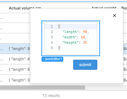
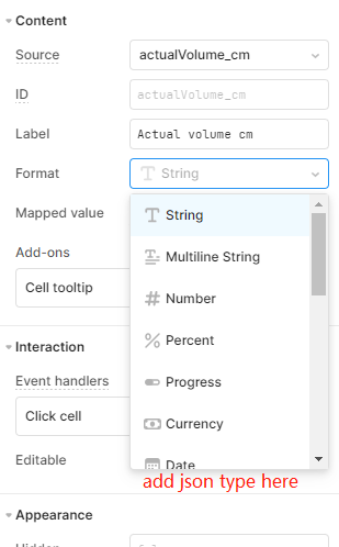
add back json column type(column format)
the edited value should be resolved to json in changesetArray instead of json str in legacy table.
    such as changesetArray:[{"actualVolume_cm": { "length": 60, "width": 50, "height": 35 }}]
instead of changesetArray:[{"actualVolume_cm": \"{ "length": 60, "width": 50, "height": 35 }\"}]
consider to add json in column type as in legacy table?
My use case is read the json type from database field. But I can't edit it on the column now. Now my workaround is complex, to create a modal, and hide it, put a jsoneditor component in it, change it datasource to table.selectedRow.someKeyPointToJson.
I think the field of json in database is so common now, so could you pls consider add jsoneditor to column type in new table component?