Would appreciate a greater range on width factor for containers to accommodate more layouts.
1 Like
Hello @neilb!
Although the following suggestion may not be an absolute solution for you (or it just may!), here are steps for one method you could use:
-
Duplicate your current app which for this example we'll call it 'my-app'.
-
Name your duplicate app something like 'my-app-tablet'.
-
Have a ternary condition for a media query on screen sizes when the following possible event actions occur that would land the end-user onto the page for 'my-app':
- Event action: When the page loads
-
Logic:
- Have a query that fires automatically which redirects the end-user to '/my-app-tablet' that checks the screen size (let's say you want to break at screens <= 1024px and > 500px) that only fires when
{{ window.viewport <= 1024 && window.viewport > 500 }} - Open two windows for creating your tablet friendly app. One to test the view by viewing your app on preview mode and pressing ⌥ + ⌘ + i (for mac) or Ctrl + Shift + i (for Windows) to open your developer tools and pressing the 'Toggle Device Toolbar' button.
Live preview mode for testing:
- As you make changes in your editor view, frequently refresh your window with your live preview to see what your changes look like.
- Have a query that fires automatically which redirects the end-user to '/my-app-tablet' that checks the screen size (let's say you want to break at screens <= 1024px and > 500px) that only fires when
-
-- OR --
- Event action: When redirecting user to another page
- Logic:
- Much easier -- simply have two events attached to the circumstance that fires this event action. One for redirecting to '/my-app' that runs when
{{ window.viewport > 1024 || window.viewport <= 500 }}, and the other for redirecting to '/my-app-tablet' which only fires when{{ window.viewport <= 1024 && window.viewport > 500 }}.
- Much easier -- simply have two events attached to the circumstance that fires this event action. One for redirecting to '/my-app' that runs when
- Event action: When the page loads
1 Like
That's a super interesting suggestion, @AJVancattenburch - I'd never really considered the potential to format the same canvas in different ways across a set of distinct apps.  Do you think this would be helpful, @neilb?
I initially interpreted your request as wanting a more refined grid system for increased customization, but let me know if I'm missing the point!
1 Like
@Darren maybe I'm not understanding how retool utilizes its width factor but why would you limit the factor to 4? there can only be design flexibility and layout benefits with an arbitrarily high width factor to accommodate a greater variety of layouts and visual designs no?
Can you explain what "width factor" means in this context? It's not a term that I'm familiar with and I want to make sure I know which part of the product you're talking about.
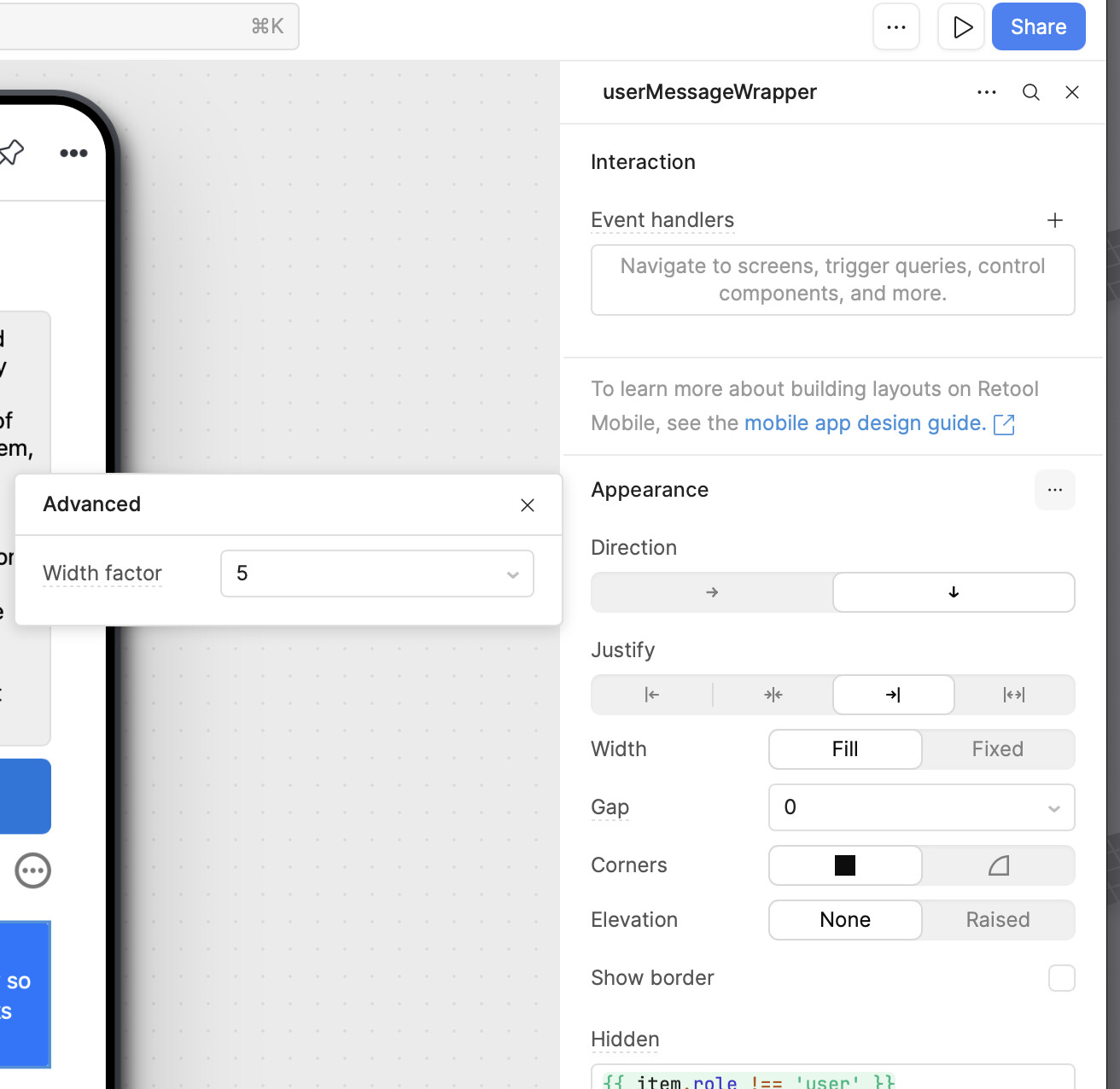
In the UI editor for a container component under appearance there is a width-factor setting. See my screenshot:
Oooh got it - I somehow missed the fact that you were building in the mobile IDE. Thanks for clarifying.  I'm sure we could increase the available width factors without too many issues! I'll reach out internally and provide an update here as soon as I have any news to share.
For additional context, though, I'm interested to get more info about the kind of layout that you're trying to build. Assuming you have a flex box with two flex items, setting the width factor of one to 5 will already make it take up ~83% of the available space. Anything more would probably only make sense on larger tablets.