-
Goal: On a smaller laptop I want some of the components to be in different places vs when on a larger screen.
-
Steps: I have tried just making everything fit better but it does not seem to work.
-
Details: I am using tables and pie charts.
1 Like
It would be cool if I could configure that if the screen resolution in width is less than a certain value then it should move these components and vice versa.
Hey @Jordan_Castro_Sauder! Welcome to the community. 
While not exactly what you're looking for, it is currently possible to configure a different layout for your app whenever the viewport is narrower than 600px, as described here. Would the ability to customize the pixel value of the threshold be helpful for this particular use case?
Thinking about a more robust solution, it would be neat to define additional app layouts that are associated with specific conditions, like a larger screen size.  Let me know what you think and I'll go to the team with some feedback!
Hey @Darren, that is a cool feature. Unfortunately it doesn't fit my use case as I am looking to be able to move things around depending on screen size. Or if there is a more intuitive approach like using flex grids or media queries. Any ideas?
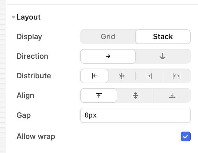
Using a flex grid is an interesting idea. Encapsulating your components in a stack container with wrapping enabled could work, depending on your exact needs.
1 Like
Yea I think this will work! I just tested it out and it is exactly what I need. Thanks Darren!
2 Likes