Basic Responsiveness / Overflow

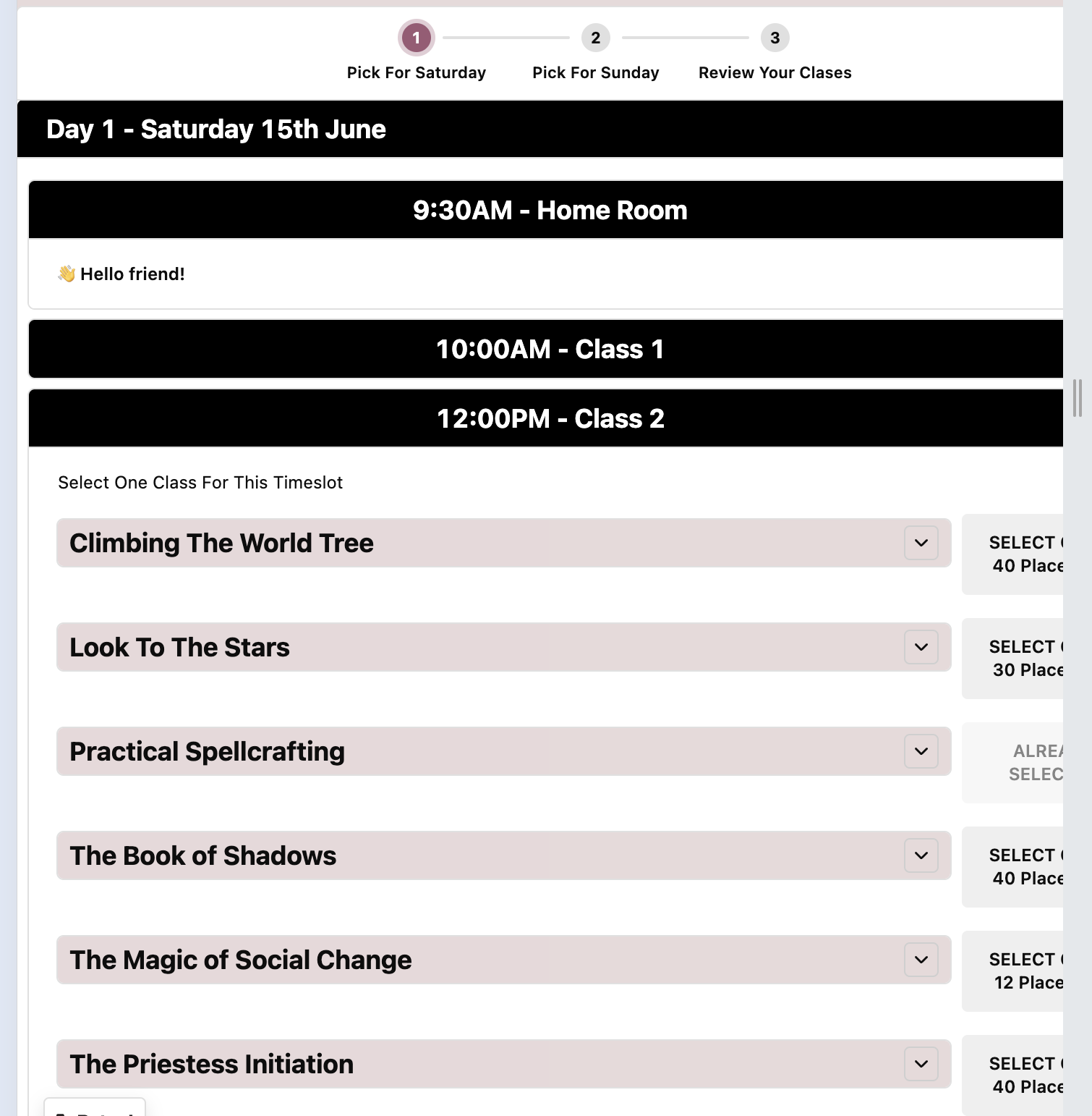
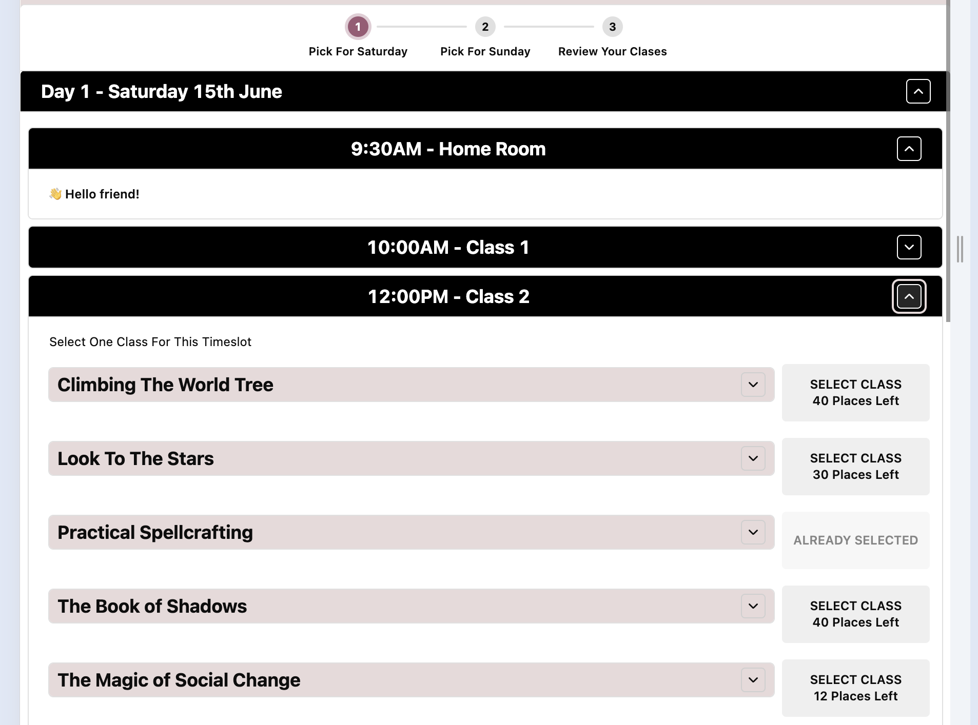
I'm trying to get some basic responsiveness working with accordion + containers. I'm finding these components tend to lock to page width - and if you use a device with a smaller viewport overflow is hidden (rather than scrolling horizontally or scaling).

Is there a way to enable this even if the whole app just scales into viewport or scrolls horizontally?

I've tried with some css, but i'm having a ton of issues.

I don't want to do this in mobile app as 70% of our use case is desktop, we just want a semi-usable approach on mobile as well (even if this is via scrolling).

Screenshots attached of what I'm seeing.

Thanks
~Ben


e

Hi @Ben_Lewis :wave:

If the goal is to create a better experience for mobile devices, you can assemble mobile layouts for web apps.

Just select the components you want to view on mobile and toggle Show on mobile under the Appearance settings.

After you selected at least one component to be viewed on mobile, at the bottom left you'll see a button to preview the mobile experience.

Note that this can be a bit of a tedious task, as you need to set this toggle for each of your components in your application.

Also important to know that these settings do not make your application responsive, it just loads the mobile experience on smaller viewports.

Hope this helps!

2 Likes

Tedious indeed, but works really well - thanks for the tip!

You would think "show on mobile" should be ticked by default.

You're right it doesn't make the app responsive, but it does allow re-arranging of components, which in my book is responsive enough.

1 Like

We have a feature request for showing on mobile by default, so I'll post here if we're able to ship that request