Is there a ways to “pin” a table to the bottom of the browser window such that, as the window is resized, the table height grows or shrinks to fit? Something like setting “canvas max width” to none in “App Settings”, only for height?
There’s talk over here about a possible CSS solution. But this doesn’t seem to work for tables since the rows get added to the DOM just-in-time before scrolling into the table’s frame. And, unfortunately, adjusting the table height in CSS doesn't change the 1) the number of rows that get loaded or 2) the position at which they get added.
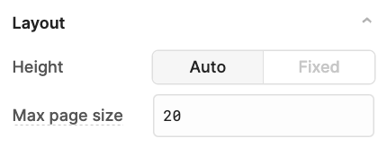
As of this writing, I don't know of a way to accomplish that. The closest thing I'm aware of is the ability to dynamically set the max page size for a table that has an auto height:
Having full-viewport layouts is something that has been requested before however! It's not currently being prioritized but if it gets picked up and included we can let you know here.
Is there a particular layout issue you're running into when the window gets resized? Or is this a more general idea for how things could be improved?
Yeah, we have a few apps where the most important control is the table, and our team would like to be able to skim over as many rows as their 30" monitors will fit.
No problem. I set the table height to fixed and make it 1400px tall or so.
But now sales, who work off macbook airs, complain because their whole screen is only 900px tall. So they have this awkward “scroll within a scroll” behavior were a section of the table takes up their entire screen, and they can’t get to the controls at the top of our retool app without scrolling to the very top of the table, at which point the browser will finally stop scrolling the table and start scrolling the page brining the controls back into view. As a developer, I understand what’s happening with the nested scroll views. But to my users, this is beyond confusing.
The root of the issue seems to be that I, the developer, am forced to make a static one-size-fits-all decision about the dynamic environments of my users. One way to address this would be for Retool to provide a table (or canvas) that adjusts itself to the height of the window it’s displayed in. Then I don't have to hard-code a decision about how tall a thing should be. The user can exercise control over this simply by adjusting the size of their browser window.
Auto height for a table is also unhelpful for this, but in a way orthogonal to the issue above. First and foremost, it forces pagination, which is unsuitable for my particular use case, so kind of makes it a non-starter. But second, even if pagination were workable in my use case, it caps the total page size at a maximum of 20 rows. So again, doesn't really help in those cases where I’d like to maximize the number of rows displayed.
Got it, yes! It looks like there are actually a few requests that have been made which align with your use case. I've connected them all with this thread internally - thanks for the added context
Containers now have a new "Expand content to fit" setting With it any single component placed in the body of the container will be expanded to fit the whole body. This can be applied to the main container of your app as well so you can have a table fill your entire app screen:
If you want to section off your app. You can have a container fill the screen letting you and set "Expand content to fit" on it as well. This gives you an additional header/footer area to put other components in while your table fills the body of the nested container:
And if you'd like to you can keep nesting like this as well. I've attached an example app for you to play around with to see if it works for your use case! example-20app.json
 With it any single component placed in the body of the container will be expanded to fit the whole body. This can be applied to the main container of your app as well so you can have a table fill your entire app screen:

