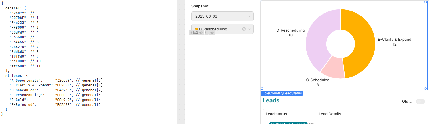
Is there any way to define the colour scheme for a pie chart using the newer chart component?
There doesn't seem to be a way to map colours to the labels.
My options seem to be:
- Manual: Clears when the options in the underlying data shift
- Palette: Colour gradient so no useful
- Array: Don't see a way to associate colours to variables
Am I going to have to use the older chart component and define it via Plotly?
Apologies if I am missing something obvious. I'm dealing with a wild wisdom toothache at the same time (should be called a wisDOOM tooth).
1 Like
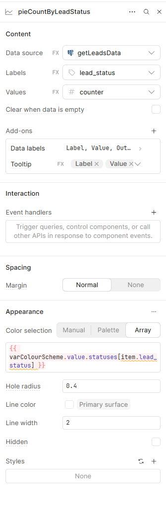
Hi @ferret141,
I'll be running a demo test in my app. You might want to try creating a transformer and use its output to set the color array in the pie chart's color section.
Transformer Code
const colorMap = {
  "B-Clarify & Expand": "#FF9800",
  "C-Scheduled": "#F06292",
  "D-Rescheduling": "#BA68C8"
};

// Get the labels from the data
const labels = {{ getLeadsData.data }}.map(item => item.lead_status);


return labels.map(label => colorMap[label] || "#CCCCCC"); /
=
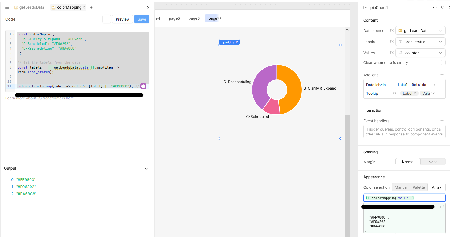
The second option is Inline Mapping in the Chart Settings
Alternatively, you can use an inline mapping directly within the chart’s color configuration:
{{
  getLeadsData.data.map(item => ({
    "B-Clarify & Expand": "#FF9800", // Orange
    "C-Scheduled": "#F06292", // Pink
    "D-Rescheduling": "#BA68C8" // Purple
  })[item.lead_status] || "#CCCCCC")
}}
5 Likes
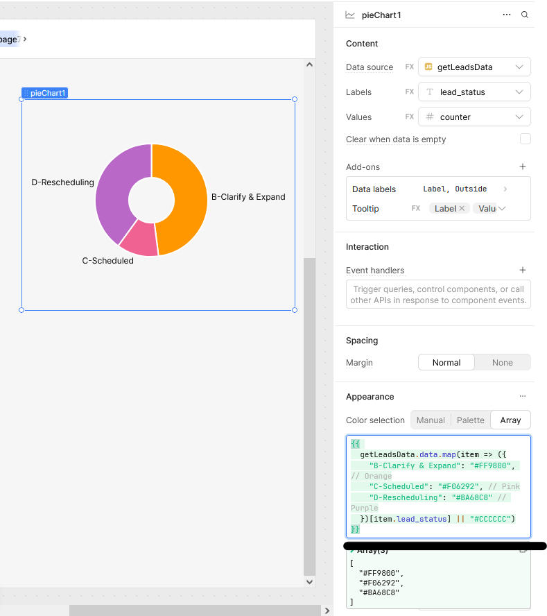
Thank you @WidleStudioLLP. That was exactly what was needed.
I used the inline method.
2 Likes
Is this color selection method going to be added to the other types of charts?
2 Likes
Hi @Kyle_Crowder,
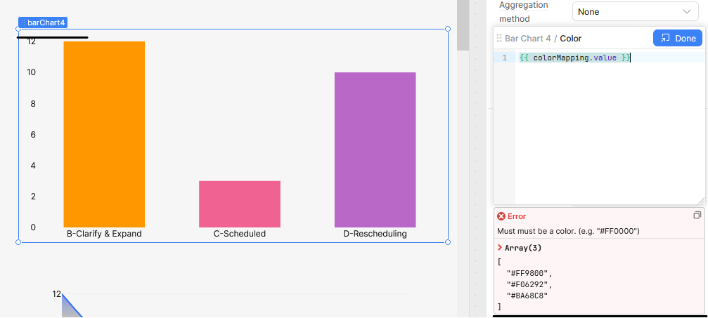
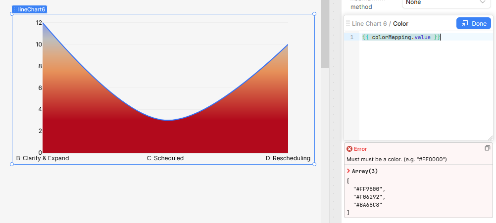
I hadn’t tried this approach in other chart types before, but after seeing your question, I gave it a shot using bar and line charts. It seems the trick partially works, but throws an error because these chart types expect a single color value. Specifically, the “Segment Color” or “Bar Color” field requires just one string value per bar or slice.
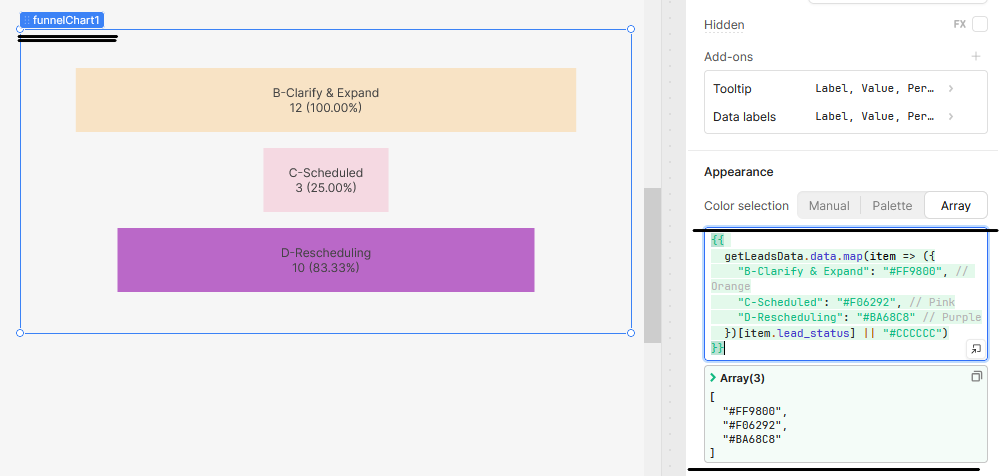
However, this method works well with chart types such as funnel charts and pie charts, which support multiple colors and values per segment. You might want to try it with those instead.
I've included some screenshots below for your reference.
Hope this helps!
4 Likes
Thanks for demoing those! Unfortunately it was specifically the bar/line chart that I had in mind when asking this. I hope someday that add this feature to the rest of the charts
2 Likes