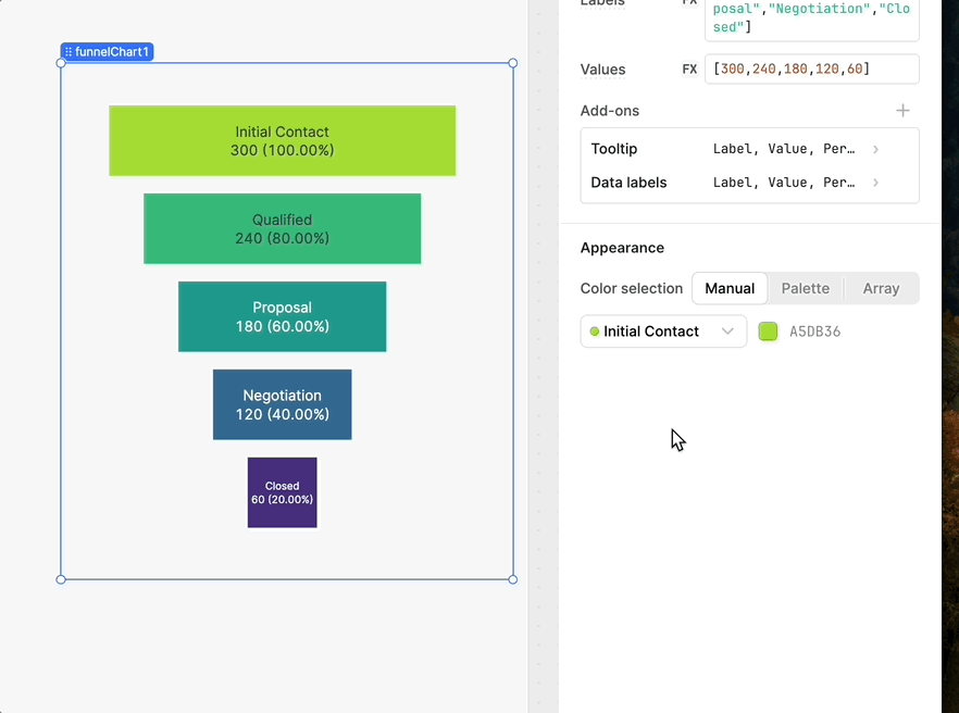
Is there something I’m overlooking? How can I change the color of the new funnel chart?
Also, I expected the larger numbers to be at the top or bottom of the funnel, but they’re currently in the middle.
Is there something I’m overlooking? How can I change the color of the new funnel chart?
Also, I expected the larger numbers to be at the top or bottom of the funnel, but they’re currently in the middle.
Hello @Levi_Miller,
Thank you for the feedback!
I agree it is not very intuitive on how to control the coloring, I can send this our our UI engineering team ![]()
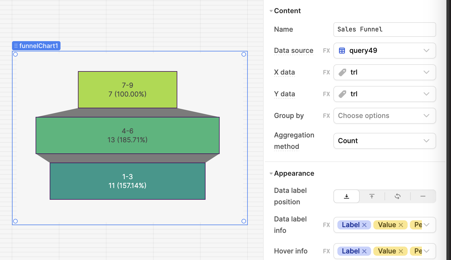
In terms of the location of larger numbers, I believe that the default set up for the component is that it first respects the title and wants to keep those in proper "chronological" order as those are the x-axis values. (1-3 lowest at the bottom, then 4-6 as the next above it, etc)
With the number that decides the width being the y-axis value, in your example the 11, 13 and 7.
These values are visually represented but do not dictate the order.
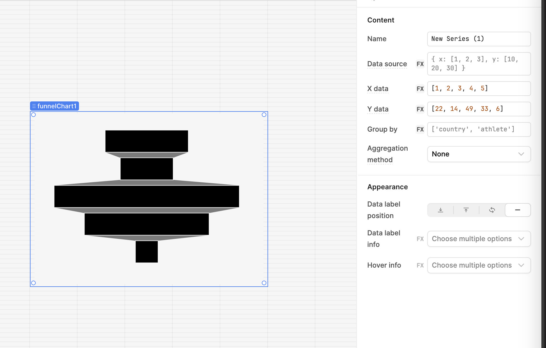
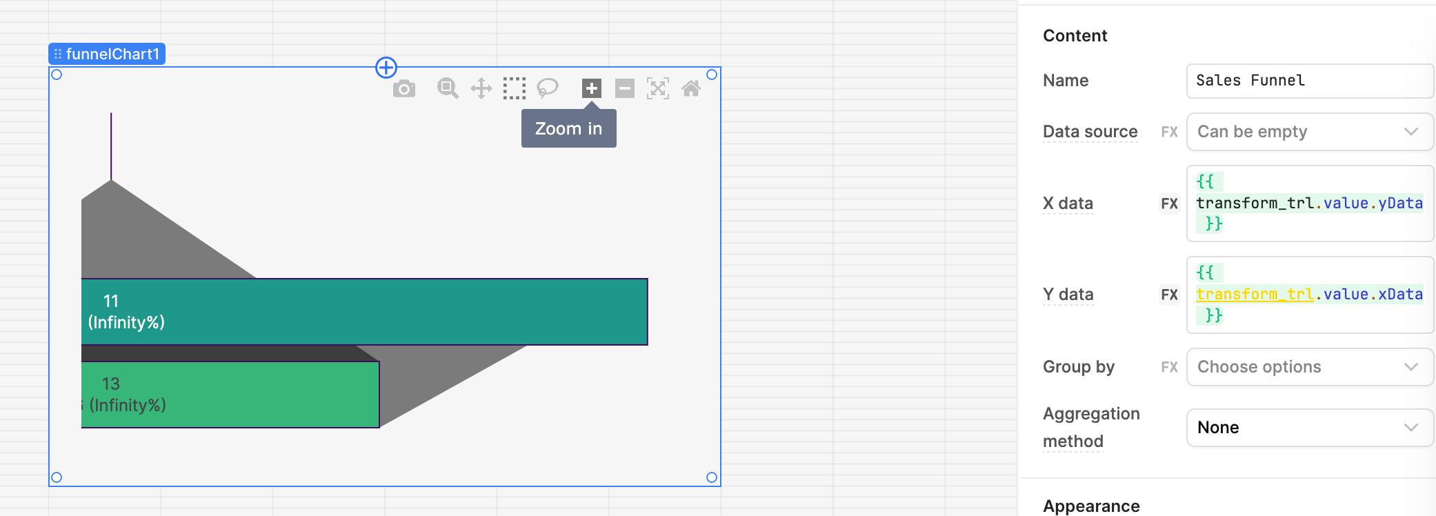
I though that if you switch the x-axis values and the y-axis values it will order based on the new x-axis values(7,11,13) with the size of the rows will be dictated by the y-axis values which are the headers at the top of each bars which may be confusing ![]()
However! I just tested this and it errored out ![]() so I will also tell the eng team to look into making sorting options available as well!
so I will also tell the eng team to look into making sorting options available as well!
Thanks Jack! That makes sense to me. Do I have any control over the colours?
This is why it's still in Beta. Thanks for testing it out.
@Levi_Miller No problem!
I can definitely see why this is still in beta ![]()
Let me track down the eng on the UI team who owns this to ask about the colors.
There should be an easy control like there is in 'Appearance' but it seems like the component is meant to get the color from the data source which isn't intuitive and requires the input to be formatted a very specific way which can be hard/not possible ![]()
Thank you for testing out switching the axis for the data sources, I did the same and realize that most likely no one wants their data to look like that ![]() It seems the component is definitely meant for the first set up.
It seems the component is definitely meant for the first set up.
I filed a feature request to add in sorting/ordering by the number value as opposed to by the range in the title as well ![]()
Hey! Sorry for the late response here, but you can control the colors for funnel charts now with a few different mechanisms: by individual step, as a gradient, or as a hard-coded array!