Whenever I make a graph the assigned colors are consistently close on the color spectrum making it hard to distinguish between them. Is there a way to make them more distinct?
Hi Paul, good question! You can customize the color by clicking on the dataset and set the color from the popup. See the screenshot attached for an example:

Note that there is a set of pre-populated colors in the color picker, but you can also specify your own color using hex code.
Let me know if you have any other questions!
1 Like
Hi @retool_team,
Is there a way to conditionally color different data points in a Plotly chart? (specifically in a scatter plot)
Thanks!
Hey @aac!
Stepping in here for Grace real quick, this may be a little more difficult but definitely doable! According to this from the plotly.JS docs, you can pass an array of color values into the data Plotly JSON
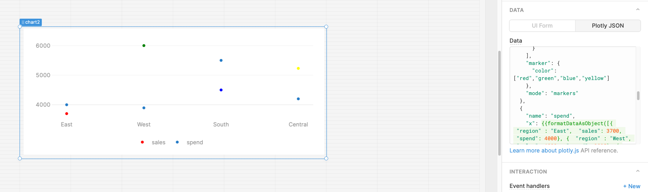
You could use your datapoints and map through their values to return different colors. Do you think this could work for your use case here?\
Hi) How about piechart labels colors? Is a way to set colors for pie chart labels
Hi @nekitdar
Thanks for chiming in! It looks like there are some good ideas on this plotly post ![]() This isn't something we support natively, so you'd want to use the Plotly JSON tab for custom styling:
This isn't something we support natively, so you'd want to use the Plotly JSON tab for custom styling:
