I am wanting to create a pie chart and a line graph displaying the frequency of certain codes our users are receiving for their accounts. I currently have both charts displaying the same results, with the only difference being the piechart is for the last 30 days. They use different queries for each component, but the data is essentially the same. How can I make the color schemes match when the codes are the same?

1 Like
Hello, it's about something of the setting of plotlyjs mark.
here is two link for your refer, but it's about python.
You can find plotly pie example here
1 Like
Are there any resources or examples referencing plotly in JS? I figured a retool expert would be able to help out a bit more with this basic topic.
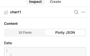
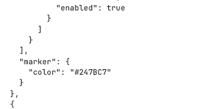
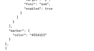
If you select Plotly instead of UI form you should see hex values for "marker" in the code that you should be able to set the same for both charts....
How would I go about this for the pie chart? It doesn't have the same structure for color schemes
You can actually find a link to the plotlyjs docs in the interface for the component itself!

(Here they are as well) plotly usually takes arrays and then matches colors to their respective data points based on the index of each:

So how you maintain consistency depends a bit on how you have your charts set up and what you're data looks like. Generally, you can try playing around with passing the colors you want as an array to marker.colors but feel free to share your setup here so we can take a look!