I'm trying to change the color of a chart line depending on the value of the series (positive > green, negative > red.)
I assume there would be some complicated ways to do so with custom JSON plotly chart and so on but I was just wondering if there was an easier way just like with buttons and cells.
Hey @Baptiste_LC ! Unfortunately chart line colors accept a single color. You could split your dataset into two series, and have a single series of one color for all values below 0, and then another series for a color for all values above 0.
So to make sure I get it, on your example is getWaterfallData a chart or an array/object that is storing the values that you're displaying on the chart?
With the name of my chart instead of getWaterfallData but there was a scoping issue as seen in the error message.
So I tried with a global array that is storing the values instead, which does not show any error message, but won't change anything on the graph. And also that makes sense to me because with the following script, I don't seen how the website could understand it has to change the values of the graph.
You will probably have to adjust to your use case. As for the line colors, I suggest you look at plotlyjs documentation, as the retool docs are not super great.
So now everything is clearer for me. I would advice anyone that has little knowledge of code to inspect the html of the component they want to develop custom CSS for and ask ChatGPT or similar to write the custom CSS needed.
For the chart component more specifically, it seems that it is easy to change the color of markers depending on value, but much more difficult for lines where you need to create different traces. So I considered it was good enough with the following structure:
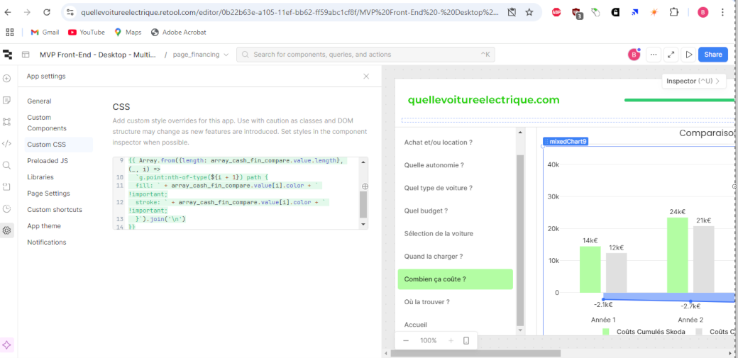
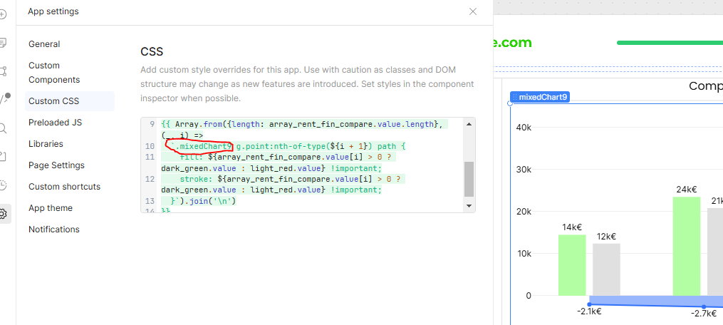
I know this is an older topic, but just wanted to share a solution that I've come up with using custom CSS. This will uphold through Retool updates, as all you are targeting is the ID of your component, and the svg path's 'd' attribute value to check for values that fall below the '0' line.
Take the following CSS snippet, paste it into your custom CSS section of your app settings, and simply change the value of [id="barChart1"] with the name of your actual bar chart component:
[id*="barChart1"] g.point:has(path[d*="V0"], path[d*="V2"]) path {
  fill: #FF0000 !important; /* should fill bar values that fall below '0' in your graph with a red background */
}