[
{
"type": "funnel",
"name": "Montreal",
"y": [
"Website visit",
"Downloads",
"Potential customers",
"Requested price",
"invoice sent",
"closed deals"
],
"x": [
120,
60,
30,
20,
5,
1
],
"textinfo": "value+percent initial",
"hoverinfo": "none"
},
{
"type": "funnel",
"name": "Toronto",
"y": [
"Website visit",
"Downloads",
"Potential customers",
"Requested price",
"invoice sent",
"closed deals"
],
"x": [
100,
60,
40,
30,
20,
4
],
"textposition": "inside",
"textinfo": "value+percent previous",
"hoverinfo": "none"
},
{
"type": "funnel",
"name": "Vancouver",
"y": [
"Website visit",
"Downloads",
"Potential customers",
"Requested price",
"invoice sent",
"closed deals"
],
"x": [
90,
70,
50,
30,
10,
8
],
"textposition": "outside",
"textinfo": "value+percent total",
"hoverinfo": "none"
}
]
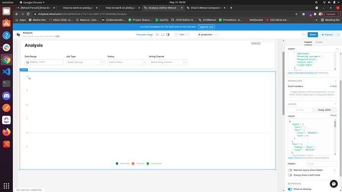
I am using code stated by @Pawan for ploty.js, but I am not getting the result.

Help me troubshoot the issue, it's an urgent requirement.
P.S- It is not working for enterprise as well as for not for free planThanks very much for reporting this, Ishi! We are looking at the issue and we'll be back to you as soon as possible.
Hey @ishi8!
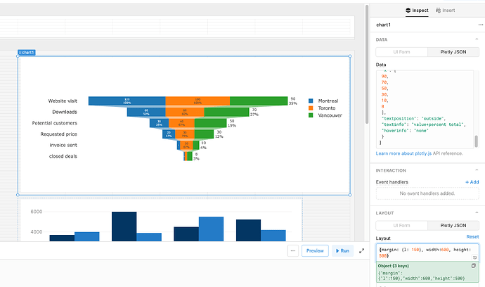
You'll also need to change the layout of the chart to be compatible with a funnel type. Grabbing the layout input from plotly's example here seems to work:
@alex-w How we can change the colour of funnel, by default it is blue
Hey @ishi8!
Sorry about the late response here. If this is something you're still looking into there are some examples here from the plotlyjs docs that demonstrate how you can change colors. It looks as though it's a sub-property of marker:
marker: {
  color: ["59D4E8", "DDB6C6", "A696C8", "67EACA", "94D2E6"],
}Where should I write this?
As I have used this earlier- {margin: {l: 400}, width: 700, height: 700, }
Here's where I pulled it from in the plotly docs I linked!
var data = [
  {
    type: "funnel",
    y: [
      "Sales person A",
      "Sales person B",
      "Sales person C",
      "Sales person D",
      "Sales person E",
    ],
    x: [1200, 909.4, 600.6, 300, 80],
    textposition: "inside",
    textinfo: "value+percent initial",
    hoverinfo: "percent total+x",
    opacity: 0.65,
    marker: {

      color: ["59D4E8", "DDB6C6", "A696C8", "67EACA", "94D2E6"], //------ color property here!

      line: {
        width: [4, 2, 2, 3, 1, 1],
        color: ["3E4E88", "606470", "3E4E88", "606470", "3E4E88"],
      },
    },
    connector: { line: { color: "royalblue", dash: "dot", width: 3 } },
  },
];
That example only has one data set, you'll want to add a color property to each of the datasets in your funnel stack. Also if you'd like to specify a single color for the entire funnel you can just pass it a string of that color instead of an array, something like marker: { color: "59D4E8" }. Let me know if that helps!
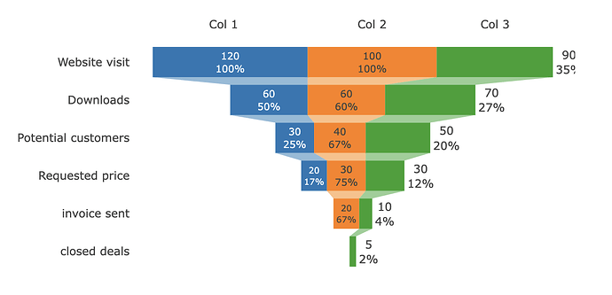
Playing around with this example a bit it looks like annotations can be defined as a top-level property on the layout object. Since you're trying to use them as labels we can remove the arrows and then play around with the x and y properties to position them correctly. Not sure if this is the best way to go about it but here's what I've put together so far:
{
  margin: { l: 130, r: 0 },
  width: 600,
  funnelmode: "stack",
  showlegend: false,
  annotations: [
    {
      x: -100,
      y: -1,
      xref: "x",
      yref: "y",
      text: "Col 1",
      showarrow: false,
    },
    {
      x: 15,
      y: -1,
      xref: "x",
      yref: "y",
      text: "Col 2",
      showarrow: false,
    },
    {
      x: 110,
      y: -1,
      xref: "x",
      yref: "y",
      text: "Col 3",
      showarrow: false,
    },
  ],
}


