Changing Line Type (or color) in chart based on row value

Hello! Long time lurker, but haven't found any solution similar to this.

I am building a chart with dates on the X-axis and percentages on the Y-axis, but the most recent rows are incomplete. I'd like to change either the color or the style of the line, based on the date of the datapoint, but it changes based on today. I've added a boolean data column that calculates whether its complete or not, but could easily do it in a different place, too.

In this example, I have a seperate column {{query.data.full_window}} that I'd like to use to change the color of the line? I could do separate SQL queries but that seems imperfect.

Thank you for any ideas

Hey @rosenberg_jockmkt! To clarify, you'd like your chart to look like

where each color represents a different day?

Or do you want to change the color based on a selected point?

Or something else? :sweat_smile:

Yeah, great question. I want to either change the color or the line type for 7 of the right most days. I basically want to change it if the date is less than 14 days from today.

Hmm, then it sounds like we need to use a JS query to loop through your data and add a color style conditionally.

Here's a simple example. You'd replace the existing_layout value with your current layout object and also, in your chart's Layout "Plotly JSON", you'll set it to your JS query's data (e.g. `{{ query5.data}}`)

If this doesn't work for you, I'd be happy to step into your app to take a look!

let colors = [];
let styles = [];
const data = month_year_chart_data.data
const existing_layout = {
  "title": {
    "text": "",
    "font": {
      "color": "#3D3D3D",
      "size": 16
    }
  },
  "font": {
    "family": "Inter",
    "color": "#979797"
  },
  "showlegend": false,
  "legend": {
    "xanchor": "center",
    "x": 0.45,
    "y": -0.2,
    "orientation": "h"
  },
  "margin": {
    "l": 16,
    "r": 24,
    "t": 24,
    "b": 32,
    "pad": 2
  },
  "hovermode": "closest",
  "hoverlabel": {
    "bgcolor": "#000",
    "bordercolor": "#000",
    "font": {
      "color": "#fff",
      "family": "Inter",
      "size": 12
    }
  },
  "clickmode": "select+event",
  "dragmode": "select",
  "xaxis": {
    "title": {
      "text": "",
      "standoff": 6,
      "font": {
        "size": 12
      }
    },
    "type": "category",
    "calendar":"gregorian",
    "tickformat": "%B %Y",
    "showticklabels": true,  
    "automargin": true,
    "fixedrange": true,  
    "gridcolor": "#fff",
    "zerolinecolor": "#fff"
  },
  "yaxis": {
    "title": {
      "text": "",
      "standoff": 6,
      "font": {
        "size": 12
      }
    },
    "type": "linear",
    "tickformat": "",
    "automargin": true,
    "fixedrange": true,
    "zerolinecolor": "#DEDEDE"
  }
}

for (let i = 0; i < data.employees.length; i++) {
  // let date = new Date(data[0].x[i]);
  if (moment().diff(data.month_year_format[i]) > 14) {
    colors.push('red');
    styles.push('dash');
  } else {
    colors.push('blue');
    styles.push('solid');
  }
}

existing_layout.line = {color:[], dash:[]}

existing_layout.line.color = colors;

existing_layout.line.dash = styles;
return existing_layout

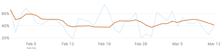
thank you for this! I think I got it to work, but it doesn't seem to have an impact on the actual chart - this is output of the jsquery:

{
  "title": {
    "text": "Daily",
    "font": {
      "color": "#3D3D3D",
      "size": 16
    }
  },
  "font": {
    "family": "Inter",
    "color": "#979797"
  },
  "showlegend": true,
  "legend": {
    "xanchor": "center",
    "x": 0.45,
    "y": -0.2,
    "orientation": "h"
  },
  "margin": {
    "l": 72,
    "r": 24,
    "t": 80,
    "b": 32,
    "pad": 2
  },
  "hovermode": "closest",
  "hoverlabel": {
    "bgcolor": "#000",
    "bordercolor": "#000",
    "font": {
      "color": "#fff",
      "family": "Inter",
      "size": 12
    }
  },
  "clickmode": "select+event",
  "dragmode": "select",
  "xaxis": {
    "title": {
      "text": "",
      "standoff": 6,
      "font": {
        "size": 12
      }
    },
    "type": "-",
    "tickformat": "",
    "automargin": true,
    "fixedrange": true,
    "gridcolor": "#fff",
    "zerolinecolor": "#fff"
  },
  "yaxis": {
    "title": {
      "text": "User Retention Rate",
      "standoff": 6,
      "font": {
        "size": 12
      }
    },
    "type": "linear",
    "tickformat": ".0%",
    "automargin": true,
    "fixedrange": true,
    "zerolinecolor": "#DEDEDE"
  },
  "line": {
    "color": [
      "blue",
      "blue",
      "blue",
      "blue",
      "blue",
      "blue",
      "red",
      "red",
      "red",
      "red",
      "red",
      "red",
      "red",
      "red",
      "red",
      "red",
      "red",
      "red",
      "red",
      "red",
      "red",
      "red",
      "red",
      "red",
      "red",
      "red",
      "red",
      "red",
      "red",
      "red",
      "red",
      "red",
      "red",
      "red",
      "red",
      "red",
      "red",
      "red",
      "red",
      "red",
      "red",
      "red",
      "red",
      "red",
      "red",
      "red",
      "red",
      "red",
      "red",
      "red"
    ],
    "dash": [
      "solid",
      "solid",
      "solid",
      "solid",
      "solid",
      "solid",
      "dash",
      "dash",
      "dash",
      "dash",
      "dash",
      "dash",
      "dash",
      "dash",
      "dash",
      "dash",
      "dash",
      "dash",
      "dash",
      "dash",
      "dash",
      "dash",
      "dash",
      "dash",
      "dash",
      "dash",
      "dash",
      "dash",
      "dash",
      "dash",
      "dash",
      "dash",
      "dash",
      "dash",
      "dash",
      "dash",
      "dash",
      "dash",
      "dash",
      "dash",
      "dash",
      "dash",
      "dash",
      "dash",
      "dash",
      "dash",
      "dash",
      "dash",
      "dash",
      "dash"
    ]
  }
}

(sorry for the delay here, it's been a busy couple weeks!)

Would it be alright if I stepped into your app to take a look at this chart? :slight_smile: If so, sharing your app name would be great :pray:

Yes sorry for my delay in response! The app is called: Pick 'Em Retention. Thank you!

Hey again @rosenberg_jockmkt! This has proven to be quite difficult. I tried a few different ways myself to no avail :frowning: With that said, I'm not a Plotly expert by any means so the Plotly forums might have a better idea here of how we can get this to work.

I'm sorry I couldn't be more helpful here!

no worries, thank you for trying! I will see if plotly folks can help and will update here if they can.