Plotly is the bane of my existence...is there no easy way to add data labels?

I've been trying to figure out how to add some simple text data labels over the top of each bar in a bar chart (or heck, any chart for that matter)...can someone please help? I've been at this for 2 hours and have gotten no where...

I think that this code is included by default for 'hovermode' or whatever that is, is screwing up anything i try, but i'm not really sure where to begin:
"hovermode": "closest",
"hoverlabel": {
"bgcolor": "#000",
"bordercolor": "#000",
"font": {
"color": "#fff",
"family": "var(--default-font, var(--sans-serif))",
"size": 12
}
},

I feel ya! Plotly is a super powerful library but not exactly friendly or intuitive all the time.

Assuming this is the chart that I responded about the other day, here's an updated JSON that adds the values to the bars.

[
  {
    "name": {{variable2.value.PinnacleName}},
    "x": {{ Object.keys((({ PinnacleID, PinnacleName, ...rest }) => rest)(variable2.value))}},
    "y": {{ Object.values((({ PinnacleID, PinnacleName, ...rest }) => rest)(variable2.value))}},
    "type": "bar",
    "text": {{ Object.values((({ PinnacleID, PinnacleName, ...rest }) => rest)(variable2.value))}},
    "textposition": 'auto',
    "hovertemplate": "<b>%{x}</b><br>%{fullData.name}: %{y}<extra></extra>",
    "transforms": [
      {
        "type": "sort",
        "target": {{ Object.keys(variable2.value )}},
        "order": "ascending"
      }
    ],
    marker: {
    color: 'rgb(158,202,225)',
    opacity: 0.6,
    line: {
      color: 'rgb(8,48,107)',
      width: 1.5
    }
  }
  }
]

Screenshot 2024-02-15 at 4.11.29 PM

Largely copied from this example in the plotly docs.

1 Like

the "text" property is what you're looking for - also the "textposition" to align it inside or outside the bars. I find that "auto" sometimes makes them scroll off the chart canvas so set them "inside"

2 Likes

Thanks for the help @dcartlidge !!
I'm closer, but still not quite there - here's what my chart currently have - I removed the hover related commands, but this is they still pop up only when i hover over the column for a user and then all 5 bar labels appear?:
image

Here's what my plotly json looks like - it's presently throwing an error for the {{y}} value:
{
"title": {
"text": "",
"font": {
"color": "#3D3D3D",
"size": 16
}
},
"font": {
"family": "var(--default-font, var(--sans-serif))",
"color": "#979797"
},
"showlegend": true,
"legend": {
"xanchor": "center",
"x": 0.45,
"y": -0.2,
"orientation": "h"
},
"margin": {
"l": 16,
"r": 24,
"t": 24,
"b": 32,
"pad": 2
},
"clickmode": "select+event",
"dragmode": "select",
"xaxis": {
"title": {
"text": "",
"standoff": 6,
"font": {
"size": 12
}
},
"type": "-",
"text": {{y}},
"textposition": "inside",
"tickformat": ".1%",
"automargin": true,
"fixedrange": true,
"gridcolor": "#fff",
"zerolinecolor": "#fff"
},
"yaxis": {
"title": {
"text": "",
"standoff": 6,
"font": {
"size": 12
}
},
"type": "linear",
"tickformat": ".1%",
"automargin": true,
"fixedrange": true,
"zerolinecolor": "#DEDEDE"
}
}

The other question I had, is I have this chart linked to a table that shows multiple agents. I'd like to be able to filter the results down based on the user I click on the table. So basically, if I had 3 users in the table of data, and I clicked on user 1 - the chart would go from showing the stats on all 3 users to just user 1's stats. Not sure where to start on something like that other than I know the table event handlers have a 'click row' action. I guess I'm basically just trying to get the chart to mirror the data in the table. If a filter is on, the chart only shows the filtered data.

This may or may not be a viable solution for you, but I gave up on Plotly and the Chart component a long time ago and moved to using chart.js in a custom component. ChatGPT is great about suggesting changes to the config if I want to do something different.

Here is my iFrame code:

<style>
body {
    margin: 0; 
}
</style>
<script src="https://cdn.jsdelivr.net/npm/chart.js"></script>
<!--<script src="https://www.chartjs.org/samples/latest/utils.js"></script>-->
<script>
window.Retool.subscribe(function(model) {
    if (!model) { return }
    model.options.tooltips['callbacks'] = {
        footer: function(tooltipItems, data) {
            var sum = 0;
            tooltipItems.forEach(function(tooltipItem) {
                sum += data.datasets[tooltipItem.datasetIndex].data[tooltipItem.index];
            });
            return sum;
        }
    };
    var chartData = model.data;
    var ctx = document.getElementById('canvas').getContext('2d');
    if (!window.myMixedChart) {
        window.myMixedChart = new Chart(ctx, model);
    } else {
        window.myMixedChart.data = model.data;
        window.myMixedChart.options = model.options;
        window.myMixedChart.update();
    }
})
</script>
<div class="chart-container" style="position: relative;margin: auto; height:100vh; width:100vw;">
    <canvas id="canvas"></canvas>
</div>
</body>
</html>

Here is my model:

{ 
  type: "line",
  options: {
  responsive: true,
  stacked: true,
  maintainAspectRatio: false,
  title: {text: "sample horizontal stacked",display: true},
  tooltips: {mode: "index", intersect: true},
  legend: {position: "bottom"},
  scales: {
      x: {
        stacked: false,
      },
      y: {
        stacked: false
      }
    }
  },
  data: { 
    labels: {{Stats_Inquiry_By_Category.data.week_start}},
    datasets:  {{GraphSource_InquiryCategrories.value.datasets}} 
  }
}

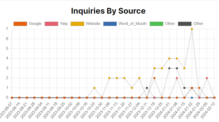
My labels looks like this:

[
  "2024-01-15",
  "2024-01-22",
  "2024-01-29",
  "2024-02-05",
  "2024-02-12"
]

My datasets object looks like this:

{
  "categories": [
    "Google",
    "Yelp",
    "Word_of_Mouth",
    "Other",
    "Website",
    "Email"
  ],
  "datasets": [
    {
      "label": "Google",
      "data": [
        "0",
        "1",
        "1",
        "0",
        "0"
      ],
      "backgroundColor": "rgb(231,95,10)"
    },
    {
      "label": "Yelp",
      "data": [
        "0",
        "1",
        "0",
        "2",
        "0"
      ],
      "backgroundColor": "rgb(231,95,112)"
    },
    {
      "label": "Website",
      "data": [
        "3",
        "7",
        "0",
        "0",
        "0"
      ],
      "backgroundColor": "rgb(230,171,2)"
    },
    {
      "label": "Word_of_Mouth",
      "data": [
        "0",
        "0",
        "0",
        "0"
      ],
      "backgroundColor": "rgb(56,108,176)"
    },
    {
      "label": "Other",
      "backgroundColor": "rgb(77,192,77)"
    },
    {
      "label": "Other",
      "data": [
        "1",
        "1",
        "0",
        "0",
        "0"
      ],
      "backgroundColor": "rgb(77,77,77)"
    }
  ]
}

Here is what is looks like:

You do need to create the proper structures, but I also needed to do that on plotly.

4 Likes

Add "hoverinfo": 'none', to your data JSON. What you've included is the layout JSON.

Same as above here, I believe this needs to move to the data JSON. Also, what does the data in y look like? Plotly expects an array of values here, equal in length to the number of x values that you have in your chart.

You'll need to create a script that programmatically creates the trace object that goes in the data JSON array. In pseudocode terms:

// If any rows are selected, use those. Otherwise use all rows.
const agents = table.selectedRows ? table.selectedRows : table.data

// Map through the array and build a trace for each row. 
return agents.map((x) => {
   return {
      x: Object.keys(x)
     y: Object.values(x)
     ...
}
})

And then reference the output of this script in the data JSON field in the chart.

1 Like