-
Goal: Trying to populate a chart with custom variable data. I have a tabbed container with 4 tabs - each tab corresponds to a time frame to aggregate the assigned time frame data by query (the query performs all the calculations). The tabs are Hour, Day, Week, and Month, and they correspond to the tables which are populated by the queries named Hourly, Daily, Weekly, and Monthly. My goal is when a user clicks one of the rows in a table, it populates the chart below the table with their 5 performance metrics - basically takes what's in the row and populates the chart with the data. The chart should update regardless of which of the 4 tabs/tables is currently active, so:
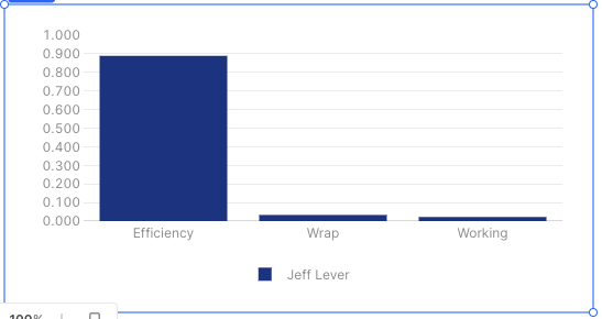
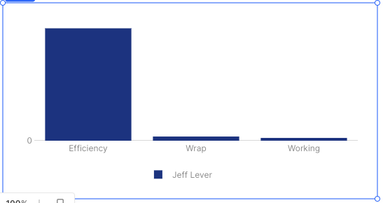
If I clicked the Hourly table row 1 -> chart 1 below would show the Agent, Efficiency, Wrap, Working, Idle, and System stats for that agent in the bar chart below.
If I switched to the Monthly tab and clicked the Monthly table row 1 -> the SAME chart would update to show the data for that row (which may be a different agent) in the chart below. -
Steps:
It worked if i referenced the datasource as the table directly. So if I did something like:
{{Weekly.selectedRows}} - it populates the chart fine, but only for the the 'Weekly' chart.
To work around this, i tried creating a new variable named 'selectedAgent' and created an event on the table so that anytime a row was clicked, the selectedAgent variable was set to {{currentRow}}. That also seemed to work - BUT only for text related references. So i could populate a text field with {{selectedAgent.value.Name}} - but when it came time to populate a the chart with a datasource from the same selectedAgent object neither {{selectedAgent.value.Efficiency}} nor {{selectedAgent.value['Efficiency']}} worked. -
Details:
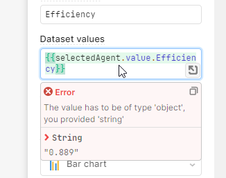
I think the problem has something to do with the error below that I'm getting. For some reason the chart doesn't like the string value - which is the correct value, but perhaps it's the wrong datatype (string instead of say float/int)? -
Screenshots:
did you intend to add an export? cause thats the link to how to do it, it doesn't help us much though heh
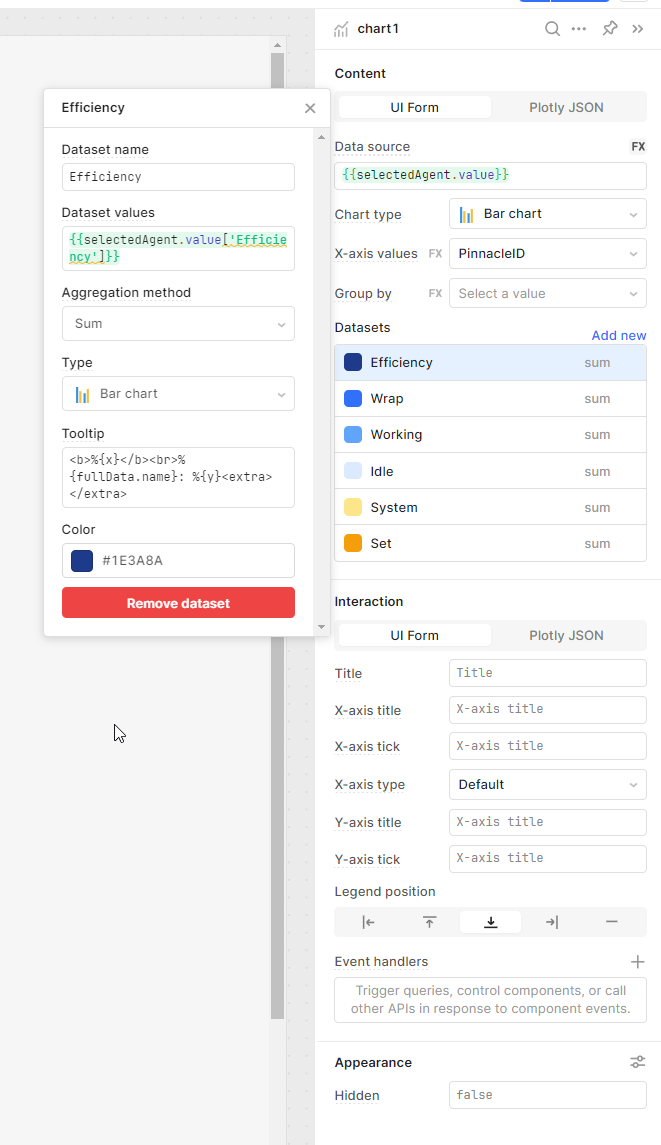
the dataset needs an object, like a json object. try using {{ selectedAgent.value }} then inside the table you'll have access to all properties of selectedAgent and you can pick which you want to use
EDIT: The screenshot above is from trying to tie the dataset to the column value. The primary dataset I'm using for the chart is the {{ selectedAgent.value }} as the object it's accessing.
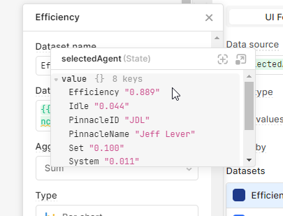
Can you paste a sample of that value here from the debug menu? Seems like it's missing or not in the shape that you're expecting. What does your state setter event for that variable look like?
This is the object connected to the chart via {{ selectedAgent.value }}
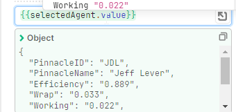
Then the chart autopopulates with this for the Efficiency value {{ selectedAgent.value['Efficiency'] }}:
Makes no sense to me unless the data type is being thrown off like I said before, because the values are there - it's just not drawing the chart...
Here's also the settings for the full chart...I don't know...it's probably some noob mistake since I don't know retool or coding in general all that well:
I think what i'm gonna have to do is create a single table, and then update that table based on the time period selected - maybe start with a default query, and if they want to repopulate the table with one of the other periods, they can click a button or something like that...
wait at that point shouldn't it be {{ item.value['Efficiency'] }} or since it's expecting an object maybe {{ {Efficiency: item.vallue['Efficiency']} }} just be careful with the spacing. it goes nuts if there are 3 }'s in a row so always put a space between the outside double brackets... ![]() while i'm throwing darts at the board
while i'm throwing darts at the board {{ {Efficiency: selectedAgent.value['Efficency']} }}
I actually think this last one has the best odds since you said you got it to work kinda once before. it def wants an object, so give it one similar to what it had? ![]() u could try using
u could try using value: instead also
I don't actually know how to make this work using the chart GUI but this JSON seems to get you where you want:
[
  {
    "name": {{variable2.value.PinnacleName}},
    "x": {{ Object.keys((({ PinnacleID, PinnacleName, ...rest }) => rest)(variable2.value))}},
    "y": {{ Object.values((({ PinnacleID, PinnacleName, ...rest }) => rest)(variable2.value))}},
    "type": "bar",
    "hovertemplate": "<b>%{x}</b><br>%{fullData.name}: %{y}<extra></extra>",
    "transforms": [
      {
        "type": "sort",
        "target": {{ Object.keys(variable2.value )}},
        "order": "ascending"
      }
    ],
    "marker": {
      "color": "#1E3A8A"
    }
  }
]
The good news is that the chart seems to parse the string floats into actual floats.
You can also change the layout a bit to fix the scale here.
"yaxis": {
    "title": {
      "text": "",
      "standoff": 6,
      "font": {
        "size": 12
      }
    },
    "type": "linear",
    "tickformat": ".3f",
    "automargin": true,
    "fixedrange": false,
    "zerolinecolor": "#DEDEDE",
    "range": [0, 1],
    "dtick": .1
  }