The "New" table doesn't... and Actions have their place possibly as a feature, but I don't see how they can or should replace always visible, identifiable, colored buttons that the user can simply click on, without constantly hovering over a row and attempting to target the minuscule Action "button".
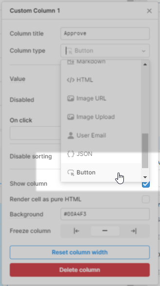
I see you can have image-type columns, but why create multiple images with different text, when you can/should just type in the text you would like on the button.
I see there is a suggested workaround by using Tag-type column and then additional css - because for some strange reason the text inside the tag is not center aligned vertically.
What I don't see is why make the user go through any of this hassle instead of just offering a button-type column with a customizable button color and text?
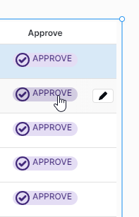
Ya that sucks. When you have been lovin something and then the improvement doesn't include access to that love. I did use the button type on occasion but personally it didn't really like it. I found it sort of clunky, big and lacking elegance. I really do like the new tables action buttons. I also think the tag column type would work as a great button. It's coloured, has text and can easily be setup with on click events.
I did end up using the tag column type, but it required quite a bit of extra fiddling with css to make it look decent, like a button - which wasn't obvious.
I can't imagine every user having to go through this process, which is too specific and prone to breaking if not done right (like in using css selectors that are too specific).
The point is to have an accessible option to have a button-like option.
You can "watch" any forum post for specific updates:
More generally, you can read through our Changelog for all updates. Retool Cloud is usually updated once a week, and self hosted is roughly every 2 weeks

 (and then on prem a couple of weeks later)