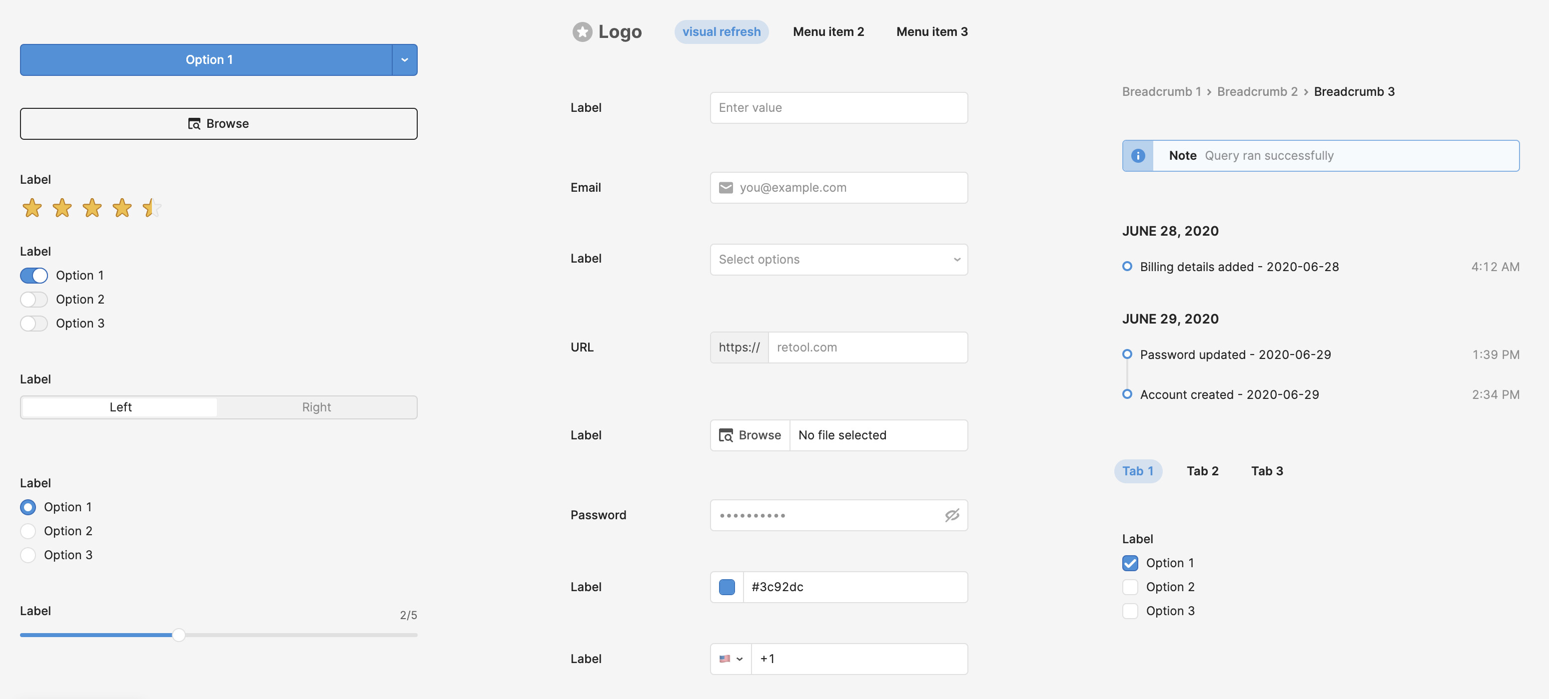
Hi all! We are excited to announce the beta launch for the visual refresh of the component library! These will mostly be small style changes, and pre-existing style overrides will still be upheld.
Below are screenshots of before/after visual refresh, but some primary changes are:
Utilizing a slightly different color palette
Changing the active and hover state appearance for buttons and inputs
Removing borders on input attachments and buttons
Fixing inconsistencies with component spacing, font weight, border radius, etc.
Tab and Navigation components have a different look now!
Please leave a comment in this thread or DM me if you’d like me to turn this feature on for your org, and feel free to leave a comment in this thread or DM me with any feedback you have (note that this is currently cloud only).