Hi Retool Community friends!
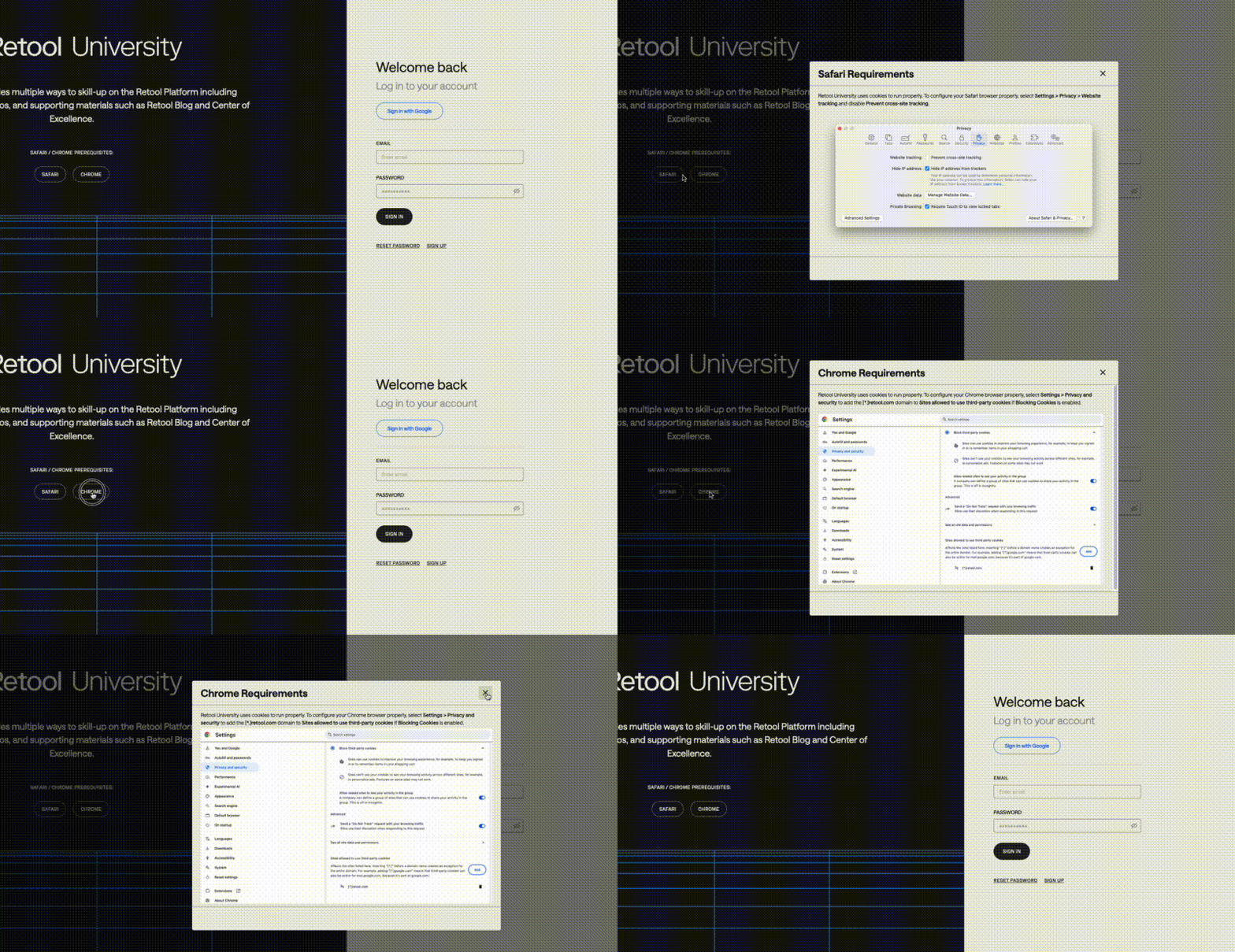
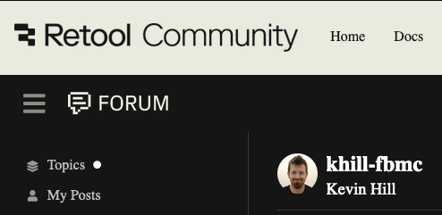
You may have noticed that the look and feel here in the UI changed as of today, September 12th, 2024! This is part of Retool’s overall new look across our public facing sites.
Retool: Reimagined
![]() Learn about Retool's new look from Justin, Head of Brand Design!
Learn about Retool's new look from Justin, Head of Brand Design! ![]()
On the Retool Community team, we particularly like this excerpt from the blog:
We are standing on a bridge between product and imagination. We are discussing explorations versus realities // expectations versus dualities.
Meet us there? We tend to think that things are more (magical)(possible)(tangible) than they seem.
Every day here in the community, we come together to bridge imagination and reality with Retool -- making magic by sharing our clever implementations and creating “aha” learning moments. We actively make imagined use cases feel more possible, and building blocks feel more tangible for one another.
Thanks for being part of this collective journey every single day! Now we get to connect with each other within a cool new frontend as Retool’s brand moves into the future ![]()
Explore the new look on our Community Forum
If you’d like, here on community.retool.com you can customize your experience by choosing one of the two Themes containing the new brand color palette, font, and logo:
Light(default) orDark.
How? Go to your Profile at the top right , click the person icon ![]() , then click Preferences:
, then click Preferences:
Click Interface, then toggle Light or Dark to explore which Theme you prefer to use going forward!
![]() Feedback on a specific aspect of the new frontend? Let us know in Feature Requests or Discussion. Thanks!
Feedback on a specific aspect of the new frontend? Let us know in Feature Requests or Discussion. Thanks!
Special shoutout to @jdreeves @Paulo @Tess @AbbeyHernandez who were instrumental in making our new Community Forum look a reality. A lot of work by many team members went into Retool's new look. These folks took it the crucial final mile for our community. Thank you!
Onward! ![]()
![]()
-- Your friendly neighborhood Retool Community team ![]()
![]()

