enable for battlecattledevelopment.retool.com please
@BattleCattleDevelopment done!
Don’t forget about s3 upload button style ![]()
Can you please enable it for ivanma.retool.com/
@agaitan026 we shipped a fix for that! Should show in Cloud in a week or so ![]()
@ivanma done!
4 posts were split to a new topic: Scroll bar clips longer lines of text - related to Visual Refresh?
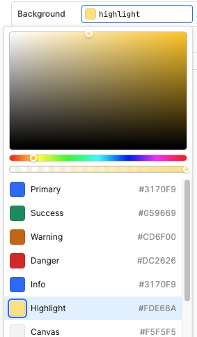
We like the look of the the new visual refresh. Only thing i would adjust right now is on the color pallet. Before there was the color #f8e4c4 which got replaced by #FDE68A
I agree the retool team that the new color code matches better with the name "Highlight". But the old color code is a very common one i used in many apps. WIth the color update being drastically different for the "Highlight", all my apps that used it look super strange with new color. So i am going in an changing them all. Maybe not as many people used the old highlight color much but i did and would love for it to be a standard color on the quick select pallet.

@PadenM thanks for the input! That makes sense and the change in color palette will unfortunately impact pre-existing apps. One simple way to change "Highlight" color is to change the Organization Themes. You can also use App Themes (here's a link), which is a new feature that recently launched on Cloud!
Congrats @brenna.chen on the official launch of the Visual Refresh out of beta! (see announcement post) And thank you all for your feedback and interest here in the past several weeks!
I went ahead and split out any open questions from this Beta thread into separate topics. For other questions or feedback folks have about the visual refresh, let's post new topics in the App Building or Feature Requests category ![]()