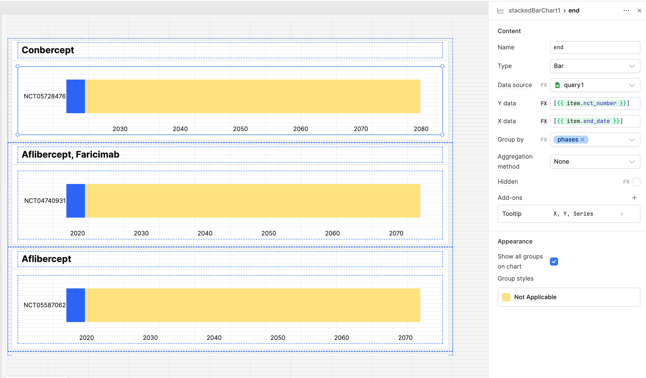
I am trying to create a list view that uses a large data set. In each list container I am tring to plot a bar chart using just the data entry in question. So only one bar is plotted. This is all working as expected. I would then like to group the bar by a specific data category to color code it. However, each bar in each separate container is being grouped one only as each bar is viewed to have one category only. See image. Any ideas how I can change this to include all the groups from the full data set?
Thanks for your reply @SalmanMaqbool !
I have a dataset of 425 entries with start and end dates.
I would like to plot all in a timeline chart component but the options for timescale are restrictive for me. I would like to be able to change that to 10 years but the options are only year, month, and day.
I tried also to plot start and end dates as a stacked bar chart which works fine but it plots all the 425 entries all at once. I would like to be able to fix the height of this chart so I can vertically scroll down like a table - but can't work out how to do that.
So that leaves me with the list view option and individual charts. I tried your suggestion and the colors all default to the same one.
I have to see your data and understand it fully to resolve the issue. Can we schedule a meeting using Calendly - Salman Maqbool
Hi @Babs1,
Were you able to resolve this issue with the help of @SalmanMaqbool?
Grouping might not be the best method for styling, since grouping would apply to all bars in a single chart, but you have one bar per chart per container.
If you want to re-order the containers to group them, let me know as that would be one solution.
To handle the color coding of the bars in each chart, you could go into the Appearance tab in the inspector and use some custom Javascript to chose the color based on the data you are using to decide the groups (phases).
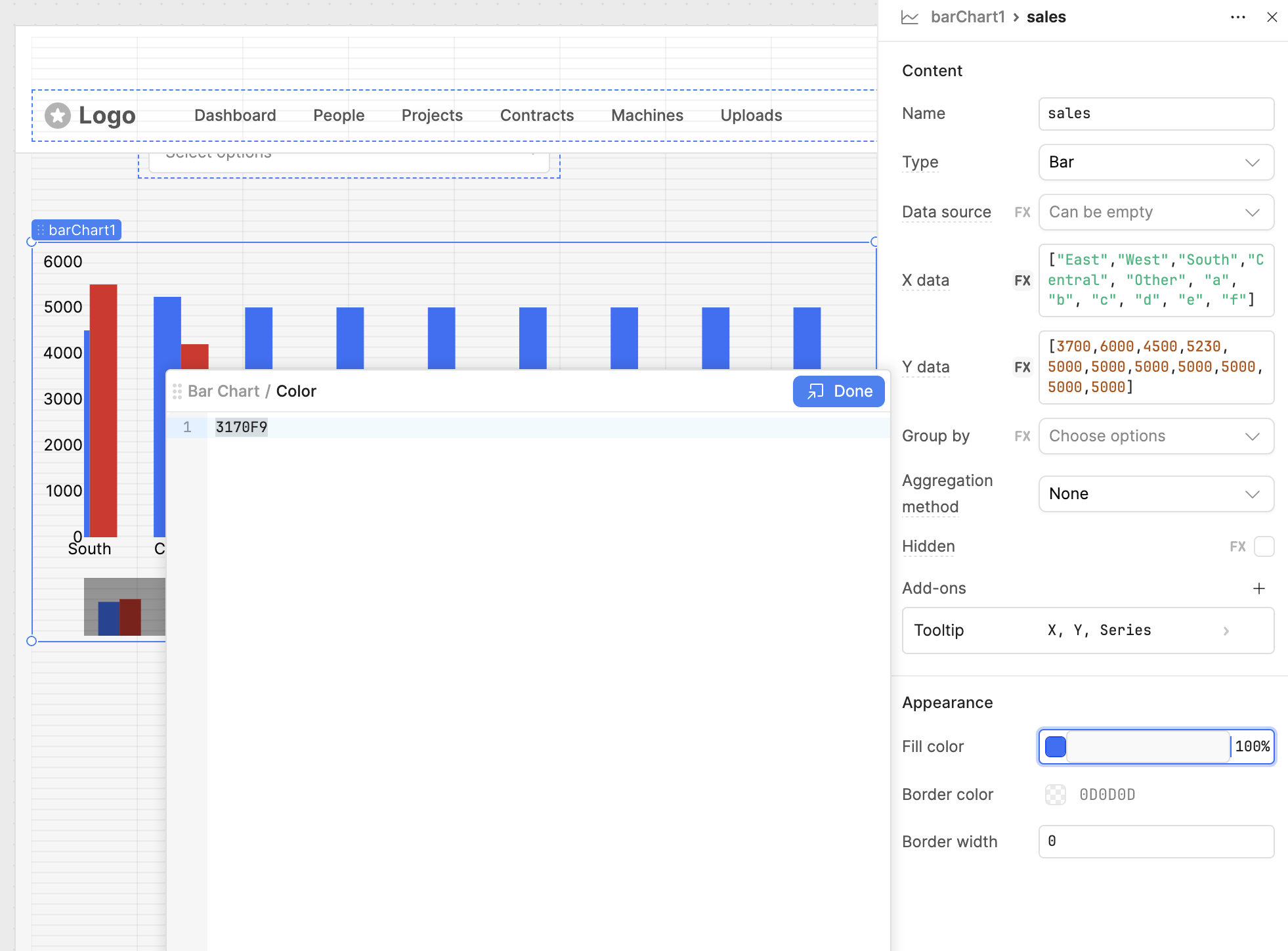
Inside this editor you can use {{}} to evaluate javascript. One idea could be to use an Variable that stores a JSON object that maps over phases to colors. So you would key into the object with the charts group, and it would evaluate to the value that is the color the bar should be.
Thanks @Jack_T for your suggestion! That worked perfectly!
1 Like