-
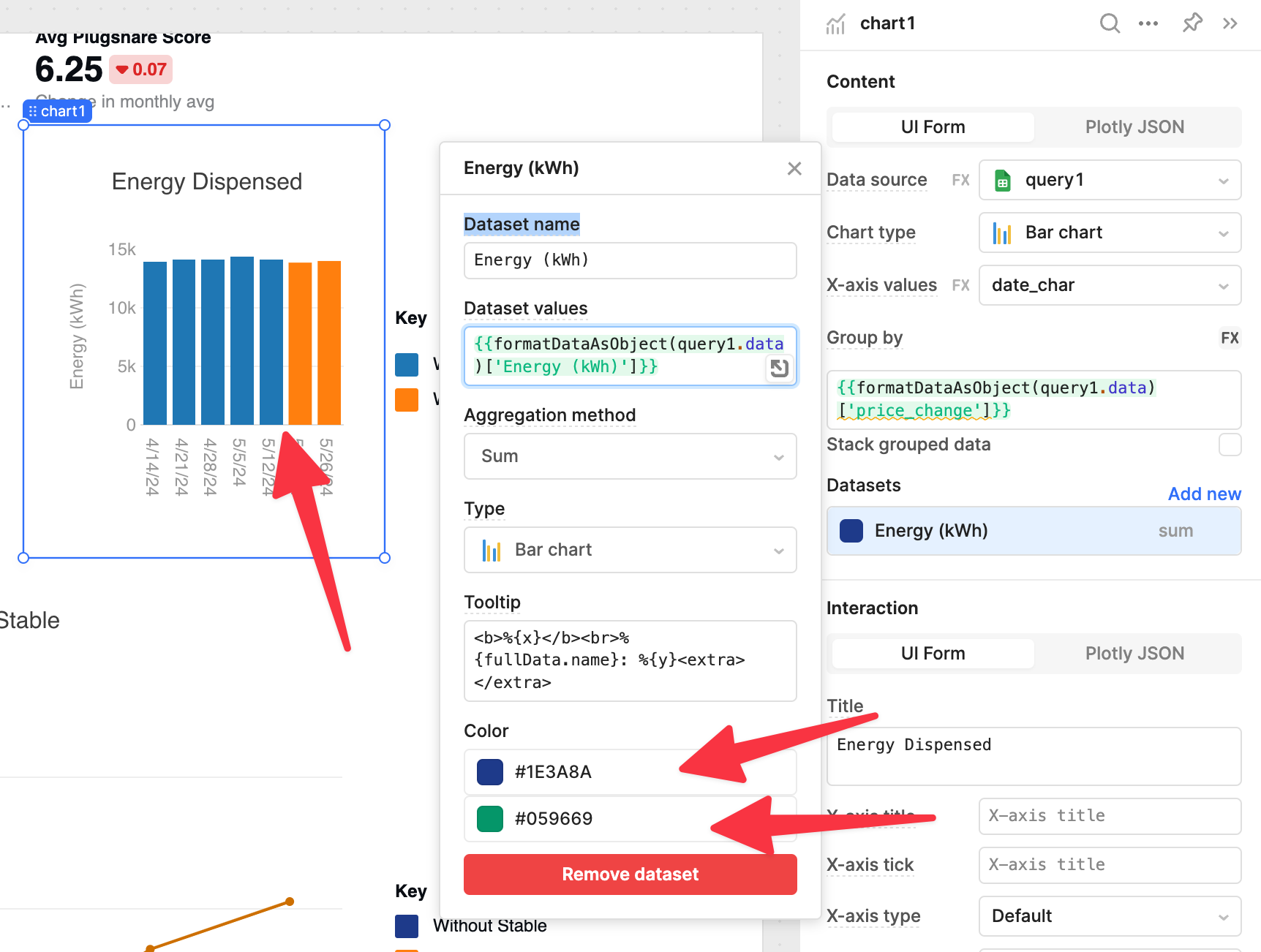
Goal: Grouped bar charts where the blue and orange color below can be customized
-
Steps: Created a grouped bar chart, modified the color using the UI editor AND the Plotly JSON. In both cases it uses this random blue/orange color and not the colors selected
-
Screenshots attached
3 Likes
Hi @rohan1, welcome to the forum! ![]()
I am unable to reproduce this bug. When I update the colors for the Datasets, they update in real time:
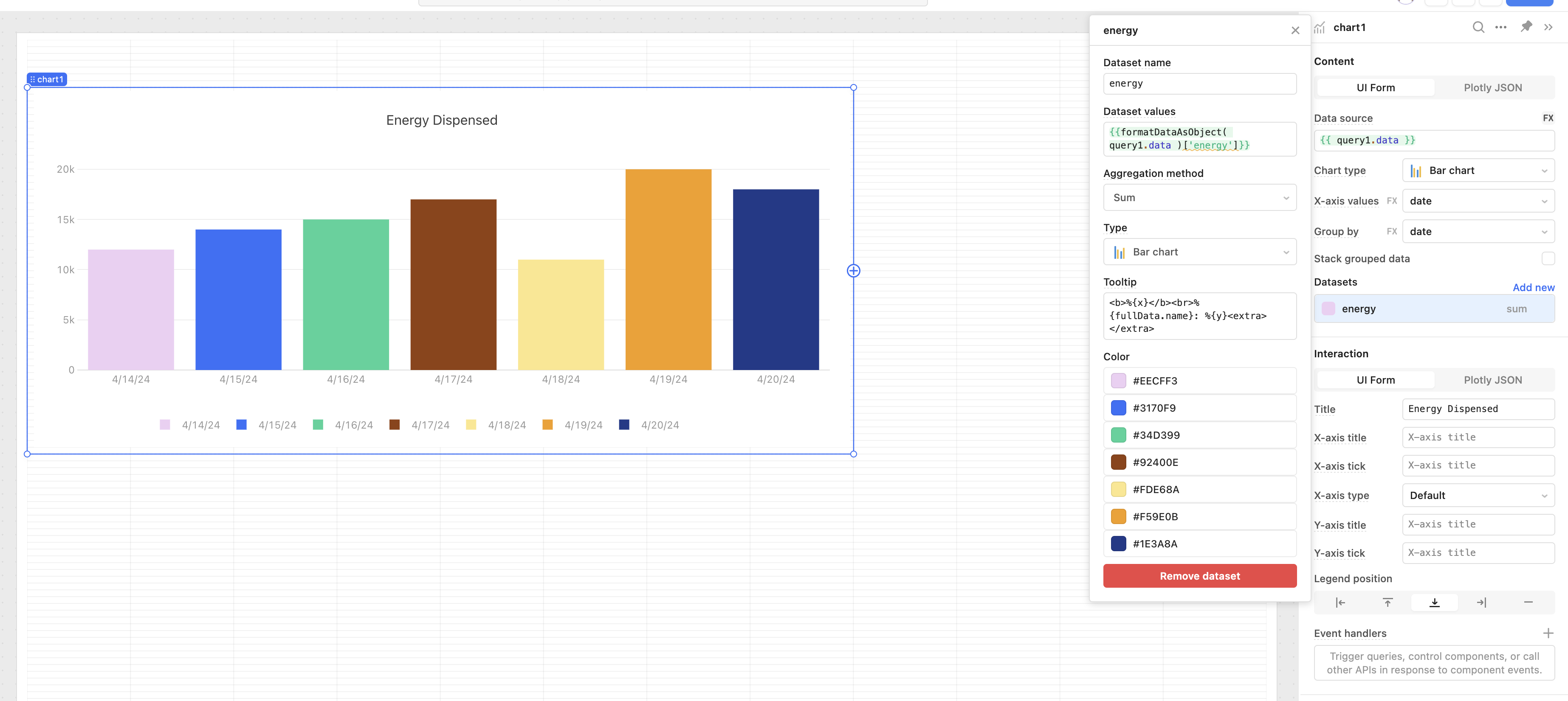
Are you still having this issue?
hmm I’m still having this bug - is it possible to give you access to edit directly?
Try exporting your app and attaching it to a comment here. Your data won't be included so it's safe to share. If you could add the schema of the table you are querying to get this data it would help us test with similar data. ![]()
"Sorry new users cannot attach attachments"
Can I email or DM you?
Please email it to me: paulobocanegra@ retool .com
After some trial and error, I was able to figure it out:
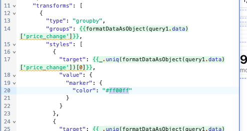
The styles property within the groupby transform specifies the colors for each group. For some reason that potentially Plotly may be able to explain to us, changing the color property there won't change the color with our current settings:
I tried with no success. ![]()
The good news is that we can set the color property for the bars (marker) at a higher scope using ternary to evaluate if there is a price change. In English, we can add a marker key at the top level of the object:
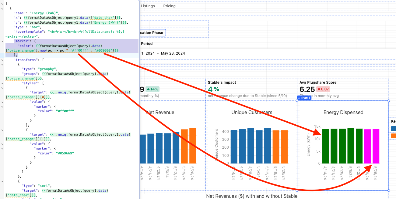
Here is the marker key and value for these colors:
 "marker": {
      "color": {{formatDataAsObject(query1.data)['price_change'].map(pc => pc ? '#ff00ff' : '#008000')}}
    },
Just add it before the transforms key and it should work. ![]()
Here is a tool to get the hex of any color: https://www.color-hex.com/
1 Like