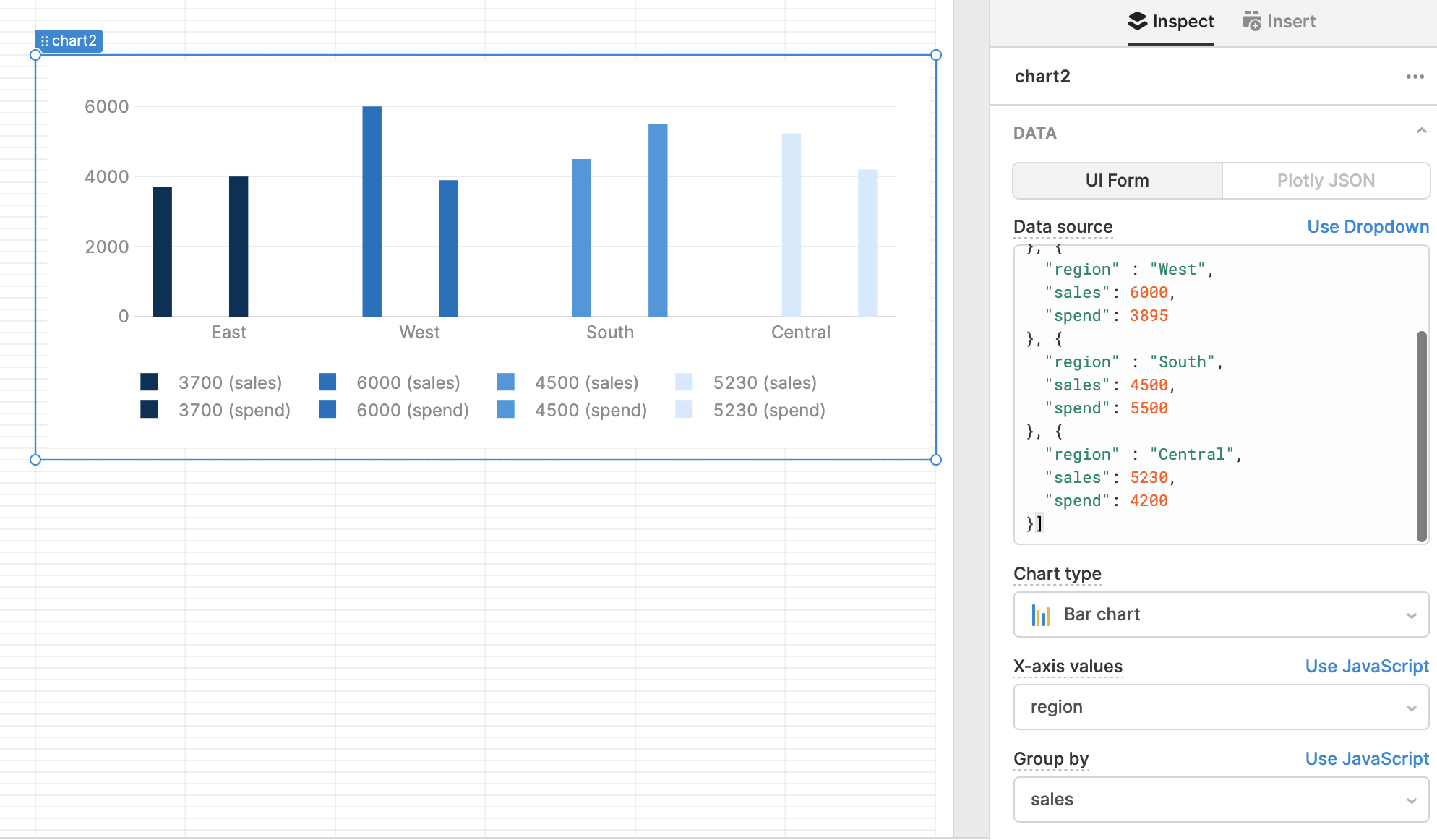
It seems that when using Plotly, if you use the 'group by' functionality to split out data, it's hard to style those data groups differently from each other.
A workaround for this would be to avoid using 'group by' by splitting up my data into groups beforehand, and then using a custom Plotly data JSON to render each one separately.
Any tips on how to do this data transformation in Retool? Ideally I'd do something like {{myQuery.data.filter(r => r.groupField == 'targetGroup').fieldToPlot}}.