I'd like to ask for some help displaying grouped data with the chart component / plotly.
The starting point:
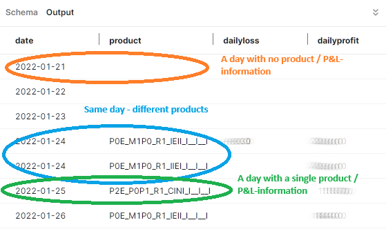
I have a table containing P&L data on a daily basis for various products. For each and every day there is at least one entry - either one with no product and P&L information, one with a single product and P&L-information or a larger number of products for the same day with P&L-information as shown in the screenshot below:
The expected result is bar-chart with the dates on the x-axis, the profits stacked on the y-axis upwards and the losses on the y-axis stacked downwards colored by product:
What I did/achieved so far:
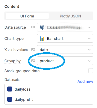
I used the charting-component of retool to create a bar-chart and grouping functionality there to group the data:
In the layout-section of the plotly-configuration I added "barmode": "relative" to ensure the same zero-line is used for all bars and the profits are stacked above this line, the losses below that line.
To reflect the grouping of products in the data-section of the plotly-configuration, retool auto-generates the structure below - for every group (product) determined it creates its own set of markers and color for it:
The function stringToColor is written by me and creates a unique color for the product provided.
Help requested:
I have two topics I'd like to resolve and I did not succeed up to now by googling/trying by myself:
Grouping-functionality is deprecated
Grouping-functionality is deprecated because - based on the plotly website - they want to focus on displaying data, not manipulating it. So my first question is: are there any ideas how I can achieve the chart displayed above without using the group-functionality of the charting-component?
Adding coloring-functionality for new products
For the time being I added the code for generating the color of the bars manually on the products known by now. How can I re-generate the code displayed above to cover new products coming up? As this is being a hard-coded information in the data-section of the plotly configuration I assume I need to generate the data-section dynamically... or is there another, possibly easier way?
I'd be happy for any hints/ideas to resolve the issues mentioned... thank you!
Whenever I have a chart question, I always start with Quickly implementing PlotlyJS examples with Chart as a solid reference. The key is passing “data” and ”layout” generated from a JS Query to the chart using the “Plotly JSON” instead of the “UI Form” option in the chart.
Using this approach, you can group your data by product for each period either directly in the (new) JS Query “data” object or passing results of a SQL Query to the JS Query “data” object. This way, you control the grouping of the data before sending it to be charted.
You regarding color, do you have a defined pattern for adding new colors for new products? If this information were in a table in a DB somewhere, you could include a join to that table when you are getting your grouped product data and add the “color” field to the results. You should then be able to pull an array of colors that aligns to the product groups from the SQL results to use as the color definition in your JS Query.
Also note that you will want to put a trigger somewhere to fire the new JS Query when your data updates so that the chart updates as well.
It may take some trial and error to pass the query results into the JS Query in the way you want as well as to set the various layout variables to process them into the chart, but once you get it working, it is pretty powerful and flexible.
Thank you for the fast reply @jg80!
IC - so generating the sections dynamically is obviously the best option...
Do you possibly also have a suggestion for the first point mentioned (grouping functionality is deprecated) - this is the more critical part, as plotly won't offer this functionality in future releases and I wonder how to setup data to make plotly deliver the same graph...
My preferred approach is to write a separate SQL query that groups the data into the series I want, and then to pass those series into the JS query that I use to control the plot. Then I don’t need the chart to do any grouping, just display the series I’ve sent it per the format I define.
Point taken as I prefer to this as well but in this special case, the data from the SQL-query is already grouped on date and product - the issue is how to display the "double-grouped" data... maybe you have an idea for this as well?
Not sure exactly what you mean, as your table in the original post has multiple lines of data for some products. I assumed that you were passing this tables data to the chart, and summing those lines in the chart.
Do you have another query that is summing the dailyprofit and dailyloss fields for each product and day?
The data provided is already summed up with the SQL-query (so the profit-column and the loss-column are already summed up by product and day by the SQL-query).
The grouping-functionality of plotly on the product is needed to avoid having the data displayed as a single profit and a single loss bar per day loosing the information on the product (so: how much of the profit and how much of the loss is coming from which product) - so no "calculation" or different grouping I could do upfront with an SQL-statement.
Or do you mean the data could be structured differently to gain the same graphical result? If yes - would you have a hint for me?
Got it - can you sum the profit and losses fields to get a net profit(loss) value and just plot that?
If you need to see both the loss and profit components of net by product, then it gets a bit trickier. One approach would be to start with a query that concatenates product name with “profit” and get the daily dailyprofit values (default to 0 if null) naming that column “series_val” and union with a second query that concatenates product name with “loss” and get the daily dailyloss values (default to 0 if null). Then you plot the “series_val” field for all of the series. There will be twice as many, but as long as you color the products consistently, it should work.
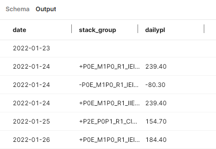
@jg80 I followed up on your suggestion today and created a query delivering the following result (it should match with your suggestion) - the first column has the date, the second one a plus for a positive P&L and a minus for negative P&L concatenated by the product name (called stack_group) and finally a column with the P&L:
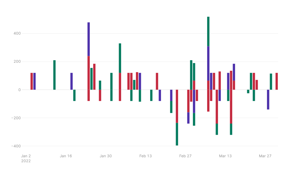
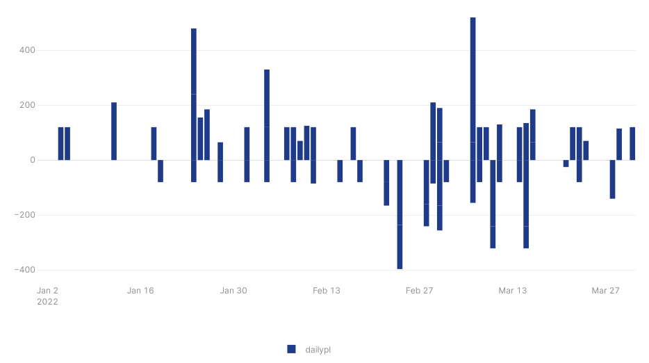
Drawing this without any grouping functionality of plotly gives me the bar chart below:
Unfortunately this misses once again the detail showing which of the products causes which parts of the P&L...
Isn't the only way to resolve this having the products as columns? I know this is impossible in SQL (columns cannot be determined at runtime) but maybe there is a way around using a transformer? I would be very thankful for any idea!
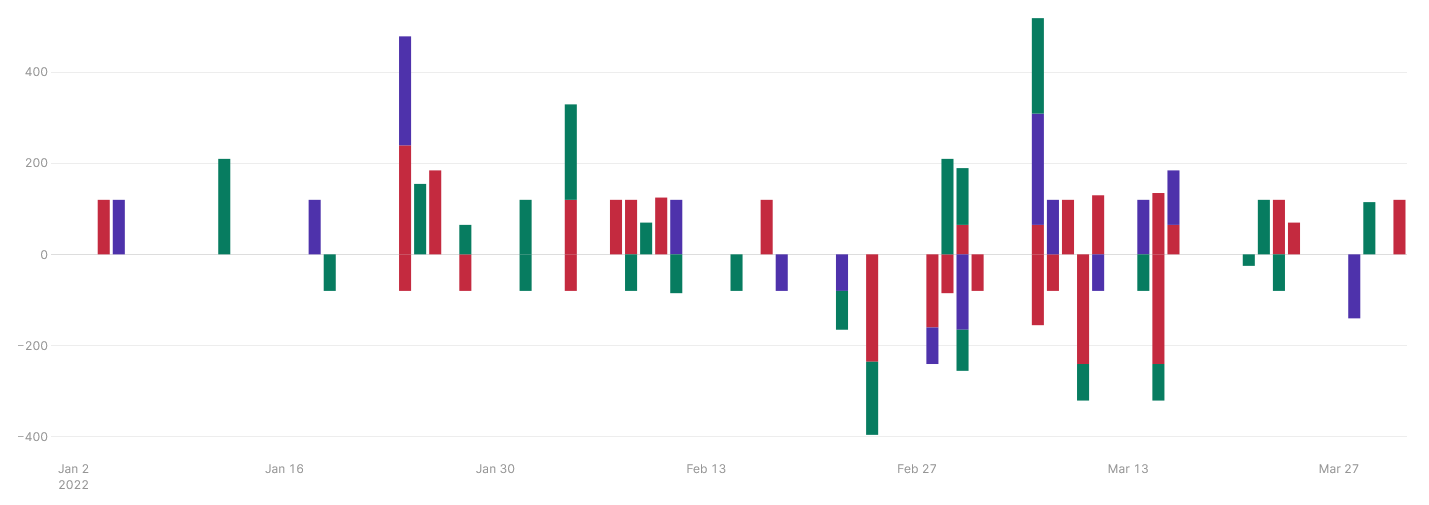
Finally, I decided to create a JS Query creating the data and layout-section for the plotly-chart as described in the first hint. The data is arranged as suggested by @jg80 - thank you!
This gives the result below by the JS Query: