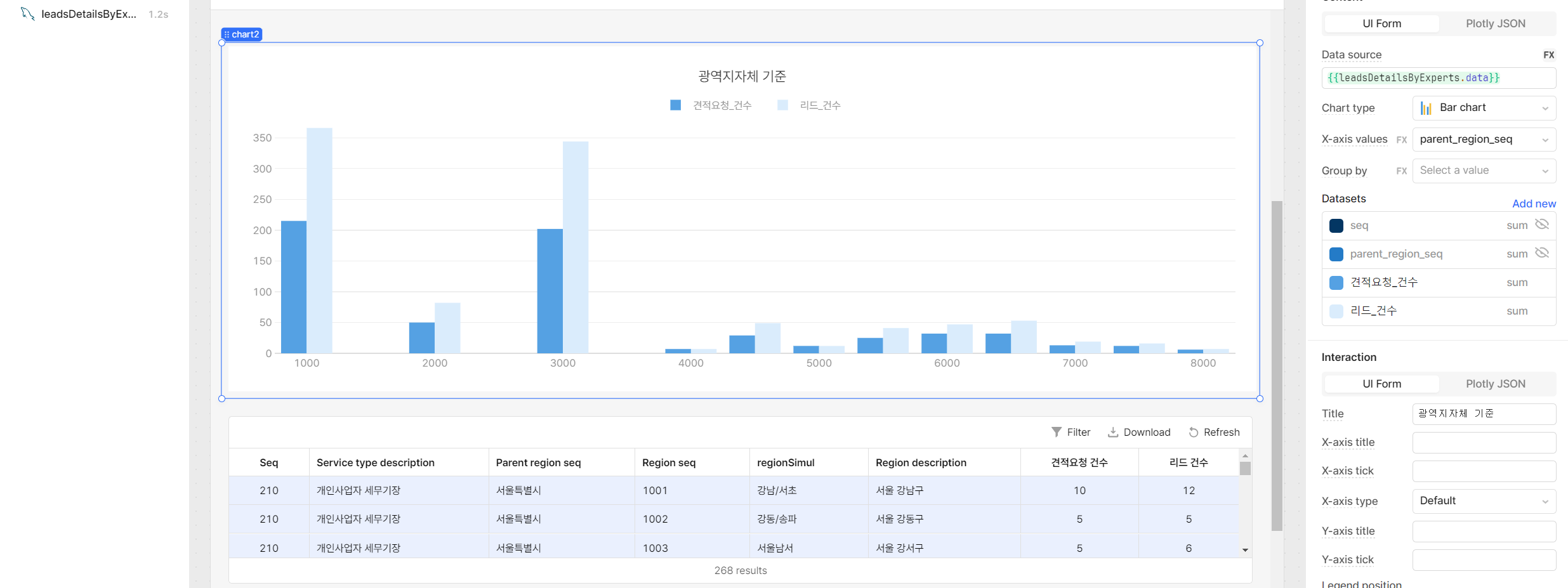
I want to make the chart based on "regionSimul" of X-axis which I created in the below table1.
To do that, I tried both {{leadsDetailsByExperts.data}} and {{table1.data}} for the chart, but "regionSimul" column does not showed up and therfore I couldn't make regionSimul of X-axis chart.
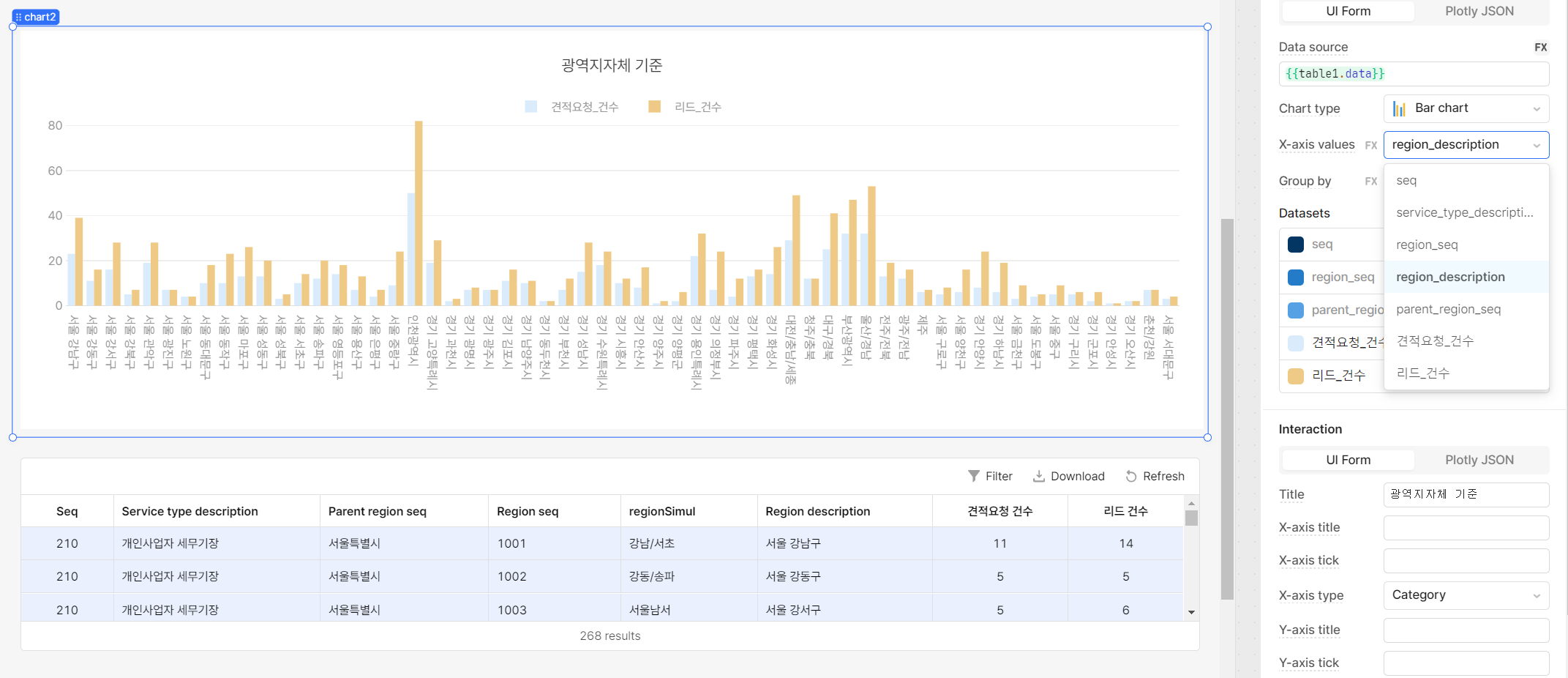
The best solution for me is to create chart without unnecessary table1, but the chart with table works for me as well
Thanks,
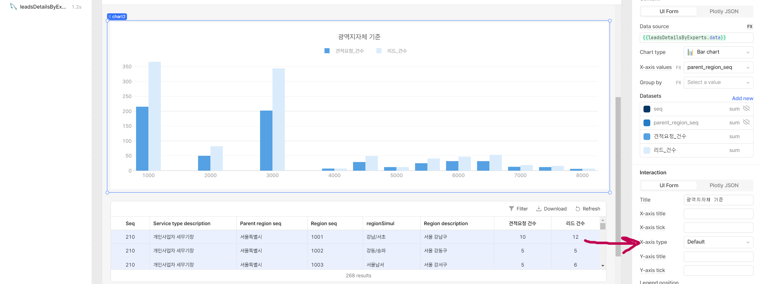
It doesn't work. As you seen below screenshot, regionSimul that is one of column of the table do not show up in the X-axis values on the right side.
Any idea on that to to solve the issue?
Is the column regionSimul a generated/custom column at all? Custom columns in the table aren't visible in the .data property as they're for presentation only. What you may want to do is generate that property in your dataset or a transformer or some other method and use that as the source of your chart data.
Would you be able to share any link for me to generate that property the way you mentioned? I couldn't find the appropriate document that I study on how to do that.
Thanks in advance,
a transformer on the query that gets the data would probably be the best option - can you share how that regionSimul column is defined? You should be able to use that logic in your transformer to make the column and its data available to both the table and chart (and any other components that need it)