I could probably help you with using the Chart component and Plotly.
I am currently heavily using it and learning a lot about it. I also have tons of experience with charting, since I used to maintain Lavacharts 
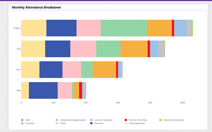
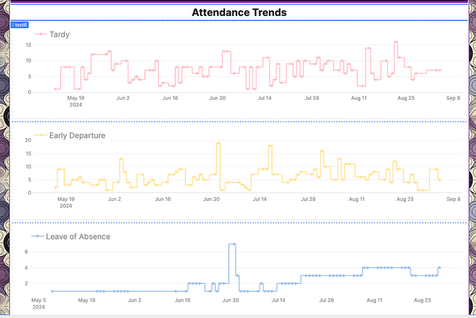
Here are some charts I've made so far
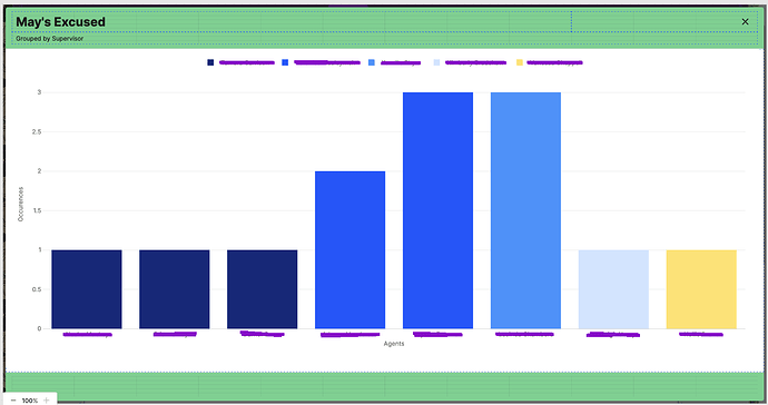
where each piece of the stack can be clicked to open a modal with another chart showing the breakdown
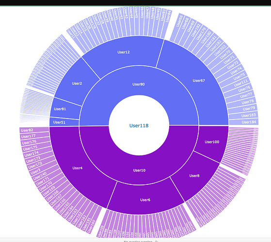
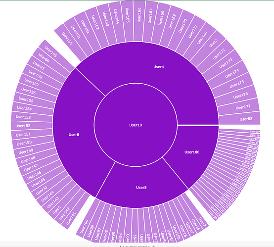
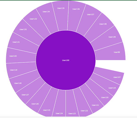
Or a sunburst chart showing the heirarchy of our manager => supervisor => agent structure.
each section can be clicked to zoom in
further down
One more
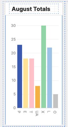
This is a simple chart, but I was experimenting with not using the UI and providing all the details from a transformer instead.

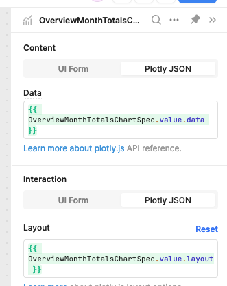
Config:

Transformer:
const styles = _.map({{ AttendanceCodeInfo.data.result }}, (codeDef) => {
  return {
    target: codeDef.code,
    value: {
      marker: {
        color: codeDef.bg_color,
      },
    },
  };
});

const codes = {{ AttendanceByMonth.data.code }};
const data = [
  {
    name: "Code",
    x: codes,
    y: codes,
    type: "bar",
    hovertemplate: "<b>%{x}</b><br>%{fullData.name}: %{y}<extra></extra>",
    transforms: [
      {
        type: "groupby",
        groups: codes,
        styles: styles,
      },
      {
        type: "sort",
        target: codes,
        order: "ascending",
      },
      {
        type: "aggregate",
        groups: codes,
        aggregations: [
          {
            target: "y",
            func: "count",
            enabled: true,
          },
        ],
      },
    ],
  },
];

const layout = {
  title: {
    text: "",
    font: {
      color: "#3D3D3D",
      size: 16,
    },
  },
  font: {
    family: "var(--default-font, var(--sans-serif))",
    color: "#979797",
  },
  showlegend: false,
  legend: {
    xanchor: "center",
    x: 0.45,
    y: -0.2,
    orientation: "h",
  },
  margin: {
    l: 0,
    r: 0,
    t: 20,
    b: 0,
    pad: 2,
  },
  hovermode: "closest",
  hoverlabel: {
    bgcolor: "#000",
    bordercolor: "#000",
    font: {
      color: "#fff",
      family: "var(--default-font, var(--sans-serif))",
      size: 12,
    },
  },
  clickmode: "select+event",
  dragmode: "select",
  xaxis: {
    title: {
      text: "",
      standoff: 6,
      font: {
        size: 12,
      },
    },
    type: "category",
    tickformat: "",
    automargin: true,
    fixedrange: true,
    gridcolor: "#fff",
    zerolinecolor: "#fff",
  },
  yaxis: {
    title: {
      text: "",
      standoff: 6,
      font: {
        size: 12,
      },
    },
    type: "linear",
    tickformat: "",
    automargin: true,
    fixedrange: true,
    zerolinecolor: "#DEDEDE",
  },
};

return { data, layout };
