hello everyone!
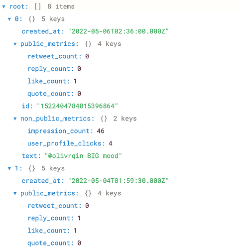
i'm currently trying to create a chart using nested JSON data. my JSON looks like this:
i would like to create a time-series plot with 'created_at' as my x-axis and 'impression_count' as my y-axis. however, i cannot get 'impression_count' to properly populate my chart.
I've successfully populated a table with this data using a custom column for 'impression_count' -- I used {{ currentRow.non_public_metrics.impression_count }}, but i can't achieve the same result in my chart.
could someone guide me through this process? any and all help is appreciated 
Hi @jordanp thanks for sharing your question here. Have you gone through our docs on charts? Happy to help if you have further questions.
hi @alina.retool -- thank you for your quick response!
i have read through the docs on charts, but i still haven't been able to find the info I'm looking for. I'm sure the answer is obvious and I'll be kicking myself later, but any guidance here would be greatly appreciated.
So, there are two parts to our chart component -- the Data and Layout sections -- that control how your chart renders. If you are having trouble configuring Data or Layout using the "UI Form" mode, you can switch to the "Plotly JSON" mode to view or edit the JSON directly. This can often make it easier to understand and debug what is happening. The JSON for the Data and Layout corresponds to the data and layout variables you see in the Plotly JS documentation. (For example, see some example Plotly JS data and layout configurations here: Bar charts in JavaScript)
Under Data, you’d define your x and y-axis values. For the y-axis, you might be referencing your 'impression_count' as something like {{ query_name.data.map(item => item['non_public_metrics']['impression_count'] }}
Hope this is helpful?
Very helpful!
The part that's new to me here is the .map(item => item) function -- Does Retool have documentation on how this works? It's exactly what I was looking for, but I couldn't seem to find it in the docs.
![]()
