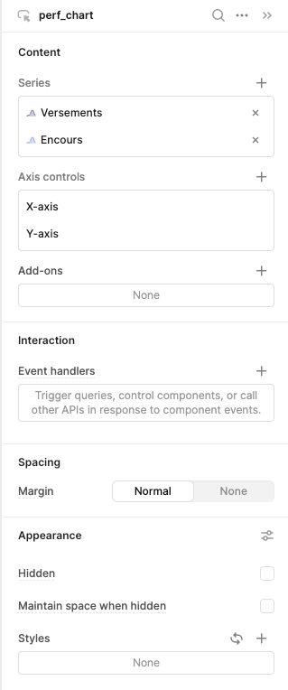
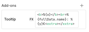
For each series, I was able to customize (a bit) the tooltip when hovering the line: (basically adding € at the end of the value)
The data model is pretty simple, that's an array in which each row has:
a date
an amount, lets call it A
another amount which we call B
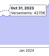
But when hovering the chart, I can't find out how to create a tooltip that could summarize A and B.
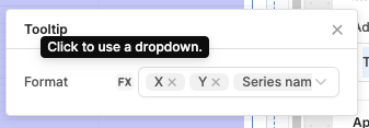
Tooltip will only display the series that's hovered.
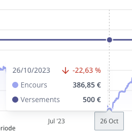
My goal is to achieve something similar to this (data wise forget about UI), where the tooltip shows A and B for the same date:
I tried grouping series, played around, but did not find any workaround.
I haven't found a way to do this with the plotly formatting that you're using, but It looks like you can enable "Use array" for the tooltip and pass in an array of strings that you want to show for each data point. You could use Javascript to calculate the data you want to show in each string