I am trying to create a line chart which has one line for the current period eg. 01/12/2024 - 08/12/2024 and another line which displays the previous period's data eg. 01/11/2024 - 08/11/2024. I can get the lines to display with my comparison query pulling a display date which matches the original lines dates (so the lines can be compared to each other on the chart) but I also pull through the original date too which I want to use on the tooltip when you hover over each datapoint on the previous period line.
I have checked the tooltip option on the chart control but I can't see where I can add the values for original date rather than the display date which is what is on the x axis.
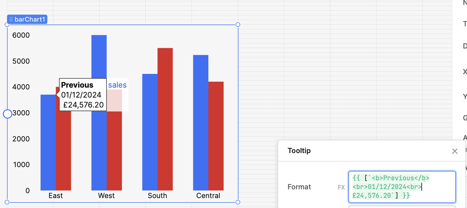
I've attached an image which shows what displays on the tooltip when I hover over the previous period line, but I need it to display the date on there from the month before.
Thanks for reaching out! I would recommend trying the "array" option on the tooltip settings so that you can customize the value with JS Hope that works for you!
Thanks for coming back to me. I've tested this and it looks like I can get it working, the only thing I can't work out is how I would have multiple lines on the tooltip, for example I want it to say:
Previous
01/12/2024
£24,576.20
With each being on a separate line, is this possible?
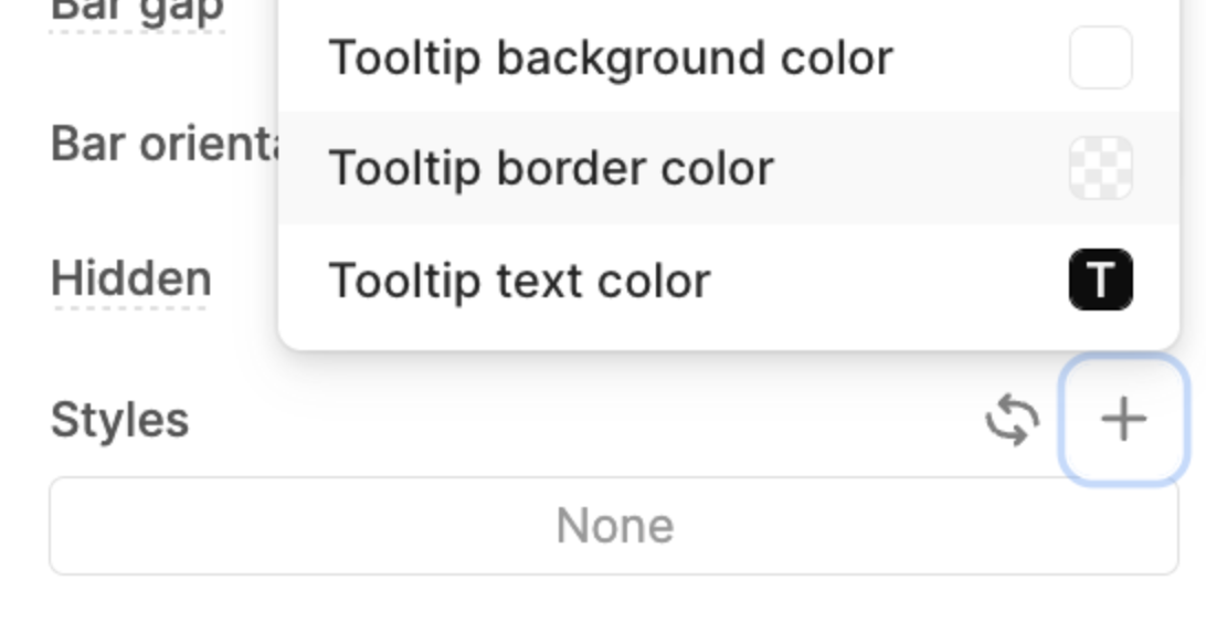
And you can add inline css to your tooltip arrays. Let us know if you have a style feature request or aren't able to set a certain style with these options