Chart Legacy Component Issue

  1. My goal: Using Chart legacy component. Computed data for plotly json. The bar chart graph is showing correctly on few systems only.

  2. Issue:For some systems it is behaving strangely.

  3. Steps I've taken to troubleshoot: Cleared cache on other system, tried different browsers. No progress.

Any compatibility issue with browser? Anyone faced it before?

Hey @utkarshwork!
Since your x-axis is dates, the issue is probably because:

  • The dates might have different formats or include times, so Plotly treats them as different and shows multiple bars.
  • The data isn’t grouped by date and aggregated by system yet, so each record shows up as its own bar.

If you're passing raw records without grouping and aggregating (like summing or counting), Plotly will render a bar for each.

Try formatting your dates to just β€œYYYY-MM-DD” and group your data by date, then aggregate (e.g., sum or count) the values before plotting. You can do aggregation in your query or inside the component (see the screenshot).

Hope that helps! Feel free to share a sample dataset if you want me to take a look.

1 Like

Hello @Spacebar
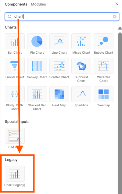
Using Chart legacy component as simple chart component is not feasible for the view.

Dataset: Let's say transformer is returning an array of objects:
[
yellow: {
"labels": [Jan 2025, ......],
"values ":[43, .......]
},
green: {
"labels": [Jan 2025, ......],
"values ":[3, .......]
},
blue: {
"labels": [Jan 2025, ......],
"values ":[0, .......]
},
pink: {
"labels": [Jan 2025, ......],
"values ":[91, .......]
}
]

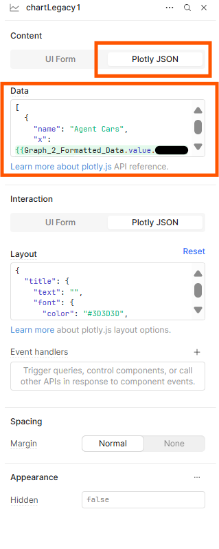
And in the component's inspector for "Data", using :

[
{
"name": "blue",
"x": {{transformer.value.blue.labels}},
"y": {{ Object.values(transformer.value?.blue.values ) }},
"type": "bar",
"hovertemplate": "%{x}
%{fullData.name}: %{y}",
"marker": {
"color": "#7DCFE3"
},
"text": {{ Object.values(transformer.value?.blue.values ) }},
"textposition": "outside",
"textfont":{
"size":12,
"color": "black"
}
},
{
"name": "red",
"x": {{transformer.value.red.labels}},
"y": {{ Object.values(transformer.value?.red.values ) }},
"type": "bar",
...
},
{
"name": "yellow",
"x": {{transformer.value.yellow.labels}},
"y": {{ Object.values(transformer.value?.yellow.values ) }},
"type": "bar",
...
},
{
"name": "pink",
"x": {{transformer.value.pink.labels}},
"y": {{ Object.values(transformer.value?.pink.values ) }},
"type": "bar",
...
}
]

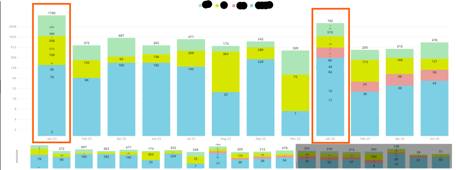
This chart graph is not rendering correctly on few systems as mentioned in the question.

Hi @utkarshwork, could you say more about what systems the bar chart isn't working for? Are they using different operating systems, different browsers, maybe different processors (ex: apple m1 vs apple intel)? Or by different systems do you mean different data sets? The two charts that you've shown are extremely different.

Also, for this data, have you tried using just a regular bar chart instead of a stacked bar chart? Since you're using a logarithmic scale it would be a lot easier to compare the different series of data if they are side by side. It also might fix some of the issues you're seeing.

1 Like