@utkarshwork,
I can try to help you fix your bar chart.
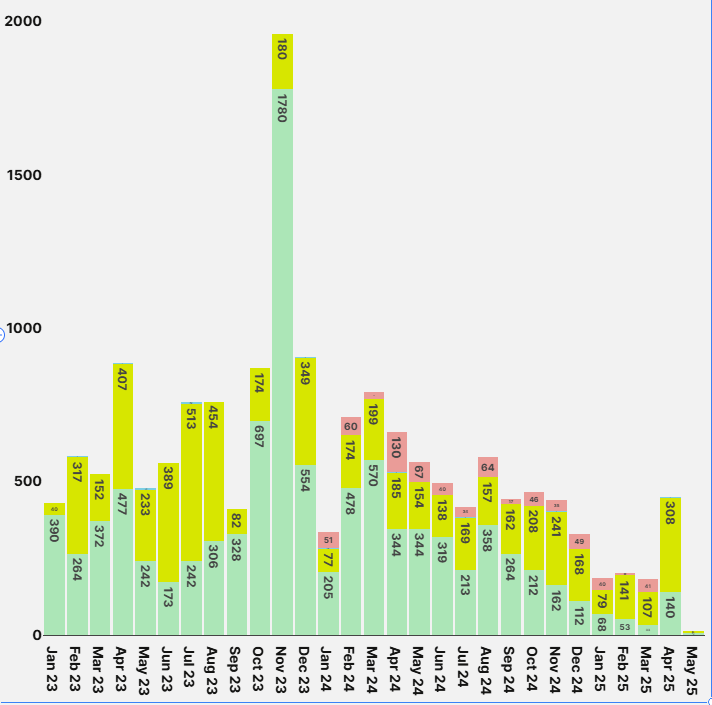
You can customize your y-axis ticks if you use the Ploty JSON chart component instead of the bar chart component. My example uses tick values of 1, 10, 100, 1000, and 5000. You can use a logarithmic scale for the y-axis layout so that you can see the smaller values better. With regard to the x-axis, you can put your ploty chart inside a container and then add custom css. You will need to find the classnames of the body and the container itself by inspecting the elements on your dev tools and then apply a wide width to the body, and then set the overflow on the container to scroll:
Here is a video of what mine looks like:
I am also attaching the exported json file for my app in case you want to see how to enter the ploty data and layout. You can download this file and then re-create my app on your own instance like this:
ploty json bar chart.json (14.4 KB)
1 Like
@utkarshwork,
Did my suggestions work for you?
1 Like
Let us know if you need any additional assistance!
1 Like