Chart adds time to date

  • Goal: Create chart with active users by day

  • Steps:

    1. Create SQL query to generate table of date strings and their corresponding active user counts.
    1. Put into line chart
  • Details:
    Trying to get a line chart of active users by day. I've already prepared the data using SQL:
    image

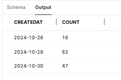
But when I graph it, the graph is adding times on and in-between the dates:
image

Hi @Topps42,

You can solve this by toggling on "Plotly JSON" in the Interaction section towards the bottom of the right panel. There, you can add any custom Plotly JS attributes.

Here's some examples:

  1. If you want the label to show up for every single day, regardless of if there is data for that day:

2. If you only want it to show up for the x axis values: