I have a retool table the main data source is from a mysql query that returns 2 colums calls per hour and time.
SELECT COUNT(*) as CallsPerHour, LEFT(timestart, 13) as Time FROM data_table WHERE STR_TO_DATE(timestamp, "%Y-%m-%d") = CURDATE() and tono = 'Ext.8000' and fromno LIKE '0%' GROUP BY LEFT(timestart, 13)
So this will give something like
CallsPerHour `| Time
1 | 2023-03-24 08
40 | 2023-03-24 09
50 | 2023-03-24 10
etc
This works perfectly but I am trying to add in a 2nd data set that also has the same 2 columns but for unanswered calls I have the query for this working fine but the issue I have is this.
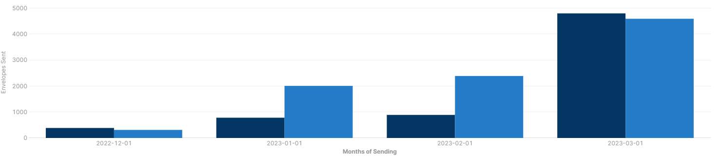
If the unanswered query has no unanswered calls between 8 and 9 it tries to plot the first CallsPerHour value to the first time on the Y Axis so the unanswered calls for 9am -10 get plotted onto 8-9am and it all goes out of step with nothing on the final time slot for unanswered.
Hi @ChrisAspireUK I am looking into this! Any chance you can share a screenshot of your chart? How are you adding in the second dataset? Are you able to share an example of the data source for the chart?
I'm testing a chart with multiple data sources & it seems to be properly starting the second dataset at the first time I've provided
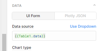
I have 2 separate tables with a list of companies I would like to compare in 1 chart. Currently I am using the table1 as the datasource
And I have added table2 as a data set. This works fine until the data in table 2 has more information(for example they've been active for a longer duration) than table1, the chart will not show the extra months and will end when the data in table 1 ends.