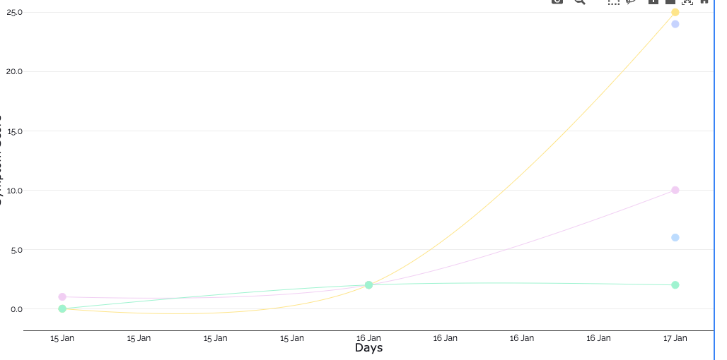
The new graphs' color palette (the auto-generated ones, for new datapoints) is a bit fainted out and soft. Can I choose the colors to be more vivid/visible?
Thanks!
The new graphs' color palette (the auto-generated ones, for new datapoints) is a bit fainted out and soft. Can I choose the colors to be more vivid/visible?
Thanks!
Hey @Orestis_Skoutellas ,
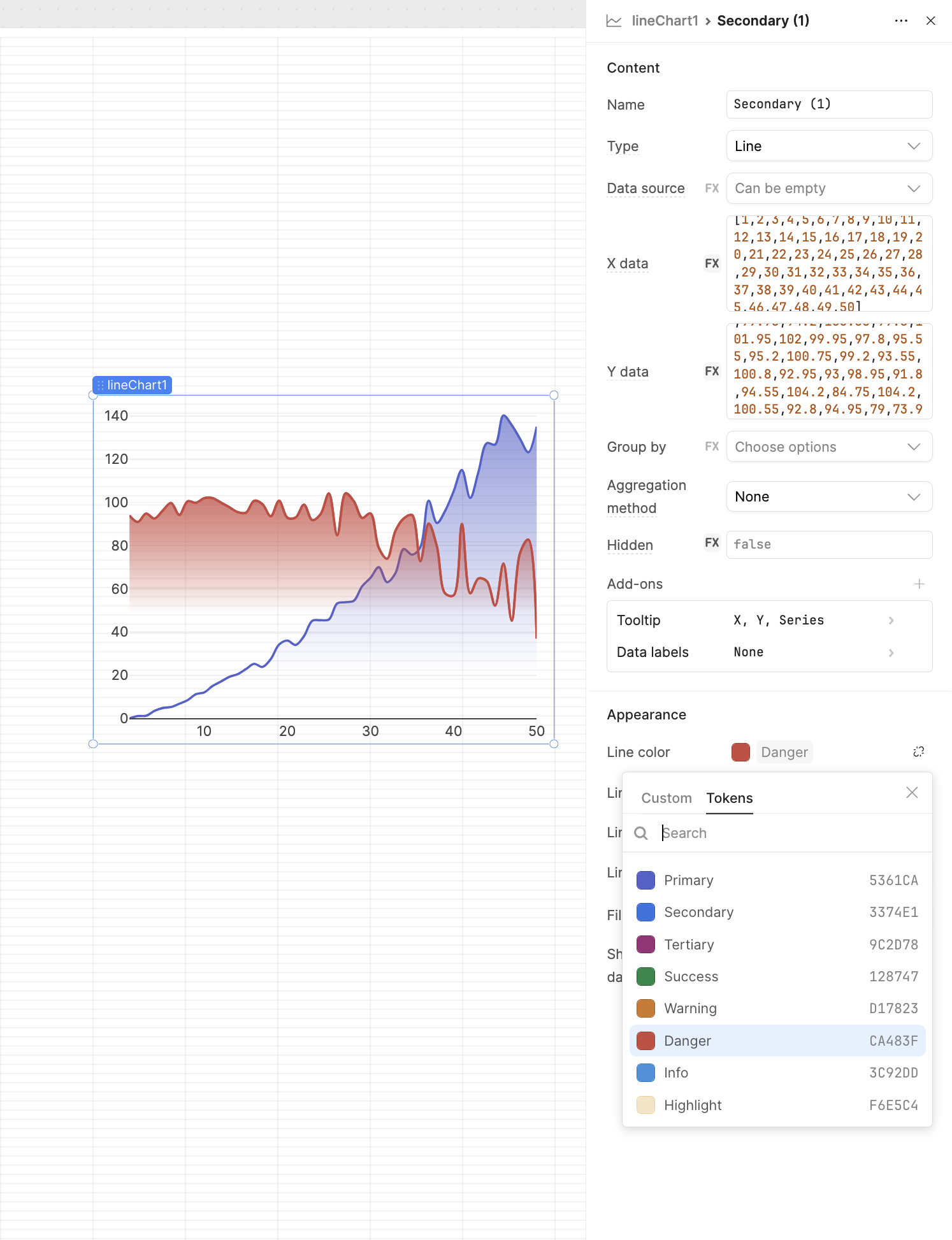
The default auto-generated chart colors in Retool may appear muted, but you can customize the palette to create more vibrant and vivid visuals.
Thank You.