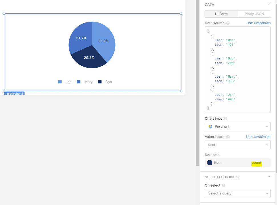
I'm trying to make a simple pie chart that shows what percentage of items are owned by a specific user, however, no attempt to group by count of items works. Take the following simple example:
Bob should have 50% of items, and Mary and Jon 25% each. However, no matter what the selected aggregation method chosen is, it always sums the values of the items if they can be cast to numbers.
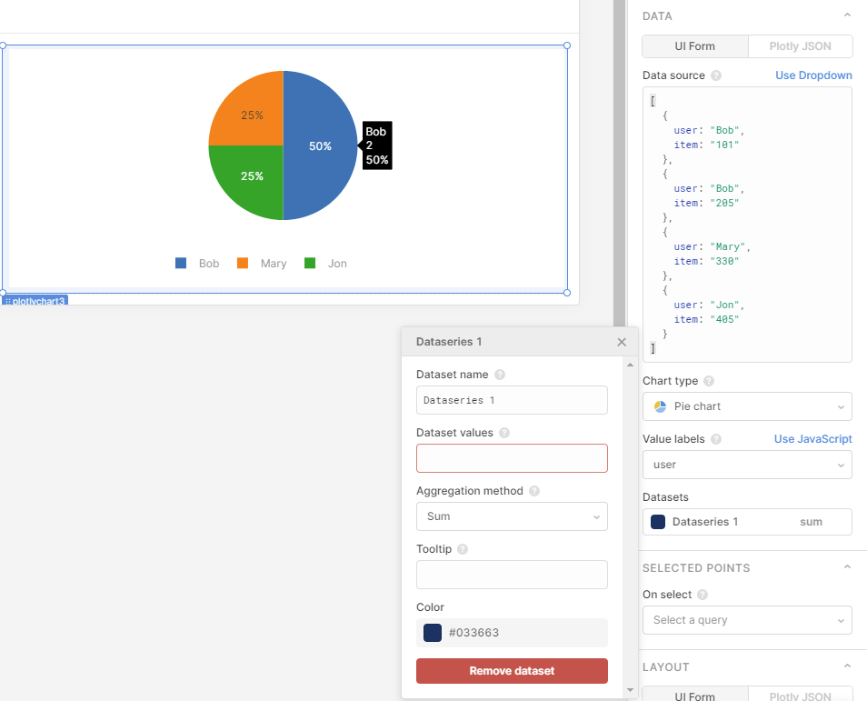
HI there! I was able to reproduce your results and found out some information for you. Our pie charts are built upon the plotly library and plotly is expecting the data that gets passed in to be in a specific format. Specifically, the labels and values should be arrays of equal length. So in your case, when you use the dataset values plotly tries to combine Bob's items in a logical way, by returning the sum of the values. When no values are given, the default plotly behavior is to return the count as the value. In any event, to ensure that your charts receive the correct data and you can be sure of the behavior we recommend something along the following lines.
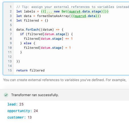
You can create a custom javascript transformer that will create an object with keys that are the labels you wish to use and the values that are the values you want to assign to those labels. In the following example I've used the results of a query to populate the graph, but you can changes this to suit your needs.
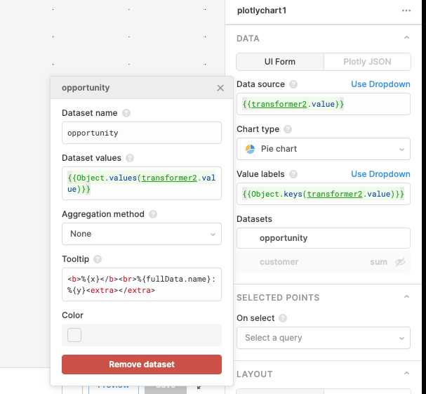
We can then use the keys and values of the returned object to populate the graph.