It's common for stakeholders to want a % of total breakdown of data. The data often includes many slices that are a very low percentage of the total.
Today
In Retool, pie charts are effectively not usable when the data source includes many slices. Stakeholders typically don't find the distinction of those slices to be helpful for analysis. Instead, the current representation of those slices significantly impairs the usefulness of the pie chart, quickly rendering it useless.
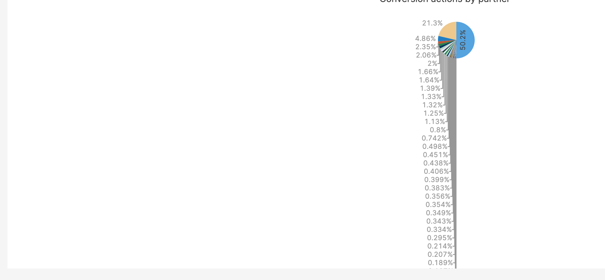
As you can see in the screenshot here, it doesn't take many slices for the pie chart to become effectively useless.
Screenshot
I think you'll agree that this pie chart is, at best, ineffective.
What are the current workarounds?
Do some plotly wizardry to turn off traces
This requires a lot more effort than seems necessary to solve the problem. I do not want nor expect an average analyst or business power user to spend time learning and experimenting with plotly json. Even if the traces are hidden under a certain percentage, the pie chart is still left with many "pointless" slices.
Combine presentation logic into the query itself (do the aggregation in the query).
Since the underlying data is still helpful in other areas in the same app (such as with filters, other charts, etc), it would require two queries with almost identical data to be run. This hurts app performance and wastes resources.
Use transformers or some other post processing
This might work for smaller data sets. But, it's not always a small data set that's presented this way. Attempting to process larger data sets either significantly taxes the user's system or causes the page to be reported as unresponsive. This is a very poor experience for the user.
In case anyone is taking this approach, there are a couple ways to do it (this is paraphrasing, and I'm sure there may be other options):
Option 1
- Do the aggregation on the results of the query, resulting in an array of items that represent the slices
- From the aggregated data array, splice out two arrays: 1) Slices you want to keep intact, and 2) slices you want to aggregate. This is where you would set up your "condition" for what constitutes a "too small" slice.
- From the spliced out array of smaller slices, aggregate the data (and give the aggregated item the name that you want to appear in the aggregated slice on the pie chart)
- Splice the aggregated smaller slice array back into the array of slices you want to keep intact.
Option 2
- Process each record of the data individually, and conditionally modify the data for each record (i.e., change the category of the record if it's under a certain amount to be the name of the aggregated slice).
This option has a couple obvious downsides. When evaluated individually, it's highly inefficient to determine the ratio of the record's categorical aggregate % of the total pie. Even if it were possible, it probably wouldn't perform as well as doing the aggregation first. But, this is a rabbit hole of a point to make since it depends highly on the data and other factors. Finally, depending on how your Retool app is set up, modifying the data like this may have some negative impacts elsewhere (i.e., filters) that depend on the unmodified data.
Set up some data view in the database or API that only pulls in slice info
This is possible, but unnecessarily complex. Pie charts are common enough to quickly make this level of effort a highly inefficient use of resources, especially considering that it may occasionally require engineering assistance.
In the future
Pie charts with many slices that are low percents of the total should be configurable so they can still be useful.
Some ideas
Define a threshold under which slices will be aggregated into a single slice.
Simple
It could be as simple as
- Having a "Aggregate slices under percent threshold" field accepting a simple number percent input
- OR enable max number of slices and aggregate the rest under a named field
Better
Offer a few fields to better manage and customize the functionality:
- Aggregate slices: Switch to turn it on or off for the pie chart
- Aggregate slices under threshold: This could be a simple percent, or possibly enable javascript to provide more functionality and choices here
- OR enable max number of slices and aggregate the rest under the named field
- Aggregate slice name: Name field with javascript enabled
For example, based on the data that results in the attached screenshot, the feature could be configured to aggregate anything under 2% into a single slice. The result would be 7 slices (6 non-aggregated slices + 1 aggregated slice) which would be infinitely better from a usability standpoint.
Thank you for considering this request to improve pie charts. I hope this also can help some other businesses use more of their time analyzing data instead of preparing it!
Matthew
