I join two time series data sets for a chart and there are NULL values in some y-value data points. How do I graph these to ignore the NULL values? I tried this but it had no effect: https://codepen.io/plotly/pen/GJPNNL
Hey @Forde_Smith! After crawling around the Plotly forums, this post seems to suggest that the best solution is to filter the data before passing it into the Plotly chart.
array.filter(row => row) would remove any null values from an array
Thanks @Victoria - do you mean something like this as a transformer after the SQL query?
I tried both of these but they didn't work.
return const filteredData = data.filter(row => row)
return const filteredData = data.filter(row => {
  for (let key in row) {
    if (row[key] === null) {
      return false;
    }
  }
  return true;
});
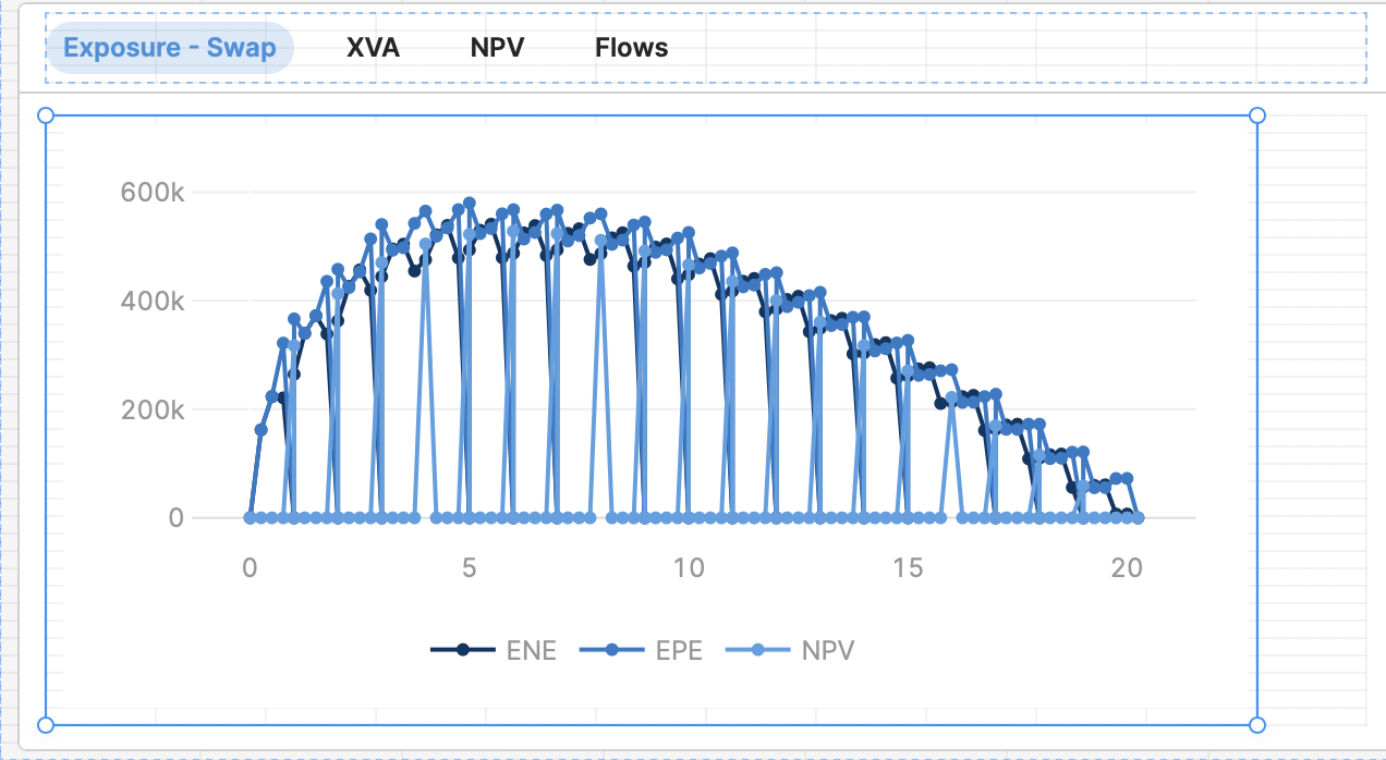
In case it helps, the data looks like this when it returns from the SQL query - TIME is the x-axis, ENE, EPE, NPV are the y-s for charting.
{
"TIME": [0, 0.248634, 0.497268, 0.754098, 1, 1.003002],
"ENE": [0, 161864, 222963, 220949, null, 264273],
"EPE": [598, 162471, 223766, 321816, null, 366336],
"NPV": [null, null, null, null, 317239.803684, null]
}
I think I need something like the code below (or this https://codepen.io/plotly/pen/GJPNNL), using traces and connectgaps but I don't know how to format this as JSON in Retool - can anyone help?
const traces = [];
// Add a trace for each column except "TIME"

Object.keys(data).forEach((key) => {

if (key !== "TIME") {

const trace = {

x: data["TIME"],

y: data[key],

name: key,

type: "scatter",

mode: "lines+markers"

};

traces.push(trace);

}

});
// Create the layout

const layout = {

title: "My Plot",

xaxis: {

title: "TIME"

},

yaxis: {

title: "Value"

}

};
// Create the plot

Plotly.newPlot("myPlot", traces, layout);
This is how it looks at the moment in Retool:
Would you mind sharing what your data currently looks like? A screenshot of your query data expanded out as much as possible in the left panel’s state tab would work great! 
Hi @Victoria I've added a few rows of the data in the post above.
Here's the data again from the post above:
In case it helps, the data looks like this when it returns from the SQL query - TIME is the x-axis, ENE, EPE, NPV are the y-s for charting.{
"TIME": [0, 0.248634, 0.497268, 0.754098, 1, 1.003002],
"ENE": [0, 161864, 222963, 220949, null, 264273],
"EPE": [598, 162471, 223766, 321816, null, 366336],
"NPV": [null, null, null, null, 317239.803684, null]
}
Hey @Forde_Smith! Sorry about the delay here, our queues have been a bit backlogged.
Are you looking for something like this?
const data = {
"TIME": [0, 0.248634, 0.497268, 0.754098, 1, 1.003002],
"ENE": [0, 161864, 222963, 220949, null, 264273],
"EPE": [598, 162471, 223766, 321816, null, 366336],
"NPV": [null, null, null, null, 317239.803684, null]
}

return Object.fromEntries(Object.entries(data).map(([k, v]) => [k, v.filter(x => x !== null)]));

Hi @victoria,
Thanks for your reply ![]()
Unfortunately it doesn't solve the issue ![]()
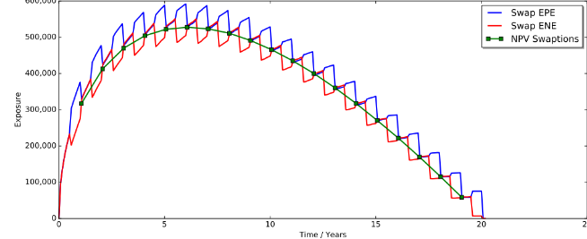
The JS removes the null values but in doing so corrupts the chart. In your example, the "NPV" part of the chart is now just one data point.
See the screen shot when you apply your JS to the whole data set. See how rather than charting the NPV data for the entire 20 years it just shows the 20 yearly data points mapped to the ENE / EPE valuations.
As mentioned above, the "TIME" is the X axis and the "ENE""EPE"NPV" are the Y's. Where there is a null I need the chart to connect the points / gaps (as per the reference to Plotly "connectgaps" above. Removing the nulls doesn't help this.
What I need to know is how to format the Plotly JSON to connect gaps / nulls in the data See the example of how matplotlib in python renders the same data.
Is this a Retool JSON specification or vanilla Plotly API JSON?
Any ideas?
Forde
Hi @victoria ,
I solved it ![]() ...ok, well...GPT4 helped
...ok, well...GPT4 helped ![]()
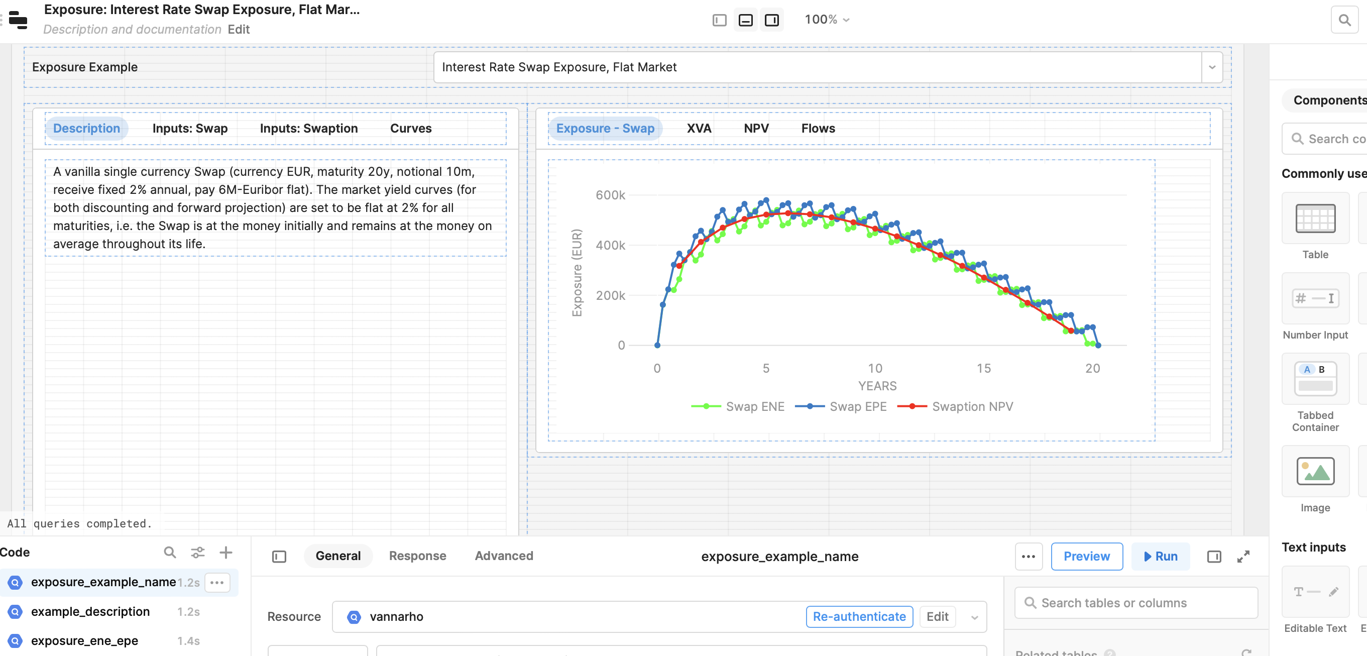
I amended the JSON, removing the default "transforms" section and adding "connectgaps", as per the below.
[

{

"name": "Swap ENE",

"x": {{example_1_data.data.TIME}},

"y": {{example_1_data.data['ENE']}},

"type": "line",

"hovertemplate": "%{x}
%{fullData.name}: %{y}",

"marker": {

"color": "#00FF00"

},

"mode": "lines+markers",

"connectgaps": true

},

{

"name": "Swap EPE",

"x": {{example_1_data.data.TIME}},

"y": {{example_1_data.data['EPE']}},

"type": "line",

"hovertemplate": "%{x}
%{fullData.name}: %{y}",

"marker": {

"color": "#247BC7"

},

"mode": "lines+markers",

"connectgaps": true

},

{

"name": "Swaption NPV",

"x": {{example_1_data.data.TIME}},

"y": {{example_1_data.data['NPV']}},

"type": "line",

"hovertemplate": "%{x}
%{fullData.name}: %{y}",

"marker": {

"color": "#55A1E3"

},

"mode": "lines+markers",

"connectgaps": true

}

]
Thanks again for your help!
F
1 Like
For those who are interested, I asked chatgpt:
How do I configure a chart in Retool (using Plotly) that has time as the x-axis and three data sets as the y-axis that contain nulls?The reply:
Here's how to create a chart in Retool with time as the x-axis and three data sets as the y-axis, taking into account null values:
- First, you'll need to create a new Retool application or open an existing one.
- Add a chart component to your canvas by clicking on the "+" icon in the top-right corner of the screen and selecting "Chart" from the list of components. This will add a new chart to your canvas.
- Click on the newly added chart to open its properties panel on the right side of the screen. Here, you'll configure the chart settings.
- In the "Library" dropdown, select "Plotly" as the charting library.
- Set the chart type to "Scatter" for all three data sets. This can be done by clicking on the "Add Series" button and selecting "Scatter" for each series.
- In the "Data" section of the properties panel, you'll need to provide the data for each of the three data sets. Assuming you have your data in the format:
{
"timestamps": ["2023-03-10", "2023-03-11", "2023-03-12"],
"dataSet1": [1, null, 3],
"dataSet2": [2, 2, null],
"dataSet3": [null, 1, 3]
}
You'll need to transform this data into a format that Plotly can understand:
[
{
x: data.timestamps,
y: data.dataSet1,
name: 'Dataset 1',
mode: 'lines+markers',
connectgaps: true
},
{
x: data.timestamps,
y: data.dataSet2,
name: 'Dataset 2',
mode: 'lines+markers',
connectgaps: true
},
{
x: data.timestamps,
y: data.dataSet3,
name: 'Dataset 3',
mode: 'lines+markers',
connectgaps: true
}
]
- Replace
datawith the variable or query result containing your data in the appropriate format. Make sure to set the "Data" field in the properties panel to use the transformed data format. - Customize the chart appearance, such as colors and axis labels, using the properties panel.
- Save your changes by clicking on the "Save" button at the top-right corner of the screen.
Now you should have a chart in Retool with time as the x-axis and three data sets as the y-axis, which can handle null values.
Please note that if you have null values in your timestamps, you should either filter them out or replace them with a suitable placeholder before plotting, as Plotly may not handle null x-axis values correctly.
!!! Forde, that's awesome.
1. So glad you found a solution that worked for you.
2. Thank you for posting it for other users to see. This is incredibly helpful to have documented here. ![]()