Building a Plotly stacked bar chart in Retool

Hi,
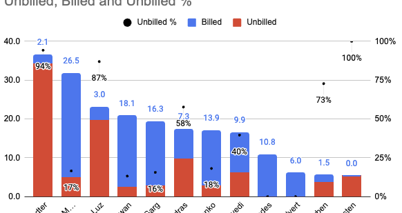
I'm very new to charting with Retool / Plotly. I'm trying to put together a stacked bar chart similar to this (in google Sheets):

Screenshot 2024-03-08 at 13.37.56

I've tried adding to the Plotly JSON field:

"layout": {
  "barmode":"stack",
  "barnorm":"percent"
},

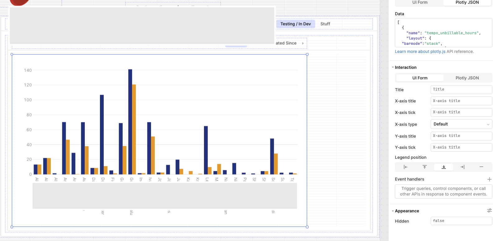
But I'm still just seeing side-by-side bars:

I also tried the approach outlined in this post but could not get that to work: Build stacked bar chart and rotate x axis labels vertically

I've put the full Plotly JSON in here :arrow_down:

Plotly JSON -> Data
[
  {
    "name": "tempo_unbillable_hours",
    "layout": {
  "barmode":"stack",
  "barnorm":"percent"},
    "x": {{formatDataAsObject(query1.data).full_name}},
    "y": {{formatDataAsObject(query1.data)['tempo_unbillable_hours']}},
    "type": "bar",
    "hovertemplate": "<b>%{x}</b><br>%{fullData.name}: %{y}<extra></extra>",
    "transforms": [
      {
        "type": "sort",
        "target": {{formatDataAsObject(query1.data).full_name}},
        "order": "ascending"
      },
      {
        "type": "aggregate",
        "groups": {{formatDataAsObject(query1.data).full_name}},
        "aggregations": [
          {
            "target": "y",
            "func": "sum",
            "enabled": true
          }
        ]
      }
    ],
    "marker": {
      "color": "#1E3A8A"
    }
  },
 
  {
    "name": "total_billable",
    "x": {{formatDataAsObject(query1.data).full_name}},
    "y": {{formatDataAsObject(query1.data)['total_billable']}},
    "type": "bar",
    "hovertemplate": "<b>%{x}</b><br>%{fullData.name}: %{y}<extra></extra>",
    "transforms": [
      {
        "type": "sort",
        "target": {{formatDataAsObject(query1.data).full_name}},
        "order": "ascending"
      },
      {
        "type": "aggregate",
        "groups": {{formatDataAsObject(query1.data).full_name}},
        "aggregations": [
          {
            "target": "y",
            "func": "sum",
            "enabled": true
          }
        ]
      }
    ],
    "marker": {
      "color": "#F59E0B"
    }
  }
]

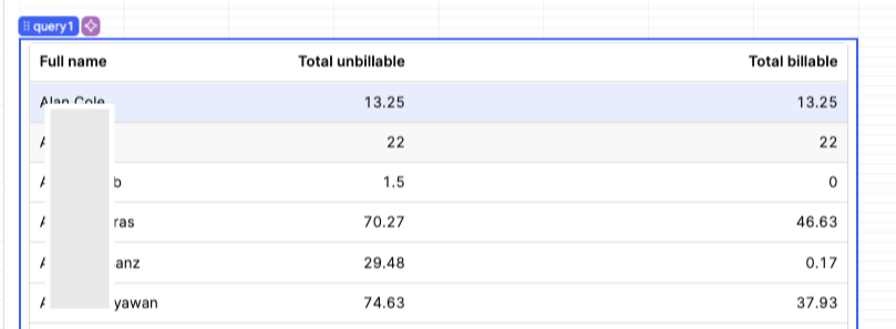
query1.data is from a basic table:

Any pointers hugely appreciated! :slight_smile:

Nick

Did you also get a change to look at Quickly implementing PlotlyJS examples with Chart? I found it hugely useful in setting up a pattern in my apps for charts/visualizations. The key part is passing the data and the layout to the chart from a JS Query that generates JSON for each. From what I can see in your snippet, you have a "layout" key in your data JSON object, which I don't think will translate to the layout.

2 Likes

Hi @jg80

Thanks for the tip! I did manage to get this working using the link you provided. Very helpful! :slight_smile:

@Kabirdas - Are additional 'native' chart types on the roadmap for Retool?

Regards,
Nick

Hi @nickaus I don't know of any chart types launching soon, but I can submit a request internally. What types of charts are you looking to create?

Hi @Tess
Thanks for your reply. Nothing specific at the moment, but internally I get a lot of requests for dashboards to reflect metrics across a quite large range of things. So being able to chart something quickly and easily would be great.

For now I mostly do this in google Sheets, but would be great if it was plug/playable in Retool instead. I'm fine with the approach @jg80 pointed me to for more long term/structural requirements.

Regards,
Nick

Pivot tables :wink: