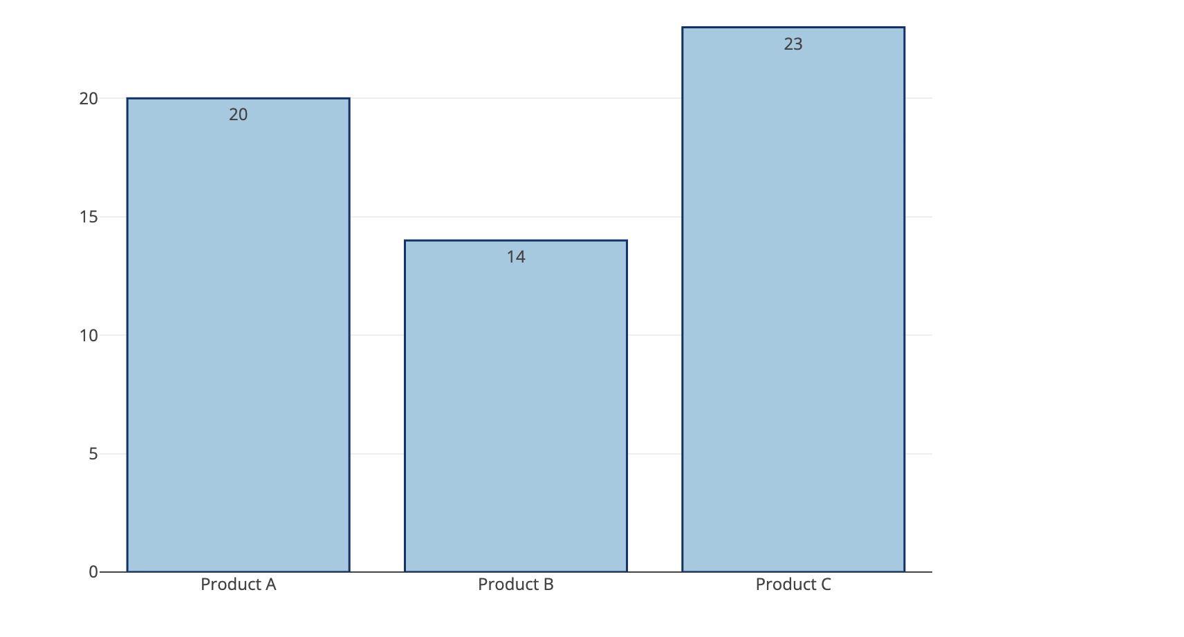
I'd like to add data labels above the bars in my bar charts. The data populating the bars is aggregated (a count of number of observations in each group), so I'd like the labels to appear above each bar and show the population size for each bar. Any idea how to do this? Similar to the screenshot shown below.
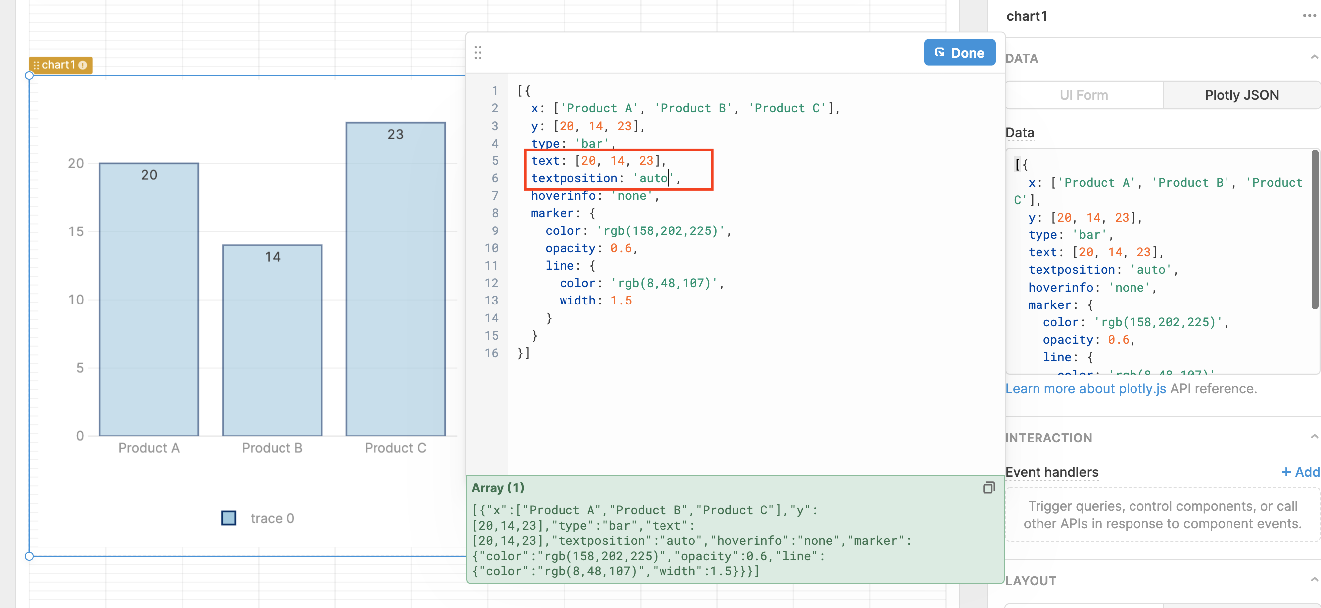
Hi @louiepp, If it's still helpful, here's how you would setup that example of a Grouped Bar Chart with Direct Labels from the Plotly docs in Retool.
Hi Everett,
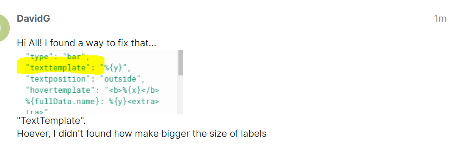
Thanks for the response. Your example is useful, however you are hard-coding the label values. In my case I'd like to populate the labels from the number of observations in each group (as calculated by a COUNT). The label values would be dynamic based on the result of the query.
Do you have an idea of how to implement the labels where they are dynamic as described above?
@louiepp, yes! You can reference Retool variables in the JSON input. So you could reference an array from your dataset with something along the lines of {{query1.data.labelsKey}} in place of the hardcoded values in the example I shared. I hope that helps!