How to Display Percentage Labels in Each Segment of a Stacked Bar Chart in Retool

  • Goal: I’m trying to create a stacked bar chart in Retool where:
  • The Y-axis represents the total amount for each category
  • I want each stacked segment to display its own percentage value as a data label (representing the proportion of that segment relative to the total for that bar) directly within each section of the stack.
  • Steps:
    1. I attempted to use data labels to show percentage values for each section of the stack, but Retool only allows string values, so I can’t format these as percentages. Additionally, I see that {y} is used to identify the index for the y-axis values, but when I try to use {y} dynamically, it doesn’t work as expected. For context, I already have a column in my data table that provides the percentage values directly, so I wouldn’t need to calculate it within the chart.
  • I also tried adding a secondary y-axis to display percentage values alongside the primary y-axis for units. However, I couldn’t find an option to specify which data should be displayed on the right y-axis versus the left y-axis.
  • I tried using Plotly to create the chart, but I had to manually repeat the data four times to display the labels, which makes it difficult to dynamically adjust if the query returns more categories or labels.
  • Details: my plotly json data code looks like this:
[
    {
      "type": "bar",
      "x": ["Product A", "Product B", "Product C", "Product D"],
      "y": [120, 80, 150, 100],
      "name": "Chocolate",
      "marker": { "color": "#8B5D9F" },
      "text": [30, 20, 38, 25],
      "texttemplate": "%{text}%",
      "textposition": "inside"
    },
    {
      "type": "bar",
      "x": ["Product A", "Product B", "Product C", "Product D"],
      "y": [100, 60, 120, 90],
      "name": "Caramel",
      "marker": { "color": "#D9A1E6" },
      "text": [25, 15, 30, 22],
      "texttemplate": "%{text}%",
      "textposition": "inside"
    },
    {
      "type": "bar",
      "x": ["Product A", "Product B", "Product C", "Product D"],
      "y": [140, 90, 160, 110],
      "name": "Sour",
      "marker": { "color": "#FF6699" },
      "text": [35, 22, 40, 27],
      "texttemplate": "%{text}%",
      "textposition": "inside"
    },
    {
      "type": "bar",
      "x": ["Product A", "Product B", "Product C", "Product D"],
      "y": [60, 40, 70, 50],
      "name": "Other",
      "marker": { "color": "#5E1F33" },
      "text": [15, 10, 18, 12],
      "texttemplate": "%{text}%",
      "textposition": "inside"
    }
]
  • my layout json plotly looks like
{"barmode": "stack",
    "title": { "text": "example" },
    "xaxis": { "title": "" },
    "yaxis": { "title": "" },
    "showlegend": true
} 
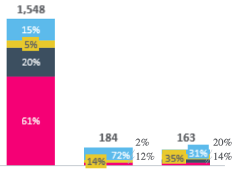
  • Screenshots: This example isn't exactly what I want (Python helped me generate it), but it illustrates the structure I'm aiming for: I want the Y-axis to represent the total units, with each segment in the stack showing its percentage of the total. Additionally, I’d like an overall units label displayed at the top of each stacked bar.
    image

Hi @manuelacastilla,

Since your dataset already has the percentage calculated, I agree with your solution of passing that data in as the text value.

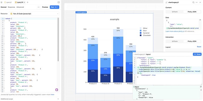
For the stacked bar label, I recommend setting up annotations, as documented by Plotly.

Here's an example:

The JS needed to make your chart more dynamic will depend on the data source, but for my dynamic chart, based on the dummy data from query14 in my screenshot, I had the following chart json:

  {
    "name": "value",
    "x": {{formatDataAsObject(query14.data).product}},
    "y": {{formatDataAsObject(query14.data).value}},
    "text":  {{formatDataAsObject(query14.data).percent}},
    "texttemplate": "%{text}%",
    "textposition": "inside",
    "type": "bar",
    "hovertemplate": "<b>%{x}</b><br>%{fullData.name}: %{y}<extra></extra>",
    "transforms": [
      {
        "type": "groupby",
        "groups": {{formatDataAsObject(query14.data)['type']}},
        "styles": [
          {
            "target": {{_.uniq(formatDataAsObject(query14.data)['type'])[0]}},
            "value": {
              "marker": {
                "color": "#1E3A8A"
              }
            }
          },
          {
            "target": {{_.uniq(formatDataAsObject(query14.data)['type'])[1]}},
            "value": {
              "marker": {
                "color": "#3170F9"
              }
            }
          },
          {
            "target": {{_.uniq(formatDataAsObject(query14.data)['type'])[2]}},
            "value": {
              "marker": {
                "color": "#60A5FA"
              }
            }
          },
          {
            "target": {{_.uniq(formatDataAsObject(query14.data)['type'])[3]}},
            "value": {
              "marker": {
                "color": "#DBEAFE"
              }
            }
          }
        ]
      },
      {
        "type": "sort",
        "target": {{formatDataAsObject(query14.data).product}},
        "order": "ascending"
      },
      {
        "type": "aggregate",
        "groups": {{formatDataAsObject(query14.data).product}},
        "aggregations": [
          {
            "target": "y",
            "func": "sum",
            "enabled": true
          }
        ]
      }
    ]
  }
]

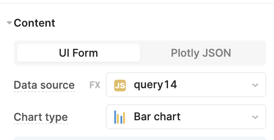
I find it is easiest to start by setting up your chart as much as possible with the UI form and then switch to the Plotly JSON tab to customize
CleanShot 2024-11-19 at 15.06.17@2x