4Γ—4 Risk Matrix Heatmap with Gradient and Clickable Points

Requirements

4Γ—4 Risk Matrix Heatmap with Gradient and Clickable Points

Goal
I want to build a 4Γ—4 risk matrix heatmap in Retool using a smooth color gradient (green β†’ yellow β†’ red). Each risk should appear as a clickable point on the matrix, based on data from a table.

Can anyone give me tips on how to implement that?

Requirements

  • Background: continuous gradient from green (low risk) to red (very high risk).

  • Axes:

    • X = Impact

    • Y = Likelihood

    • Both with 4 levels: Low, Medium, High, Very High

  • Clicking a point should select the corresponding row in a Retool table


Low to Very high, I let chatpgt translate it, dont get confused with the false designations please

Hi there @RojanKmh,

Yup, you can absolutely achieve that, see below example:

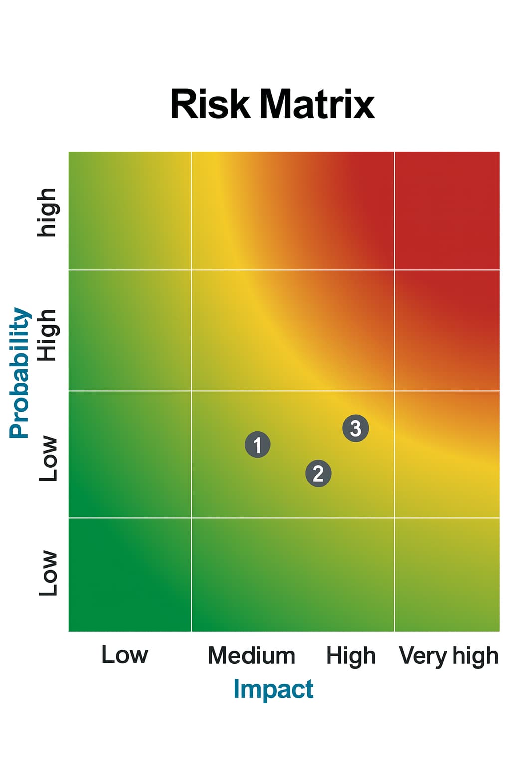
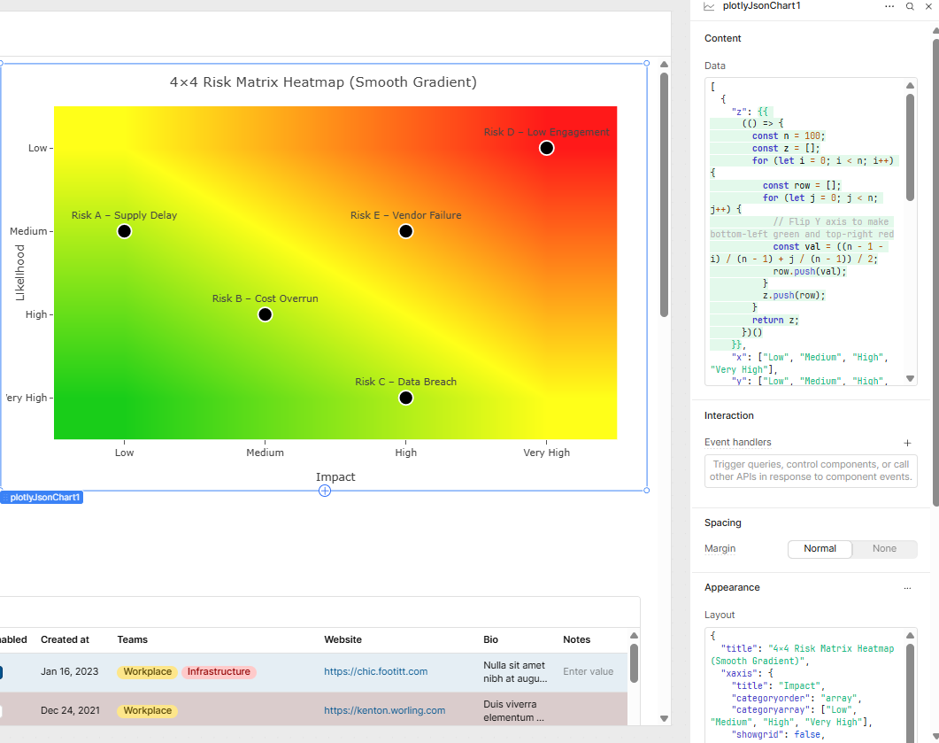
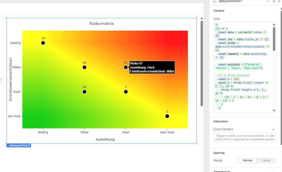
I added a plotly json Chart, and this is the data;

Content

[
  {
    "z": {{ 
      (() => {
        const n = 100;
        const z = [];
        for (let i = 0; i < n; i++) {
          const row = [];
          for (let j = 0; j < n; j++) {
            // Flip Y axis to make bottom-left green and top-right red
            const val = ((n - 1 - i) / (n - 1) + j / (n - 1)) / 2;
            row.push(val);
          }
          z.push(row);
        }
        return z;
      })()
    }},
    "x": ["Low", "Medium", "High", "Very High"],
    "y": ["Low", "Medium", "High", "Very High"],
    "type": "heatmap",
    "colorscale": [
      [0, "rgb(0,200,0)"],
      [0.5, "rgb(255,255,0)"],
      [1, "rgb(255,0,0)"]
    ],
    "showscale": false,
    "hoverinfo": "skip",
    "opacity": 0.9,
    "zsmooth": "best"
  },
  {
    "x": ["Low", "Medium", "High", "Very High", "High"],
    "y": ["Medium", "High", "Very High", "Low", "Medium"],
    "text": [
      "Risk A – Supply Delay",
      "Risk B – Cost Overrun",
      "Risk C – Data Breach",
      "Risk D – Low Engagement",
      "Risk E – Vendor Failure"
    ],
    "mode": "markers+text",
    "type": "scatter",
    "textposition": "top center",
    "marker": {
      "size": 18,
      "color": "black",
      "line": { "width": 2, "color": "white" }
    },
    "hovertemplate": "%{text}<extra></extra>",
    "customdata": [1, 2, 3, 4, 5]
  }
]

layout

{
  "title": "4Γ—4 Risk Matrix Heatmap (Smooth Gradient)",
  "xaxis": {
    "title": "Impact",
    "categoryorder": "array",
    "categoryarray": ["Low", "Medium", "High", "Very High"],
    "showgrid": false,
    "zeroline": false
  },
  "yaxis": {
    "title": "Likelihood",
    "categoryorder": "array",
    "categoryarray": ["Low", "Medium", "High", "Very High"],
    "showgrid": false,
    "zeroline": false,
    "autorange": "reversed",
  },
  "plot_bgcolor": "rgba(0,0,0,0)",
  "paper_bgcolor": "rgba(0,0,0,0)",
  "hovermode": "closest",
  "margin": { "l": 60, "r": 30, "t": 50, "b": 60 },
  "height": 500
}

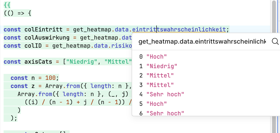
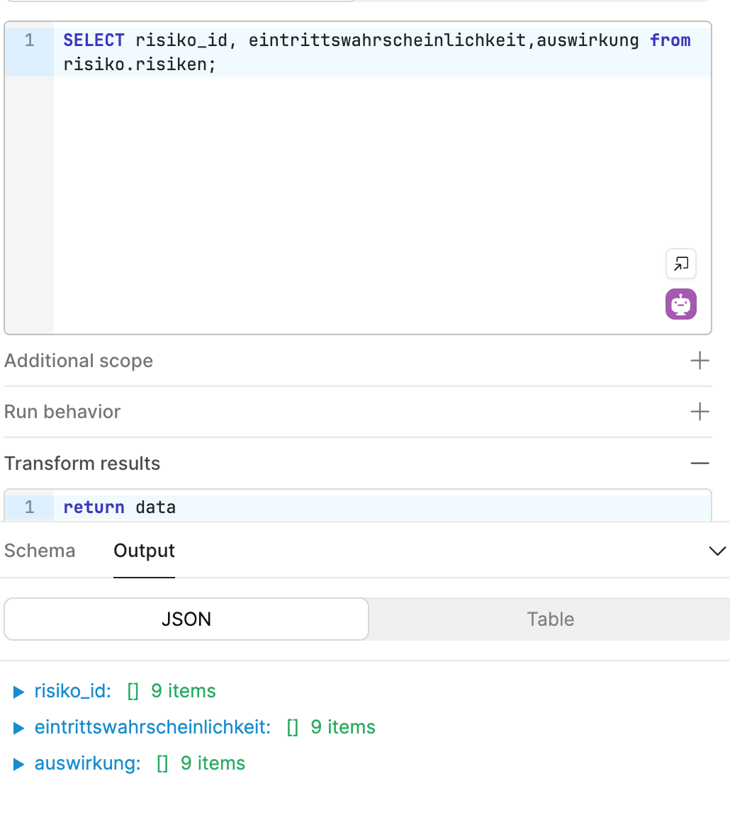
You can plug in your data dynamically within the data section.

Hope this helps, chat gpt should be able to guide you through the rest!

3 Likes

Hi, thank you very much.
And how exactly can I put one column of a table into the data section ?
Thank you

{{
(() => {
  const table = (dashboard_table.data || []);

  const colEintritt = get_heatmap.data.eintrittswahrscheinlichkeit;
  const colAuswirkung = get_heatmap.data.auswirkung;
  const colID = get_heatmap.data.risiko_id;

  const axisCats = ["Niedrig", "Mittel", "Hoch", "Sehr Hoch"];

  const n = 100;
  const z = Array.from({ length: n }, (_, i) =>
    Array.from({ length: n }, (_, j) =>
      ((i) / (n - 1) + j / (n - 1)) / 2
    )
  );

  const xCats = [];
  const yCats = [];
  const labels = [];

  for (const r of table) {
    const auswirkung = r?.[colAuswirkung];
    const wahrscheinlichkeit = r?.[colEintritt];
    const name = r?.[colID] || "Unbenannt";
    if (axisCats.includes(auswirkung) && axisCats.includes(wahrscheinlichkeit)) {
      xCats.push(auswirkung);
      yCats.push(wahrscheinlichkeit);
      labels.push(name);
    }
  }

  return [
    {
      z,
      x: axisCats,
      y: axisCats,
      type: "heatmap",
      colorscale: [
        [0, "rgb(0,200,0)"],
        [0.5, "rgb(255,255,0)"],
        [1, "rgb(255,0,0)"]
      ],
      showscale: false,
      hoverinfo: "skip",
      opacity: 0.9,
      zsmooth: "best"
    },
    {
      x: xCats,
      y: yCats,
      text: labels,
      mode: "markers+text",
      type: "scatter",
      textposition: "top center",
      marker: {
        size: 18,
        color: "black",
        line: { width: 2, color: "white" }
      },
        "hovertemplate": "Risiko:<extra>%{x} | %{y}</extra>"
    }
  ];
})()
}}

I came this far, but the points wont show on my heatmap ;(

1 Like

Hey there @RojanKmh,

Are you able to share a JSON of how get_heatmap.data is structured?

It seems to me that what you'tr trying to do below is incorrect]

const colEintritt = get_heatmap.data.eintrittswahrscheinlichkeit;
const colAuswirkung = get_heatmap.data.auswirkung;
const colID = get_heatmap.data.risiko_id;
  • get_heatmap.data is most likely an array of rows, not an object of columns.
  • So get_heatmap.data.eintrittswahrscheinlichkeit is undefined.
    β†’ r?.[colAuswirkung] later becomes r?.[undefined], which always fails.

I'm navigating blind here, but can you with the below?

{{
(() => {
  const rows = get_heatmap.data || [];
  const axisCats = ["Niedrig", "Mittel", "Hoch", "Sehr Hoch"];

  // Build gradient
  const n = 100;
  const z = Array.from({ length: n }, (_, i) =>
    Array.from({ length: n }, (_, j) =>
      ((n - 1 - i) / (n - 1) + j / (n - 1)) / 2
    )
  );

  // Scatter points
  const x = [];
  const y = [];
  const labels = [];

  for (const r of rows) {
    const auswirkung = r["auswirkung"];
    const wahrscheinlichkeit = r["eintrittswahrscheinlichkeit"];
    const name = r["risiko_id"] || "Unbenannt";
    if (axisCats.includes(auswirkung) && axisCats.includes(wahrscheinlichkeit)) {
      x.push(auswirkung);
      y.push(wahrscheinlichkeit);
      labels.push(name);
    }
  }

  return [
    {
      z,
      x: axisCats,
      y: axisCats,
      type: "heatmap",
      colorscale: [
        [0, "rgb(0,200,0)"],
        [0.5, "rgb(255,255,0)"],
        [1, "rgb(255,0,0)"]
      ],
      showscale: false,
      hoverinfo: "skip",
      opacity: 0.9,
      zsmooth: "best"
    },
    {
      x,
      y,
      text: labels,
      mode: "markers+text",
      type: "scatter",
      textposition: "top center",
      marker: {
        size: 18,
        color: "black",
        line: { width: 2, color: "white" }
      },
      hovertemplate: "Risiko %{text}<br>Impact: %{x}<br>Likelihood: %{y}<extra></extra>"
    }
  ];
})()
}}

Hi and good morning, I get my data through a query.

Ah I see, thanks for clarifying, so based in the structured you provided, here's what it works for me:

Data

{{
(() => {
  const data = get_heatmap.data || {};
  const ids = data.risiko_id || [];
  const probs = data.eintrittswahrscheinlichkeit || [];
  const impacts = data.auswirkung || [];

  const axisCats = ["Niedrig", "Mittel", "Hoch", "Sehr hoch"];

  // πŸ”Έ Build gradient
  const n = 100;
  const z = Array.from({ length: n }, (_, i) =>
    Array.from({ length: n }, (_, j) =>
      ((n - 1 - i) / (n - 1) + j / (n - 1)) / 2
    )
  );

  // πŸ”Έ Map to (x, y, label)
  const x = [];
  const y = [];
  const labels = [];

  for (let i = 0; i < ids.length; i++) {
    const auswirkung = impacts[i];
    const wahrscheinlichkeit = probs[i];
    const name = ids[i];
    if (axisCats.includes(auswirkung) && axisCats.includes(wahrscheinlichkeit)) {
      x.push(auswirkung);
      y.push(wahrscheinlichkeit);
      labels.push(name.toString());
    }
  }

  return [
    {
      z,
      x: axisCats,
      y: axisCats,
      type: "heatmap",
      colorscale: [
        [0, "rgb(0,200,0)"],
        [0.5, "rgb(255,255,0)"],
        [1, "rgb(255,0,0)"]
      ],
      showscale: false,
      hoverinfo: "skip",
      opacity: 0.9,
      zsmooth: "best"
    },
    {
      x,
      y,
      text: labels,
      mode: "markers+text",
      type: "scatter",
      textposition: "top center",
      marker: {
        size: 18,
        color: "black",
        line: { width: 2, color: "white" }
      },
      hovertemplate: "Risiko %{text}<br>Auswirkung: %{x}<br>Eintrittswahrscheinlichkeit: %{y}<extra></extra>"
    }
  ];
})()
}}

Layout

{
  "title": "Risikomatrix",
  "xaxis": {
    "title": "Auswirkung",
    "categoryorder": "array",
    "categoryarray": ["Niedrig", "Mittel", "Hoch", "Sehr hoch"],
    "showgrid": false,
    "zeroline": false
  },
  "yaxis": {
    "title": "Eintrittswahrscheinlichkeit",
    "categoryorder": "array",
    "categoryarray": ["Niedrig", "Mittel", "Hoch", "Sehr hoch"],
    "showgrid": false,
    "zeroline": false,
    "autorange": "reversed"
  },
  "plot_bgcolor": "rgba(0,0,0,0)",
  "paper_bgcolor": "rgba(0,0,0,0)",
  "hovermode": "closest",
  "margin": { "l": 60, "r": 30, "t": 50, "b": 60 },
  "height": 500
}

HEre's a screenshot:

1 Like

Thank you very very much, can you give me also a hint on how to reverse the labels on the y-axis and on how to put a event handler/click event on the buttons?

Hi, I’ve managed to switch the axis. Only the click handler is missing for me

1 Like

Great that is working,

For click events on the heatmap points, you need to add an Event Handler:

  1. Select your Plotly chart component
  2. Go to the Event Handlers section
  3. Add a new event handler for "Select" event

You can access the clicked point information using:

  • {{ plotlyJsonChart1.selectedPoints }} - contains the data of the clicked point
  • {{ plotlyJsonChart1.selectedPoints[0].x }} - x-axis value
  • {{ plotlyJsonChart1.selectedPoints[0].y }} - y-axis value

In your event handler, you can then trigger actions like opening a modal, updating another component, or running a query based on which risk point was clicked.

Best,
Miguel

1 Like

Everything works right now. Do you know if it’s possible to create duplicate data sets that don’t overlap?

Because β€œlow and low” will only show one point on the heatmap.
You know what I mean?

And do you know how I can create exactly this typa heatmap, is there a generator or something?