Hello,
Context
I'm trying to create a dashboard with several graphs having the following dataset type :
[
  {
    "newUsers": "24",
    "date": "2023-05-26T22:00:00.000Z",
  },
  {
    "newUsers": "21",
    "date": "2023-05-27T22:00:00.000Z",
  },
  {...}
]
This dashboard must be translated into French and English.
Problems
My charts are displayed as follows :
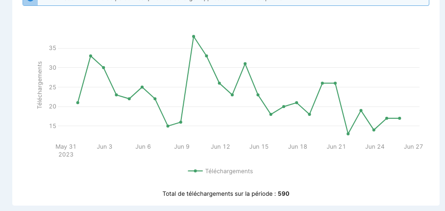
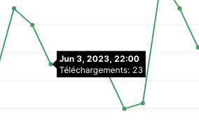
I can't translate the dates inside my graphs axis and tooltips.
The date isn't displayed in my timezone
Expected results
Instead of "May 31" i would like to display "31 Mai"
Same for the date inside the tooltip
What I've tried
I saw that it was possible to define a global configuration for plotly and define a locale this way: Plotly.setPlotConfig({locale: 'fr-FR'})
But I can't access Plotly's global instance and it's not possible to do this from a chart's retool parameters
So how can I do it?
Also, I know I can change the display format of an axis with the tick format field, but if I put "%x" for example, I get the following display 06/31/2023, whereas the French format is 31/06/2023.
If anyone has ever had to deal with a similar configuration, I'd love to hear your feedback.
