Duplicated X-Axis labels

Hi all, Im getting dupes in X-Axis date labels even when axis is formated correctly and data is tranformed to match the same day on any given month. So all transactions or budget lines from April will be shown as April 1st.


On the other hand, is there a way to override locale settings for D3? I want to use € on currency for Y-Axis but $ is the only posibility.

Thanks!

1 Like

Hello @luismarcos,

I'm not entirely sure about the issue with duplicate x-axis labels, but I can provide a solution for formatting the € (Euro) currency using D3 in Retool charts.

You can refer to my previous response on the community forum for more details: How to set D3 locale currency format (€) in charts? € - #3 by WidleStudioLLP

Here is the relevant JavaScript code :

// Your updated raw data (replacing old rawData)
const rawData = [
  { month: "March 2025", actualIncome: 2200, budgetedIncome: 2500 },
  { month: "April 2025", actualIncome: 2500, budgetedIncome: 2000 },
  { month: "April 2025", actualIncome: 1800, budgetedIncome: 1700 },
  { month: "May 2025", actualIncome: 6000, budgetedIncome: 1600 },
  { month: "May 2025", actualIncome: 0, budgetedIncome: 2200 }
];

// Define a custom D3 locale for Euro formatting
const locale = d3.formatLocale({
  decimal: ".",
  thousands: ",",
  grouping: [3],
  currency: ["€", ""]
});

// Create a currency formatter
const formatCurrency = locale.format("$.2f");

// Return formatted data for use in charts (e.g., labels or tooltips)
return rawData.map(item => ({
  ...item,
  actualIncomeFormatted: formatCurrency(item.actualIncome),
  budgetedIncomeFormatted: formatCurrency(item.budgetedIncome)
}));

Let me know if you have any further questions!

3 Likes

I'm having the same issue with duplicate labels on the x-axis. Is there any way to resolve this?


1 Like

Hey @Annie_Ellenberger ,

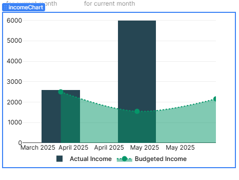
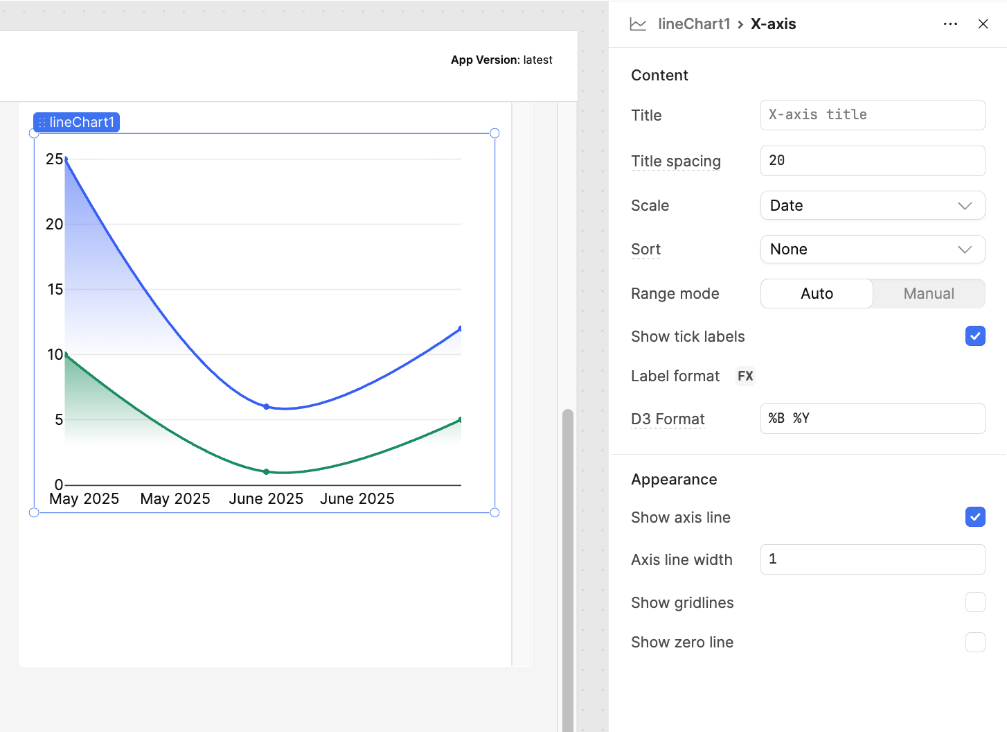
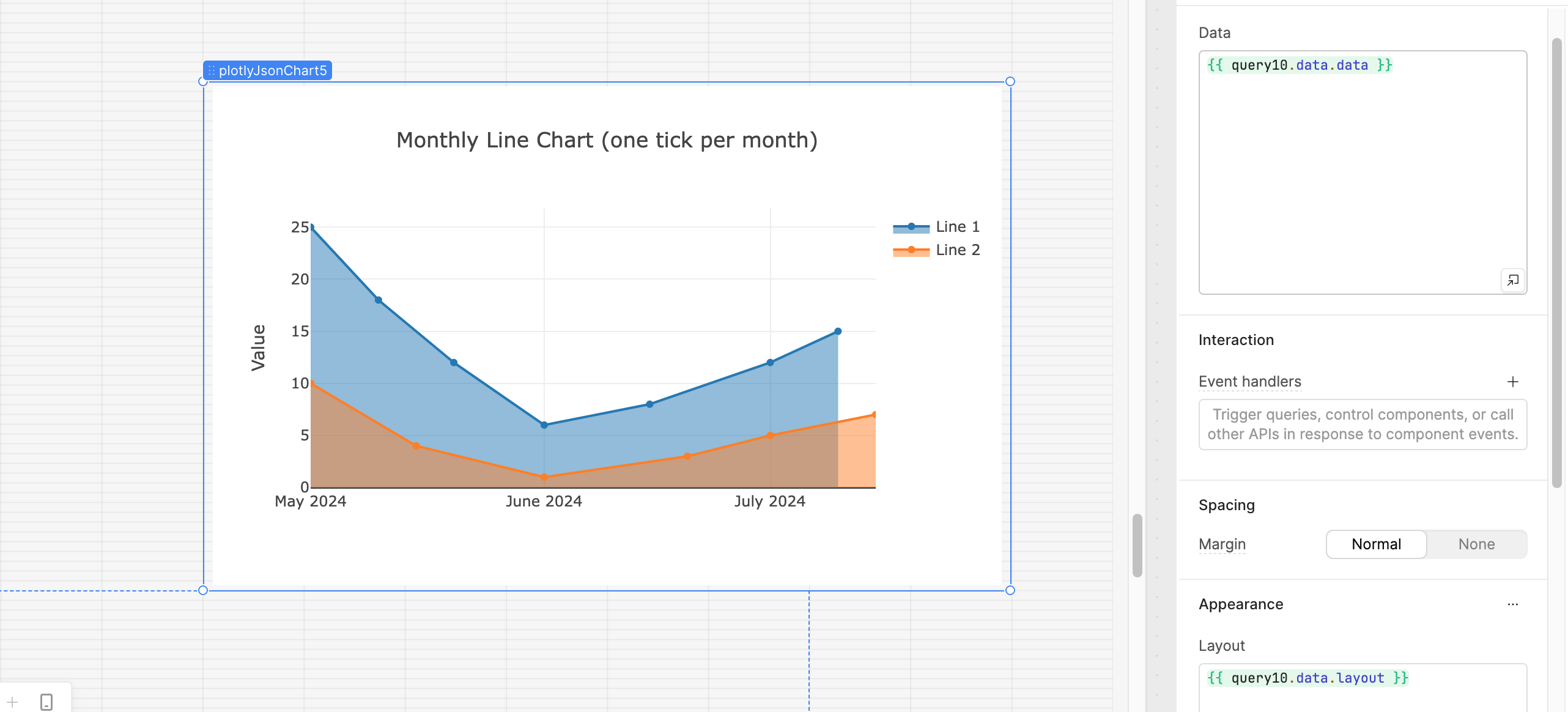
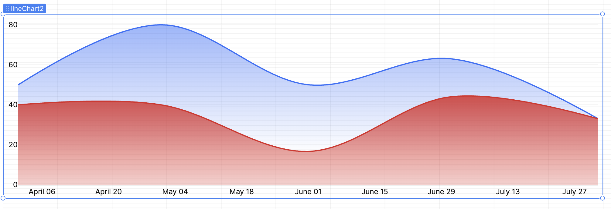
If you're running into the issue of duplicate month labels on the X-axis using the lineChart component, I’d recommend switching over to the Plotly JSON chart instead. It gives you a lot more flexibility in formatting, axis control, and overall customization.

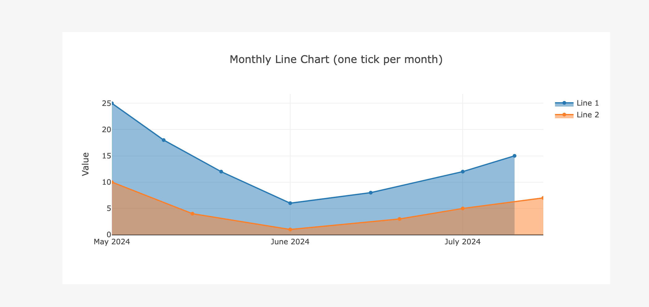
Here’s an example that solves the duplicate month issue by setting the tick mode to one tick per month (dtick: "M1") and formatting the date labels to show just the month and year:

return {
  "data": [
    {
      "x": [
        "2024-05-01", "2024-05-10", "2024-05-20",
        "2024-06-01", "2024-06-15",
        "2024-07-01", "2024-07-10"
      ],
      "y": [25, 18, 12, 6, 8, 12, 15],
      "type": "scatter",
      "mode": "lines+markers",
      "fill": "tozeroy",
      "name": "Line 1"
    },
    {
      "x": [
        "2024-05-01", "2024-05-15",
        "2024-06-01", "2024-06-20",
        "2024-07-01", "2024-07-15"
      ],
      "y": [10, 4, 1, 3, 5, 7],
      "type": "scatter",
      "mode": "lines+markers",
      "fill": "tozeroy",
      "name": "Line 2"
    }
  ],
  "layout": {
    "title": {
      "text": "Monthly Line Chart (one tick per month)",
      "x": 0.5
    },
    "xaxis": {
      "type": "date",
      "tickformat": "%B %Y",
      "tickmode": "linear",
      "dtick": "M1",
      "tick0": "2024-05-01",
      "showline": true,
      "linewidth": 1
    },
    "yaxis": {
      "title": "Value"
    },
    "showlegend": true
  }
}

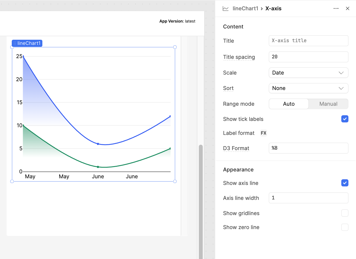
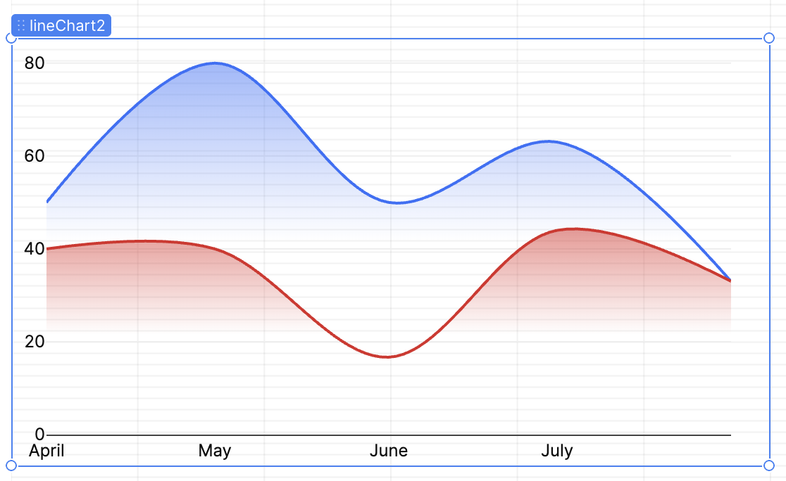
Here’s a quick screenshot for reference:


3 Likes

Thanks for helping with this, @WidleStudioLLP! Switching to the generic Plotly component would definitely provide more flexibility, but I'd still like to figure out what is causing the duplicate entries. Is it possible that there are just duplicates in your backing data sets, @luismarcos and @Annie_Ellenberger? Are you doing any grouping?

It would be super helpful if one or both of you could share a JSON export of your app that includes hard coded query results!

3 Likes

Hey @Darren -

I put together a quick demo app that reproduces the issue ... didn't notice the "easy button" in your screenshot until I'd already done it. :upside_down_face:

See the attached JSON.

Repro-Duplicate-XAxis-Values.json (45.2 KB)

Not doing any grouping, though it's entirely possible that my data structure isn't as expected. Hope this helps get to the bottom of it!

I'm trying to stick with the "new" chart components as what I'm building is for the charity I support; I imagine the older versions will be deprecated sooner than later and would like to avoid as many maintenance issues as possible for the team of volunteers.

Thanks for your help!

1 Like

Thanks for sharing, @Annie_Ellenberger! The issue here is a subtle one that ultimately stems from the fact that you're using a lineChart instead of a barChart. The former assumes that you're dealing with continuous data, whereas the latter works better with discrete categorical data.

This is most clearly visible when changing the width of the chart, which you also seem to have noticed:


Because Plotly thinks that it is working with continuous data, it will automatically increase or decrease the number of ticks on the X-axis and interpolate their value. What you end up seeing only appears to be duplicated because the tick labels only show the month.

It may be possible to add an option that prevents this, but there's currently no native way to do so. I'll talk to the team and let you know when I have an update.

In the meantime, your best option is to change the Scale setting to Category if you really want to use a lineChart. You'll lose the ability to nicely format the labels, but can otherwise guarantee that there won't be any duplicates. Alternatively, you can switch to using a barChart, instead. Your last option is to utilize the fully customizable plotlyJsonChart component, but this requires a working knowledge of Plotly.

1 Like

Hey @Annie_Ellenberger,

If you’re still running into this issue, I’d recommend switching to the Plotly JSON chart component instead of the default LineChart component. The Plotly option gives you much more flexibility and is often the perfect solution for these kinds of problems.

With Plotly, you’ll be able to fully customize the look and feel of your chart — from axis formatting and legends to colors, tooltips, and data grouping. It’s also easier to handle edge cases like duplicate labels or complex date formatting, since you can directly control the underlying JSON configuration.

This way, you’ll not only solve the current issue but also have more room to enhance your charts as your requirements grow.

2 Likes

Thanks for the detailed explanation and suggestions!

This helped me arrive at a good solution: use categories and pre-format x-axis labels in the dataset (why not! Already needed to aggregate and massage the data via transformer anyway)

I also note your point about the difference between bar charts & line charts (& expected types/shapes of data for each). Bar charts would work here, they’re just not as nice aesthetically (opinionated statement).

Thanks for taking the time to look into this & share knowledge.

1 Like

Thanks for the suggestion. I'm trying to keep things as simple as I can. I'm an experienced software person but I'm the only experienced software person in our tiny charity organization (all volunteers, self included). I was able to switch to using 'categories' and pre-formatting the x-axis labels. I'm good with this for now. I'll switch to Plotly if the case arises where I can't find a suitable workaround or out-of-the-box substitute!

1 Like