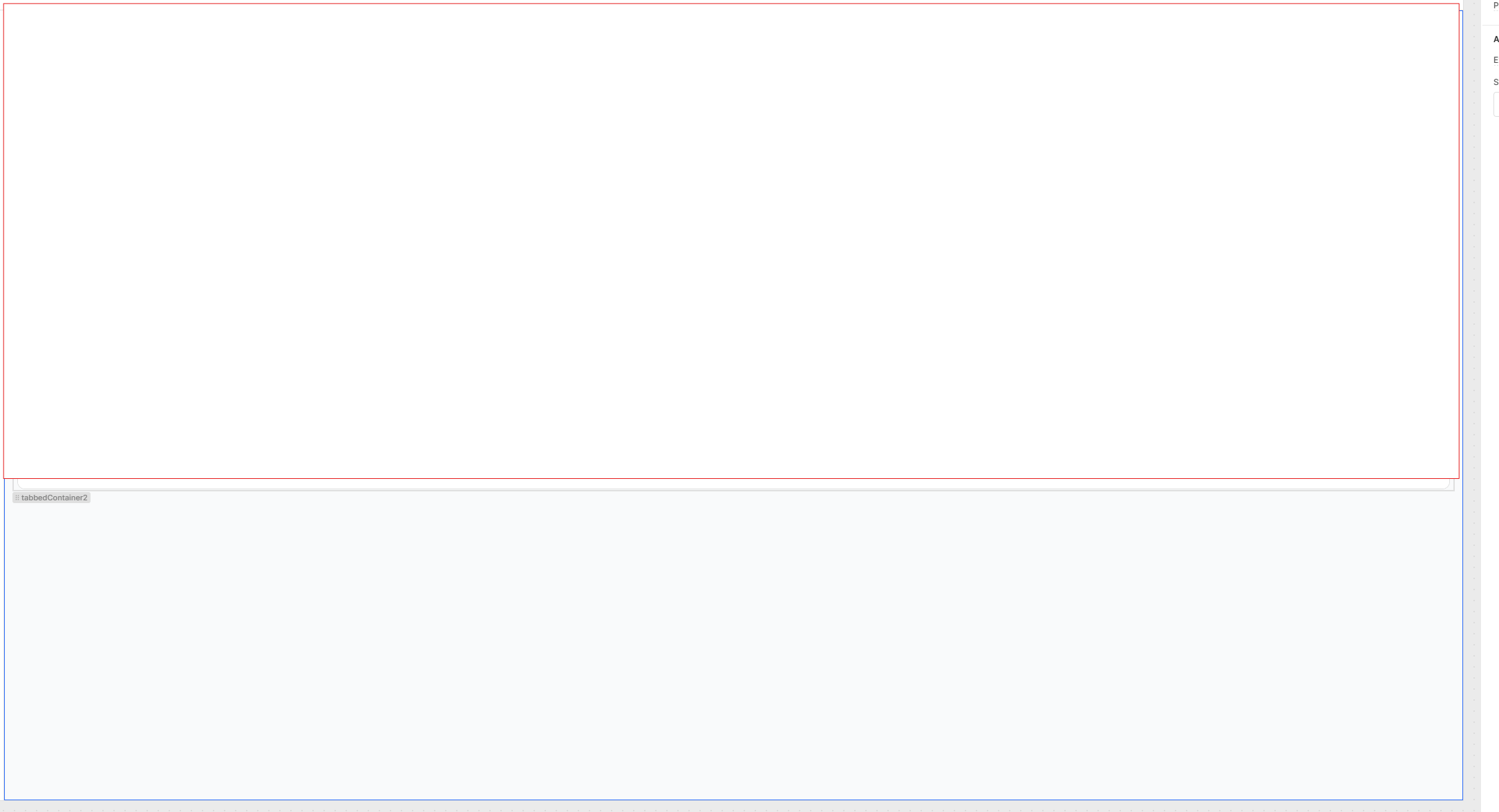
Can components be adjusted to adapt appropriately to different screen resolutions? For example, on a 3440x1440 or 4K monitor, there’s a noticeable gap due to scaling, whereas on a 1920x1080 monitor, the table component fills most of the canvas. Is there a way to utilize the additional space on higher-resolution displays?
Have you tried using the stack functionality of the containers. You can define with pixels both width and height, so that it persists regardless of screen resolution. I use it constantly and it works like a charm.
For this specific example are you using a custom component?
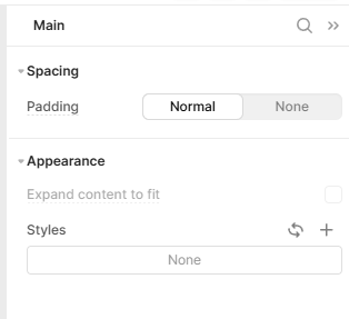
An option would be to use a container and use the expand content to fit functionality. This would make the component within the container cover the whole container, regardless of the size of the screen. The same can be done for the main frame where you can add a single container and fit it to the frame: