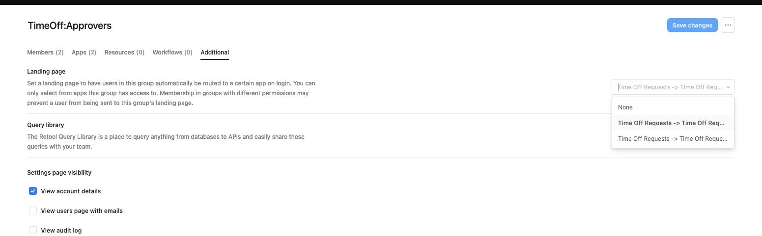
I have noticed, when Apps are put into folders, the folder name gets prepended to the names of the Apps.
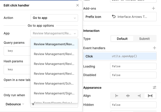
When trying to select an App to link to, we get this:
I know many ReTool components have captions that can go with the label, like this:
So maybe we put the folder name as a caption so the app name can take the label position?
I also looked, and when it opens, it gets a very restrictive width:
So could we bump that value up?
1 Like
Agree! This also happens in the Page Settings when trying to connect properties on the page to values in the URL, would be amazing if the width was also adjusted there
Paulo
March 14, 2024, 12:51am
3
Hi @khill-fbmc , thank you for your feedback! @nikita_from_bunch , I also added your +1 to the request.
We'll keep you updated with any news from our devs.
1 Like
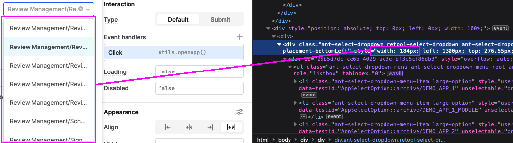
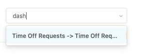
I found another location where the select box is too small
Even when I search, it doesn't really show what is matching (there is a few pixels of highlight?)
1 Like
Paulo
June 7, 2024, 11:50pm
5
We added this to the internal FR.
1 Like
Paulo
June 17, 2024, 9:24pm
6
We have updates!
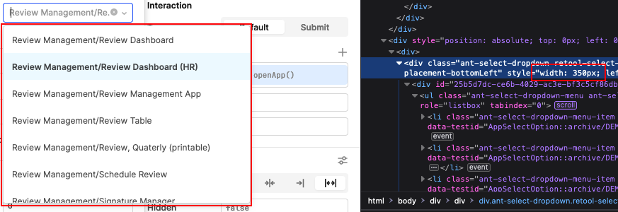
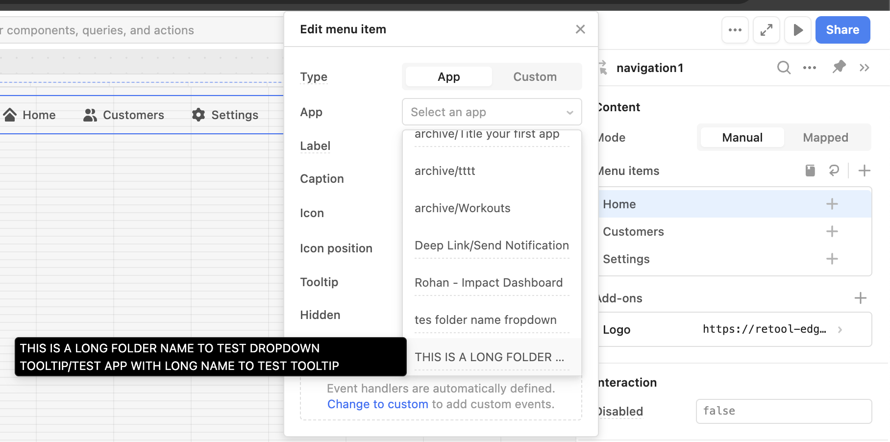
The dropdown for the App selection on a Navigation component:
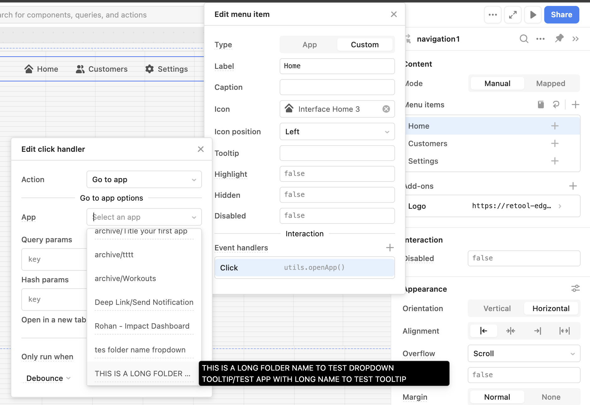
And the "Go to App" event handler when the configuration is set up manually:
Both include a tooltip that shows up when we hover any option, to show the full name both the folder and the app.
The PR that includes the addition of a tooltip for the "Landing page" dropdown options (org settings) will be available on Cloud next week!
This is a bit different than what was originally requested but it should help with selecting the correct App.
1 Like