-
Goal:
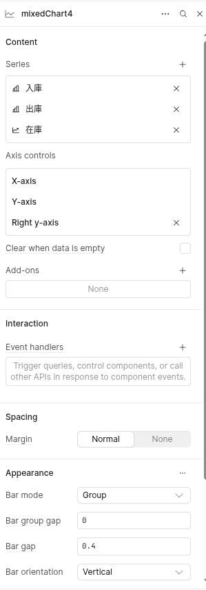
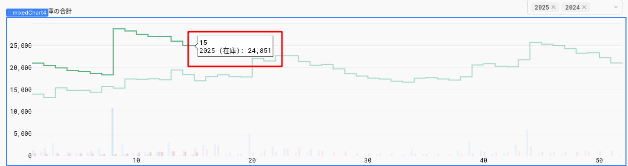
- Currently there are 3 Series in my mixedChart and I have added a tooltip for it and on hover over the chart with line and bar I am getting a format with Series in it like 12 2024(入庫): 2,411,200
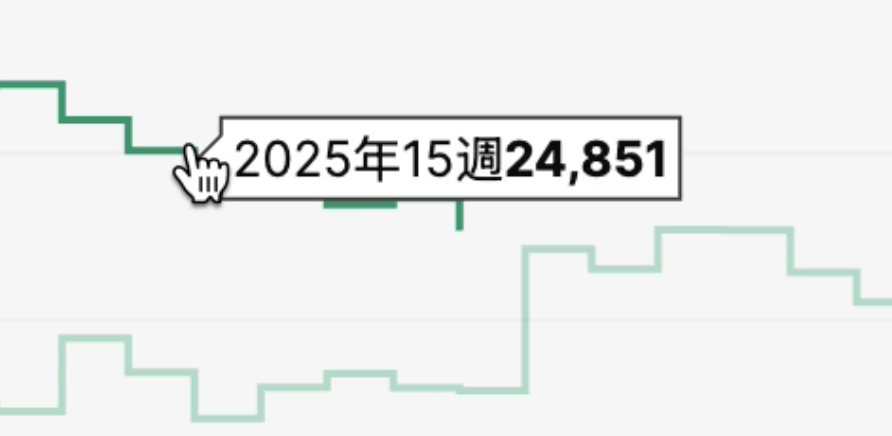
- Remove the Series name from the tooltip on hover from mixedChart without removing the year. Customize the tooltip in a format similar to 2024年12週 2,411,200 on hover over the lines and bars on the chart.
-
Steps:
- I have tried to remove the Series
{fullData.name}but on removing it my year
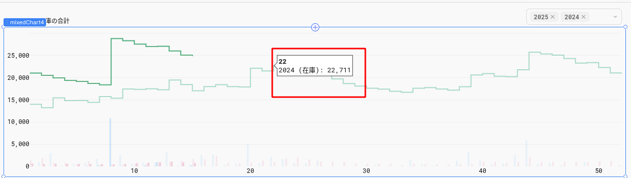
is also removed from the tooltip on hover. - I also added a transformer or custom array to extract the year, week and 入庫 and customized the tooltip based on array but my format of graph changed as each line should show data based on year but instead it appeared as mentioned in the example.
example: I have data selected from year 2025 and 2024, the result should be first line showing data from 2025 and second from 2024 but instead the line first showed data from year 2024 to it's certain week and continued to next line from next week of 2024 to the present week of 2025.
- I have tried to remove the Series
-
Details:
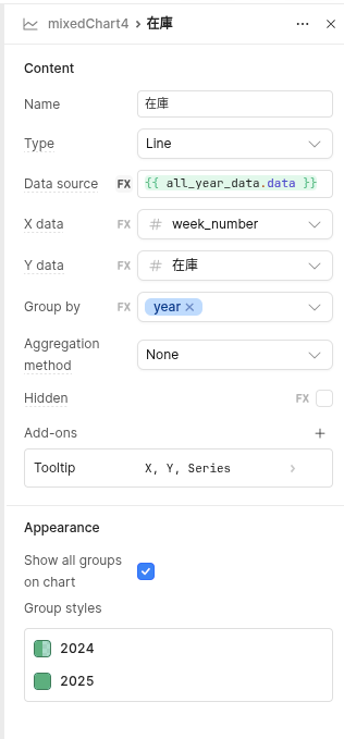
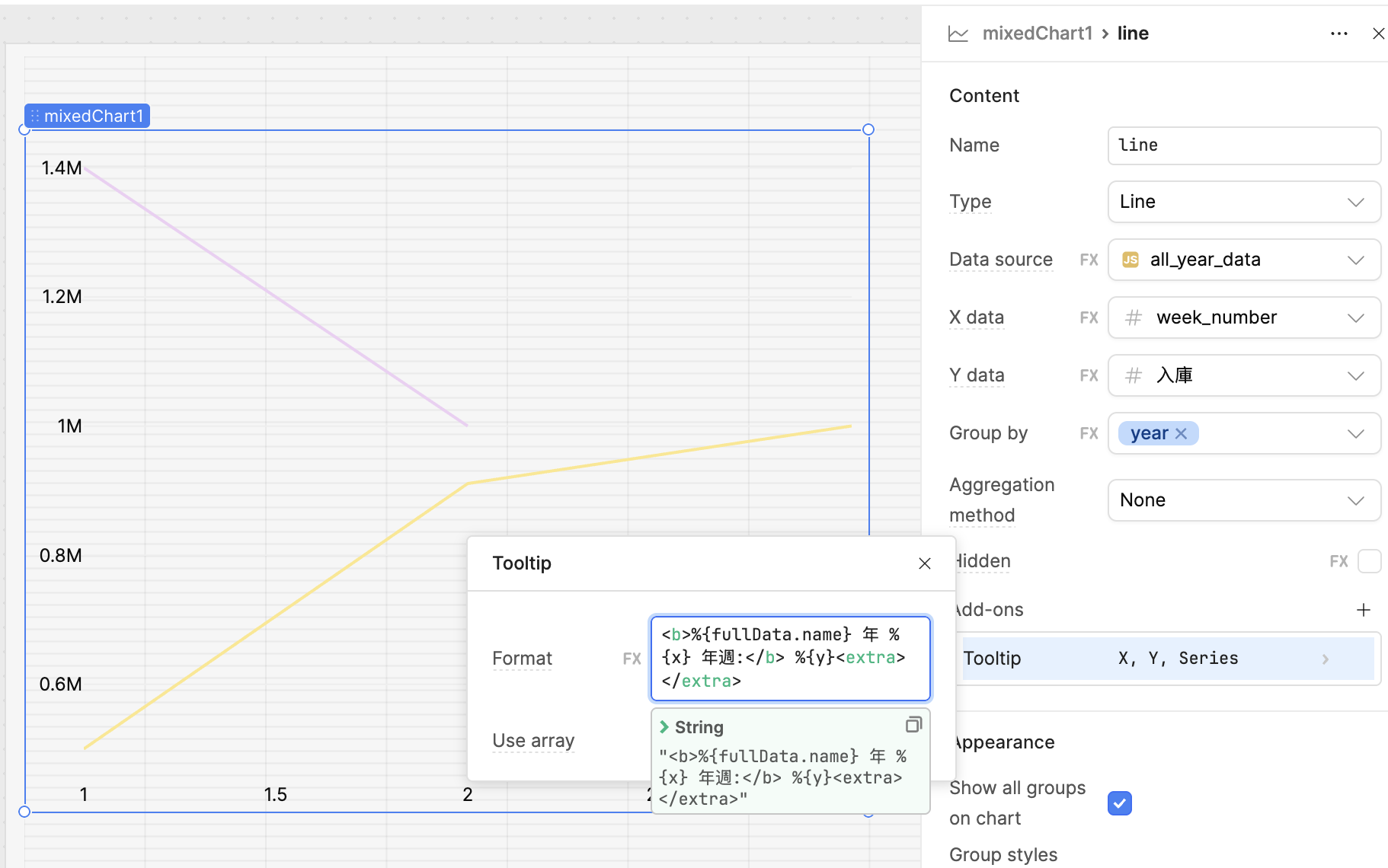
- Here is the format for tooltip using default format:
%{fullData.name}年%{x}週 <b>%{y} </b><extra></extra> - using array:
const year = all_year_data.data.year[index]; // value from the year array const week = all_year_data.data.week_number[index]; // corresponding value from week_number array const stock = all_year_data.data.入庫[index]; // corresponding value from 在庫 array // Format stock with commas, with a fallback if stock is not a number const formattedStock = typeof stock === 'number' ? stock.toLocaleString('en-US') : stock; return ` ${year}年${week}週 <b>${formattedStock}</b><extra></extra> `;}) }}``` - Here is the format for tooltip using default format:
-
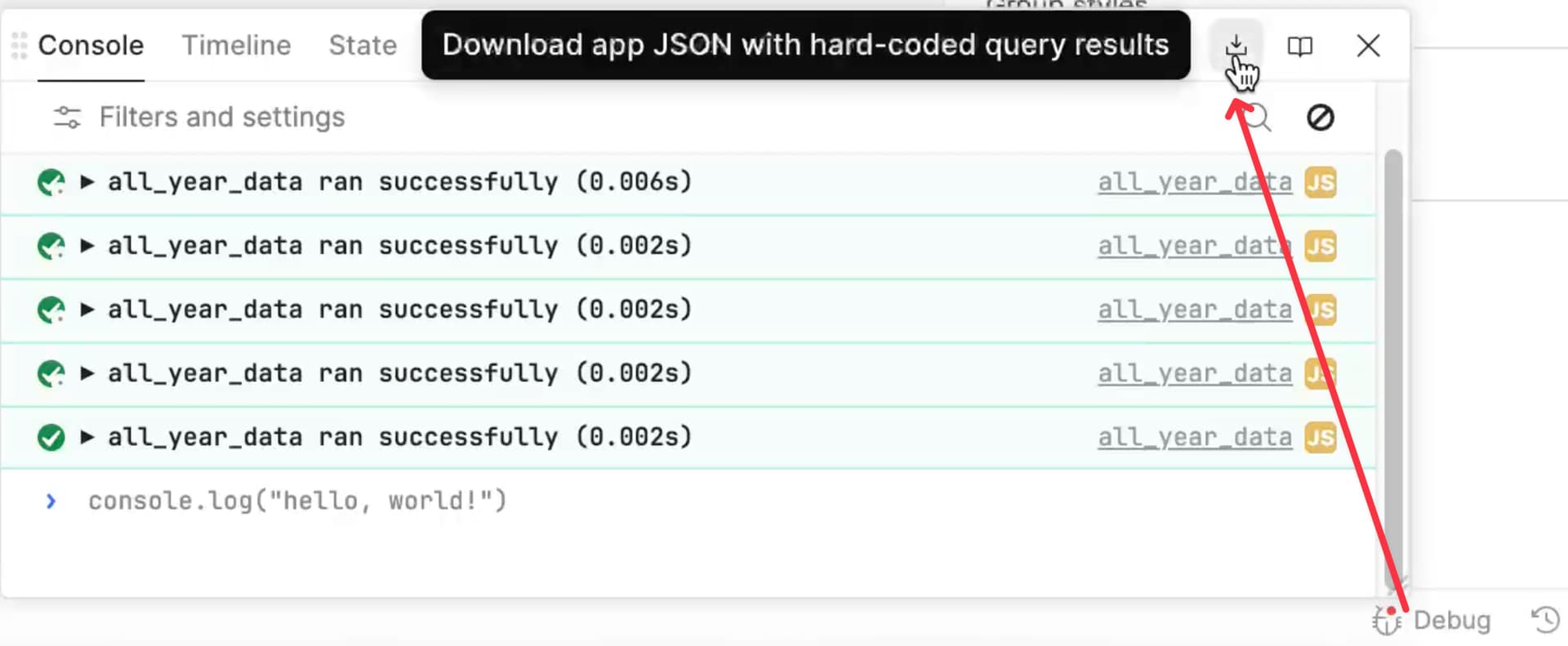
App json export: (here's how to get a json export)
Hi @Redhood,
Thanks for reaching out!
![]() It is a little tricky to troubleshoot this without the actual data, but I hope the following note helps
It is a little tricky to troubleshoot this without the actual data, but I hope the following note helps ![]()
In the default format, fullData.name should refer to the group (2024, 2025), {x} should refer to the x axis (week number), and {y} should refer to the y axis data. I'd expect you to be able to remove any of those values from the default format if you wanted to.
Here's an example (with dummy data) where I change the order of the values in the default to more closely match what you've suggested in your "Goal":
If this isn't helpful, I'd recommend:
- Check out this post on custom formats Hovertemplate questions for charts V2 - #6 by Darren
- Join office hours if you're available
- Send me a DM with an app json that is populated with your actual data so that I can work on a more specific solution:
Hi @Redhood,
Thanks for sending over the json! Apologies for the delay here.
What about this array format:
{{_.flatten((Object.values(_.groupBy(formatDataAsArray(all_year_data.data), ({ year }) => year)))).map(x=>x.year+'年'+x.week_number+'週<b>'+x.在庫.toString().replace(/\B(?=(\d{3})+(?!\d))/g, ",")+'</b><extra></extra>') }}