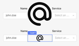
Using an icon for the '@' can help fill the space (if not in a little bit of a goofy way) however, with the minimum component width this is as snug as I could make three horizontally aligned components:
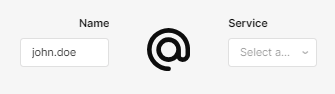
Reducing the height of the icon reduces the overall centered size but leaves more space visible from the minimum width:
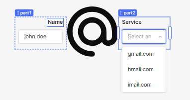
In either case, disabling the margins on all of the components can get you a bit more snug, but it's still always going to take up a minimum 3 block width (1 block per component):