I would like to create component groups. They would all move together, change size together, copy and delete together.
I realized I do this with Containers in applications where I really don't need a container for the UI, I just need some help managing layout. Grouping would be a far better way to do this and I would use it quite a bit.
Hello there @ferret141, happy new year! Thanks for checking in on this post. You can now group related components together in a card using the Container components. Check out the docs here and let me know if you have any questions after taking a look! Group components with containers | Retool Docs
I am aware of containers but like bradlymathews I don’t need the full UI and padding of a container. I need a method of keeping components arranged as expected.
Perhaps this usage issue we can take to another thread but my immediate use case is the following:
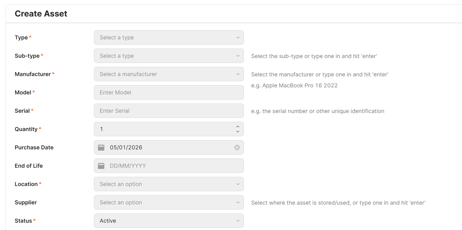
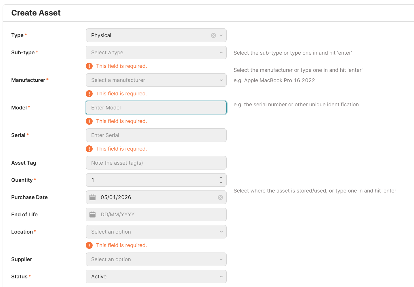
I have a form and there are several elements I want to keep organised. I can line up boxes side by side however if validation kicks in then it shifts things vertically, skewing the alignment.
Example one: I have a text input box, and to the right of it I have a text box describing the expected input.
Example two: I have a dropdown with a lot of items, to help the user I’ve excluded inactive items by default. But sometimes it is necessary to see those inactive items too. So there is a checkbox beside the dropdown for this.
I would love to group those components together in a line to maintain their alignment regardless of other components above appearing conditionally or validation text shift things down.
Is there another method recommended to achieve this?
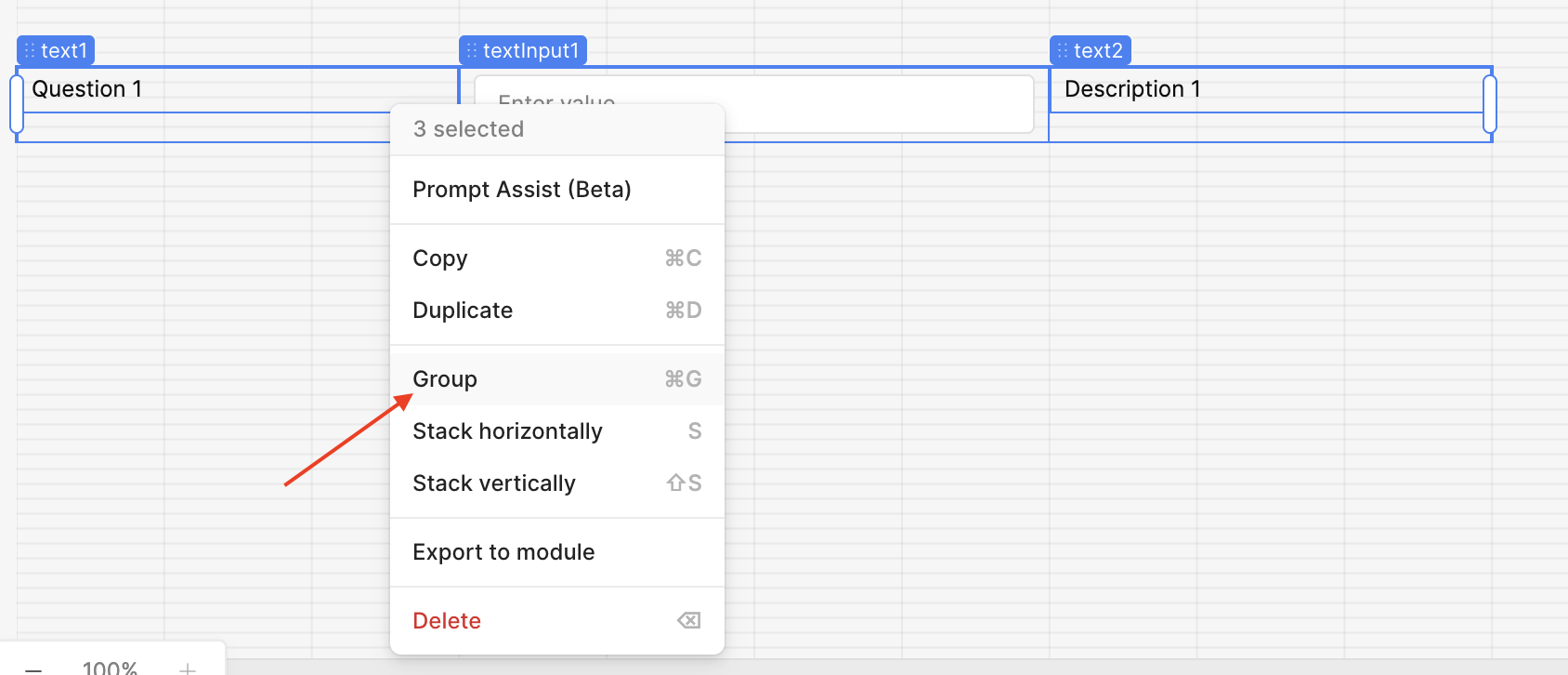
Group the components you want to stay on the same line, then place the grouped component inside your Form
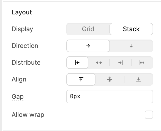
Click on the grouped component and go to Inspect > Layout. I used Stack as the display and aligned the components to the top. This way, when validation shows up, the question and description text stay aligned at the top. Feel free to tweak the layout settings based on your design needs
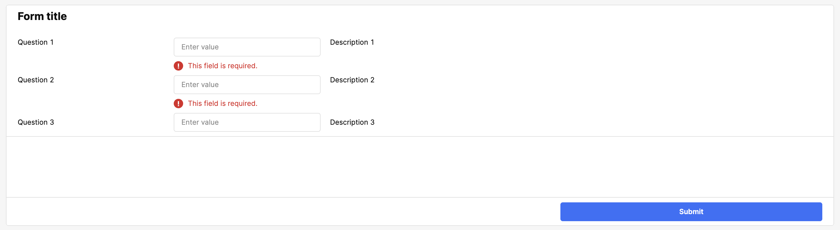
This is an example of the final product! This approach should help keep everything aligned even when validation messages appear! Have fun building!
Let me know if you have any other questions
That worked. The last time I tried grouping objects it created a container around them instead of this.
For anyone trying this and your components are not lining up with the rest of the form
If within the Group you have Layout > Display set to “Grid” then you’ll need to stretch the Group to match the width of your app. The reason behind this is that the ~12 columns in the grid of the Group scales down to the width of the Group.
If you’re using the “Stack” layout for the Group then you have granular adjustment of the width of components within.