Hello,
I'm reaching out to you regarding an issue I'm experiencing with the charts in Retool.
In my application, I'm retrieving a row from my connected Google Sheet using a query, based on a name (see attachment).
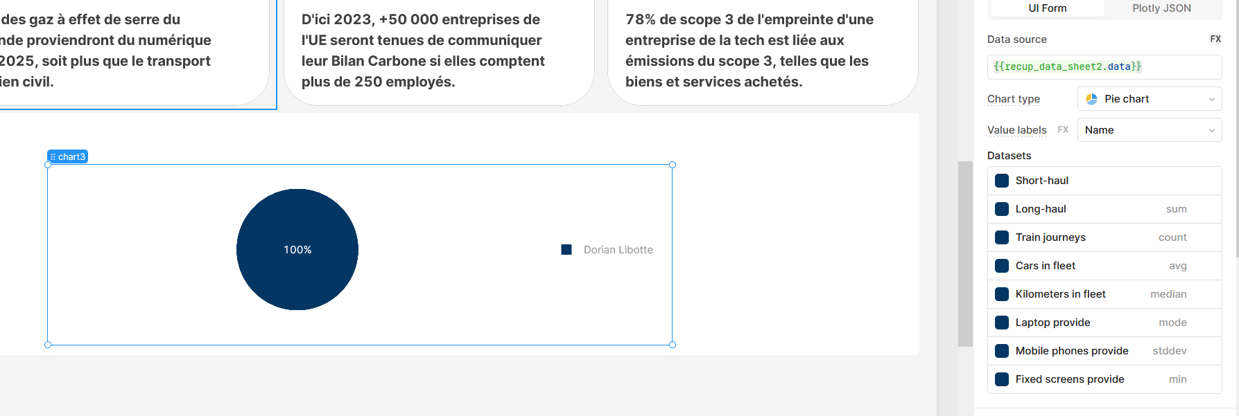
I would like to create a pie chart that shows the data corresponding to that name (see attachment).
Unfortunately, in my case, due to the "value label," it always displays 100% instead of the values I would like to see (see attachment).
Hey Dorian,
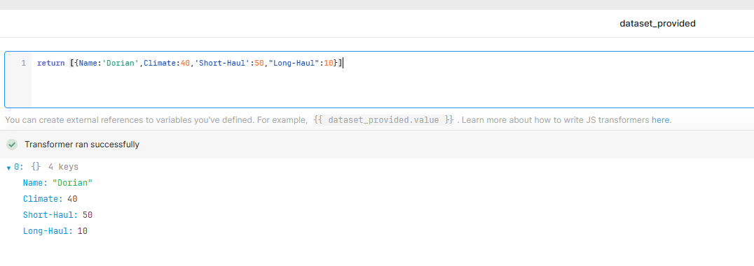
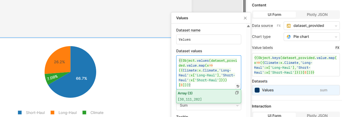
To replicate your dataset I've used a transformer to create an array consisting of 1 object.
I'm assuming that you're trying to create a pie chart of CO2 emissions where you want to display values for climate 40%, short-haul 3% etc (can be different in your case I'm just using this as an example).
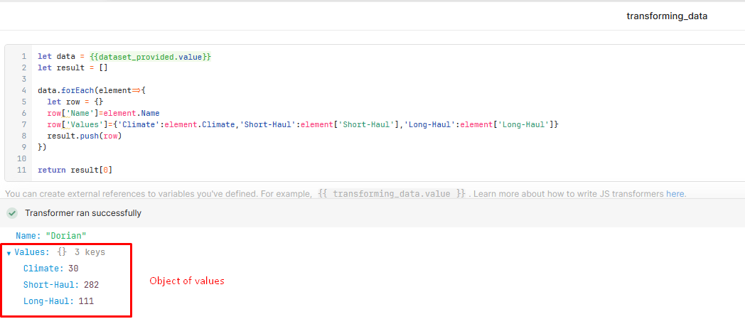
So your goal is to transform that Object into value object where you only have values you're trying to display.
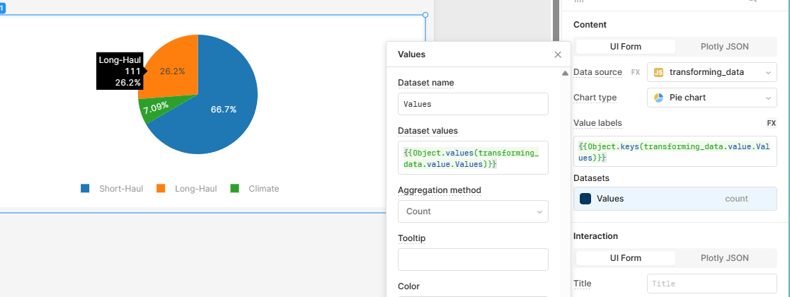
From there you can create a pie chart like I've shown in example (where object keys will be your labels, and values will be your values).
You can accomplish the same without transformer just having everything within the pie chart set up as shown here (but requires more complex JS transformation)
/*Value Labels*/
{{Object.keys(dataset_provided.value.map(x=>({Climate:x.Climate,'Long-Haul':x['Long-Haul'],'Short-Haul':x['Short-Haul']}))[0])}}
/*Values*/
{{Object.values(dataset_provided.value.map(x=>({Climate:x.Climate,'Long-Haul':x['Long-Haul'],'Short-Haul':x['Short-Haul']}))[0])}}
Hope this helps!
1 Like