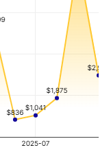
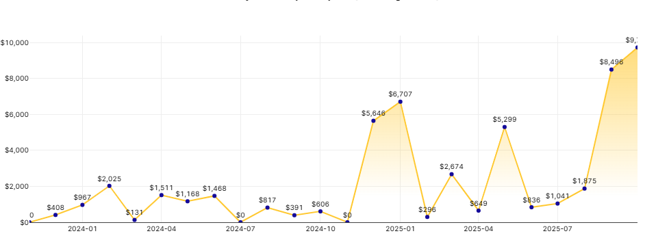
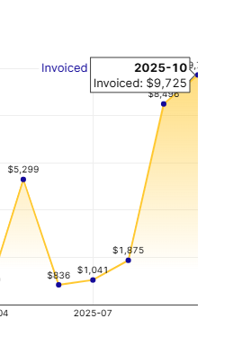
I have a line chart with labels for the points. The first and last points are displaying as truncated. Setting the margin on or off makes no difference. The final point should display $2,973
Hi @klautier,
That is odd that the value is getting cut off. It is hard to see from the screenshot but are you able to expand horizontally the line chart component? Could you share a larger screenshot or a video of you resizing the component?
If you have steps to reproduce this, I can test them out and see if this is a repeatable bug.
Certainly. I have tried turning margin on and off, but it makes no difference. It looks as if the last point goes right to the RHS edge rather than having some additional space for display. Because of this the label is therefore truncated in the middle.
Thank you for sharing that!
That is frustrating that the margin isn't giving the actual data more space on the ends.
I just did a quick repro and it looks like if you mouse over the x-axis the mouse will turn into horizontal arrow. Then you can click and drag the x-axis scaling to give the data more or less space to exist in.
I know this is more of a temporary work around and I will contact the UI team to figure out why data and label do not auto scale to fit as users should not be having labels or anything else get cut off unless they explicitly make alterations on purpose.
If you have a JSON export of the app with just the component and its data that would be very helpful for reproducing this behavior and sharing with the engineers!