Hello everybody! Is there any way to get the appearance of a prefix icon like we used in the link, for a text component?
What I got closer to that was using the icon component, but it doesn't looks good.
Hello everybody! Is there any way to get the appearance of a prefix icon like we used in the link, for a text component?
What I got closer to that was using the icon component, but it doesn't looks good.
@douglas.palermo
Hey there  You should be able to use any text symbols/emojis. Would that work for your use case?

Hello @lauren.gus ! Thank for the feedback.
I tried using both options, but it didn't look good for my case.
The ideal would be the icons we use on the buttons.
@douglas.palermo
Got it! As that is not currently a feature I will move this to our feature requests 
Second this
I was able to use the "status" component as a workaround. Are there still plans to add this as a feature?
Hey @MiguelHA! This is in fact something that's still being explored and worked on by the dev team. If it gets included we'll try and let you know here!
In the meantime, components now come with more margin and padding settings that allow for more granular control over what your layout looks like. For instance, if you create a container without padding or margins and put in a text and icon component you can get something that may be a lot closer to what you're looking for:

Got it, think this is a good workaround if the icon is to the left of the text.
If we wanted to place it to the right then there's currently no way of doing so and have it be aligned to the end of the text @Kabirdas
I see, thanks for the additional context!
+1 on this. Sometimes there are just times when you want/need to include an icon before or after text, and having an "Add-ons > Prefix Icon" like you can do on other components would be terrific.
Appreciate the workarounds above, in the meantime!
+1
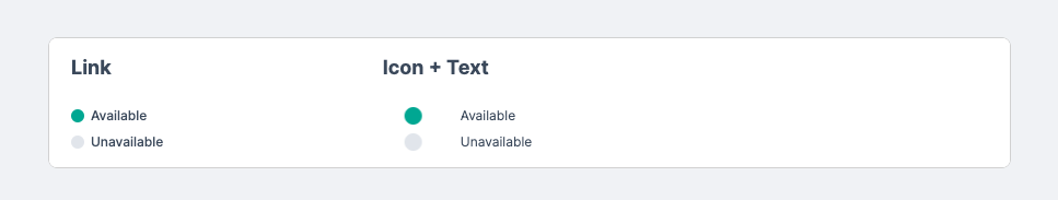
Hey everyone! We now have an iconText component for this feature. Let us know if you have additional feedback for your use case. Thanks!
A post was split to a new topic: Can I wrap the text in a iconText component?
