Add event handlers to suffix/prefix icons

Hi team,

It would be great to have the possibility to add event handlers, e.g. on click, to prefix/suffix icons.

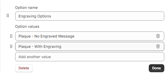
Concrete example currently in my mind: I'm building a listview similar to Shopify's interface to add options to a product:

image

As you can see, they have a suffix icon to delete the row. I know this is achievable with the icon component, but as the text input and other components have prefix and suffix icons, it would be nice if we could have trigger events from those as well.

1 Like

Hi @MiguelOrtiz

Thank you for reaching out! You're right—while there are workarounds, I agree that having this feature would be really helpful. I've submitted a request internally to add it to our backlog.

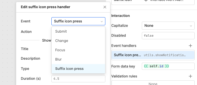
Currently, this feature is only available for TextInput suffix icons in mobile apps:

suffixicon

We'll reach out when it ships!

2 Likes

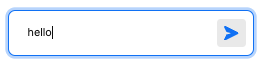
Hello! I’m in the process of creating a note/chat container and have a specific vision for the layout and design. I recently noticed the elegant use of a combined input field in the AI Chat component, which looks incredibly clean.

Screenshot 2024-10-14 at 5.49.29 PM

Typically, I would place a button next to a text field and call it a day—sometimes even using an icon for the button text. I even went into creating a custom component text field to replicate the look but that takes more time to get up and running. However, with the option to incorporate a prefix or suffix icon that can be activated with a click or by pressing enter, I see a great opportunity for enhanced functionality. I utilize a similar concept in the table component, where we can set a button as an icon within a column and an option like this would definitely be awesome!

I did make a rough rough draft style of this in a custom component but the cons outweigh me using this from just a normal text input and button combo.

<!DOCTYPE html>
<html lang="en">
<head>
    <meta charset="UTF-8">
    <meta name="viewport" content="width=device-width, initial-scale=1.0">
    <title>Chat Message Input</title>
    <style>
        body, html {
            margin: 0;
            padding: 0;
            font-family: Arial, sans-serif;
            background-color: #f5f5f5;
        }
        .chat-container {
            display: flex;
            align-items: center;
            justify-content: center;
            height: 100vh;
        }
        .message-input-container {
            display: flex;
            align-items: center;
            border: 1px solid #ccc;
            border-radius: 25px; 
            padding: 5px; 
            width: 100%;
            max-width: 500px;
            background-color: white;
            box-shadow: 0 2px 5px rgba(0, 0, 0, 0.1);
            position: relative;
        }
        .message-input {
            flex: 1;
            border: none;
            outline: none;
            font-size: 16px;
            padding: 10px 50px 10px 10px; 
            border-radius: 25px; 
            background-color: #f0f0f0;
        }
        .send-button {
            background: none; 
            border: none; 
            position: absolute; 
            right: 10px; 
            cursor: pointer;
            display: flex;
            align-items: center;
            justify-content: center;
        }
        .send-button svg {
            fill: none; 
            stroke: #007bff; 
            strokeWidth: 2;
            width: 24px; 
            height: 24px;
        }
        .send-button:hover svg {
            stroke: #0056b3; 
        }
    </style>
</head>
<body>
    <div id="react"></div>

    <script crossorigin src="https://unpkg.com/react@18/umd/react.development.js"></script>
    <script crossorigin src="https://unpkg.com/react-dom@18/umd/react-dom.development.js"></script>

    <script type="text/babel">
        const MessageInput = ({ model }) => {
            const [message, setMessage] = React.useState(model.message || "");

            const handleSend = () => {
                if (message.trim()) {
                    if (window.Retool) {
                        window.Retool.modelUpdate({ message: message });
                        console.log("Message sent:", message);
                    } else {
                        console.warn("Retool context is not available.");
                    }
                    setMessage("");
                }
            };

            return (
                <div className="chat-container">
                    <div className="message-input-container">
                        <input
                            type="text"
                            className="message-input"
                            placeholder="Type a message..."
                            value={message}
                            onChange={(e) => setMessage(e.target.value)}
                            onKeyDown={(e) => e.key === 'Enter' && handleSend()}
                        />
                        <button className="send-button" onClick={handleSend}>
                            <svg xmlns="http://www.w3.org/2000/svg" viewBox="0 0 24 24">
                                <path d="M2 21l21-9L2 3v7l15 2-15 2v7z"/>
                            </svg>
                        </button>
                    </div>
                </div>
            );
        };

        const ConnectedComponent = Retool.connectReactComponent(MessageInput);
        const container = document.getElementById('react');
        const root = ReactDOM.createRoot(container);
        root.render(<ConnectedComponent />);
    </script>
</body>
</html>


Maybe try this:

  1. Place that text input component and button component into a container component;
  2. Remove the container header, set its padding and margin to none, then set the background to #FFFFFF;
  3. Remove the border from your text input component;
  4. Align your button component contents to the right so it only takes up text/icon space;
  5. Increase the border-radius on the button component by a few pixels until you get the desired result?
2 Likes

Not bad. I’ve used this approach before. It does get the idea across and it works but I was thinking of a native component without a workaround like this. Pretty much gaining access to that chat input field outside of the chat component. I thought of using that component outside of AI but I think it’s mainly used for an AI help bot or other AI use.

Agreed! Linking this to a similar feature request I made recently

2 Likes

I saw this! I wasnt sure if this was much different so I should have just commented there haha. Glad we think alike.

Hey all! :wave: I've linked both use cases to the same internal feature request and will provide an update here whenever I can.

2 Likes

Thank you!

1 Like